Personalizarea scatter plot-urilor
Introducere în vizualizarea datelor cu Seaborn

Content Team
DataCamp
Subgrupuri cu mărimea punctelor
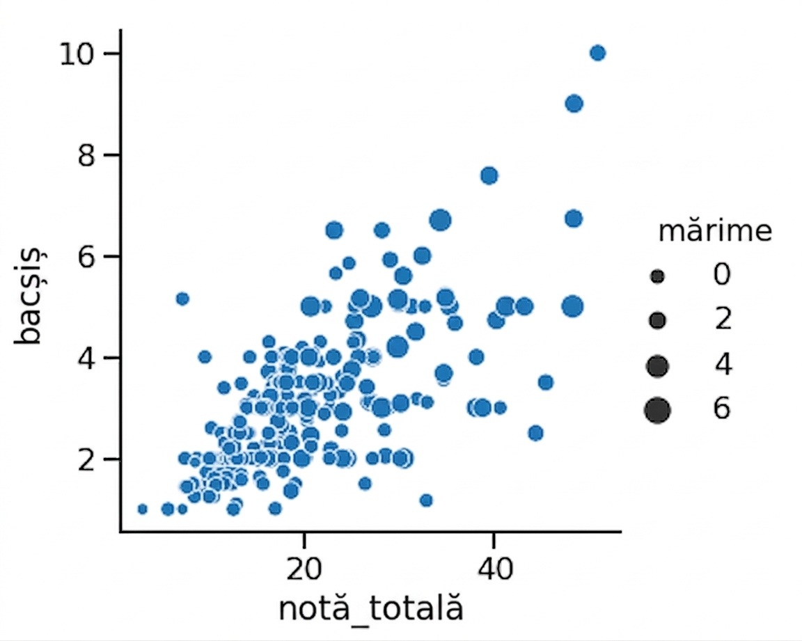
1 Waskom, M. L. (2021). seaborn: statistical data visualization. https://seaborn.pydata.org/
Mărimea punctelor și hue
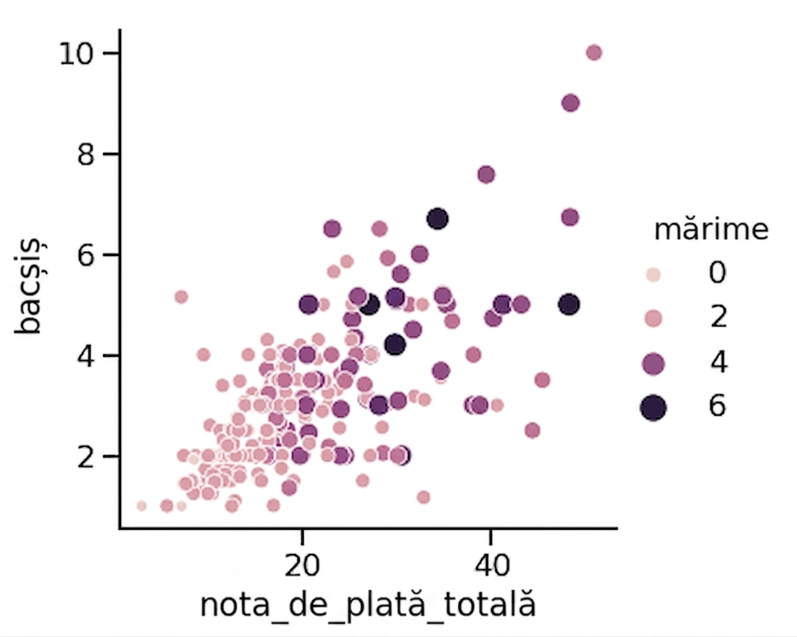
1 Waskom, M. L. (2021). seaborn: statistical data visualization. https://seaborn.pydata.org/
Subgrupuri cu stilul punctelor
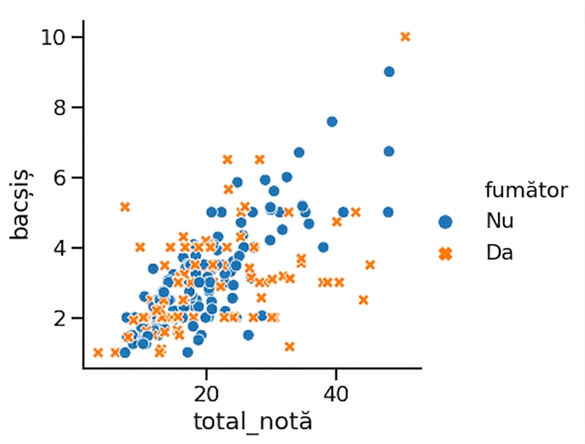
1 Waskom, M. L. (2021). seaborn: statistical data visualization. https://seaborn.pydata.org/
Modificarea transparenței punctelor
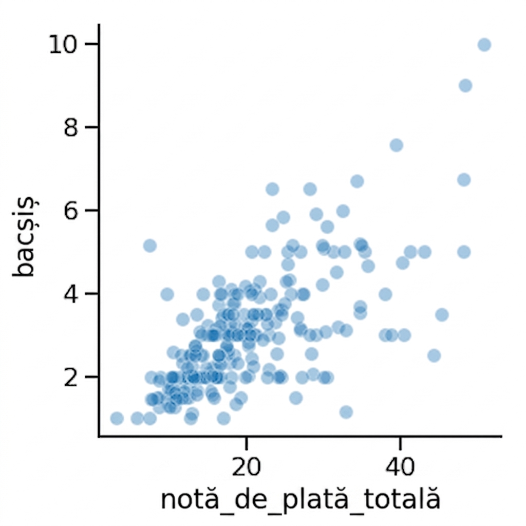
1 Waskom, M. L. (2021). seaborn: statistical data visualization. https://seaborn.pydata.org/

