Точкові діаграми

Вступ до візуалізації даних з ggplot2

Rick Scavetta

Founder, Scavetta Academy

48 геометрій

geom_*
abline contour dotplot jitter pointrange ribbon spoke
area count errorbar label polygon rug step
bar crossbar errorbarh line qq segment text
bin2d curve freqpoly linerange qq_line sf tile
blank density hex map quantile sf_label violin
boxplot density2d histogram path raster sf_text vline
col density_2d hline point rect smooth
Вступ до візуалізації даних з ggplot2

Поширені типи графіків

Тип графіка Можливі Geoms
Точкові points, jitter, abline, smooth, count
Вступ до візуалізації даних з ggplot2

Точкові діаграми

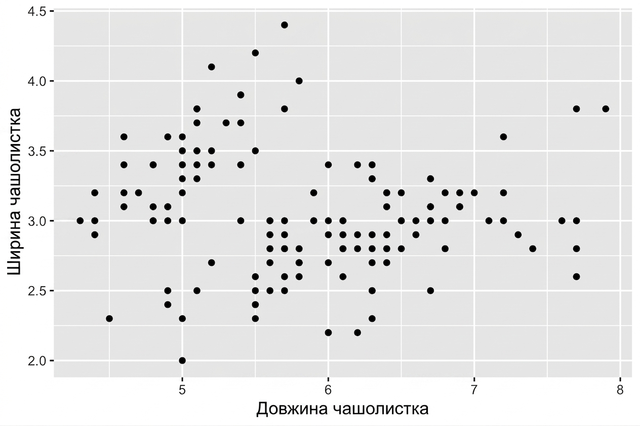
  • Кожен geom має свої естетичні відображення, напр. geom_point():
Обов'язкові
x,y
ggplot(iris, aes(x = Sepal.Length, 
                 y = Sepal.Width)) + 
  geom_point()
Вступ до візуалізації даних з ggplot2

Точкові діаграми

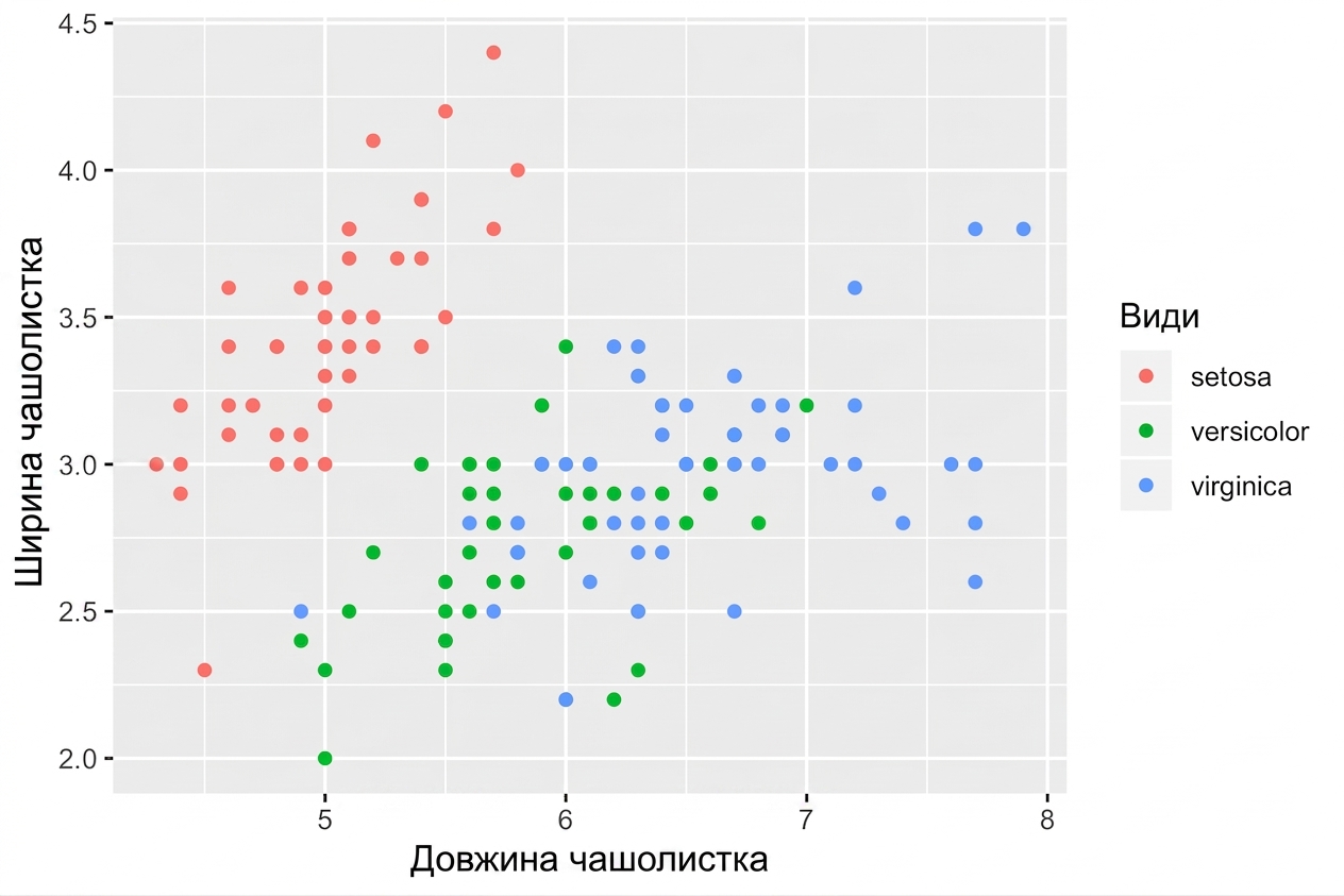
  • Кожен geom має свої естетичні відображення, напр. geom_point():
Обов'язкові Додаткові
x,y alpha, color, fill, shape, size, stroke
ggplot(iris, aes(x = Sepal.Length, 
                 y = Sepal.Width,
                 col = Species)) + 
  geom_point()
Вступ до візуалізації даних з ggplot2

Естетика, специфічна для geom

# Це дає однаковий графік! 
ggplot(iris, aes(x = Sepal.Length, y = Sepal.Width, col = Species)) + 
  geom_point()

ggplot(iris, aes(x = Sepal.Length, y = Sepal.Width)) + 
  geom_point(aes(col = Species))

Керуйте естетикою кожного шару окремо:

Вступ до візуалізації даних з ggplot2
head(iris, 3) # Сирі дані
Species Sepal.Length Sepal.Width Petal.Length Petal.Width
1  setosa          5.1         3.5          1.4         0.2
2  setosa          4.9         3.0          1.4         0.2
3  setosa          4.7         3.2          1.3         0.2
iris %>%
  group_by(Species) %>% 
  summarise_all(mean) -> iris.summary

iris.summary # Підсумкова статистика
# A tibble: 3 x 5
  Species    Sepal.Length Sepal.Width Petal.Length Petal.Width
  <fct>             <dbl>       <dbl>        <dbl>       <dbl>
1 setosa             5.01        3.43         1.46       0.246
2 versicolor         5.94        2.77         4.26       1.33 
3 virginica          6.59        2.97         5.55       2.03
Вступ до візуалізації даних з ggplot2
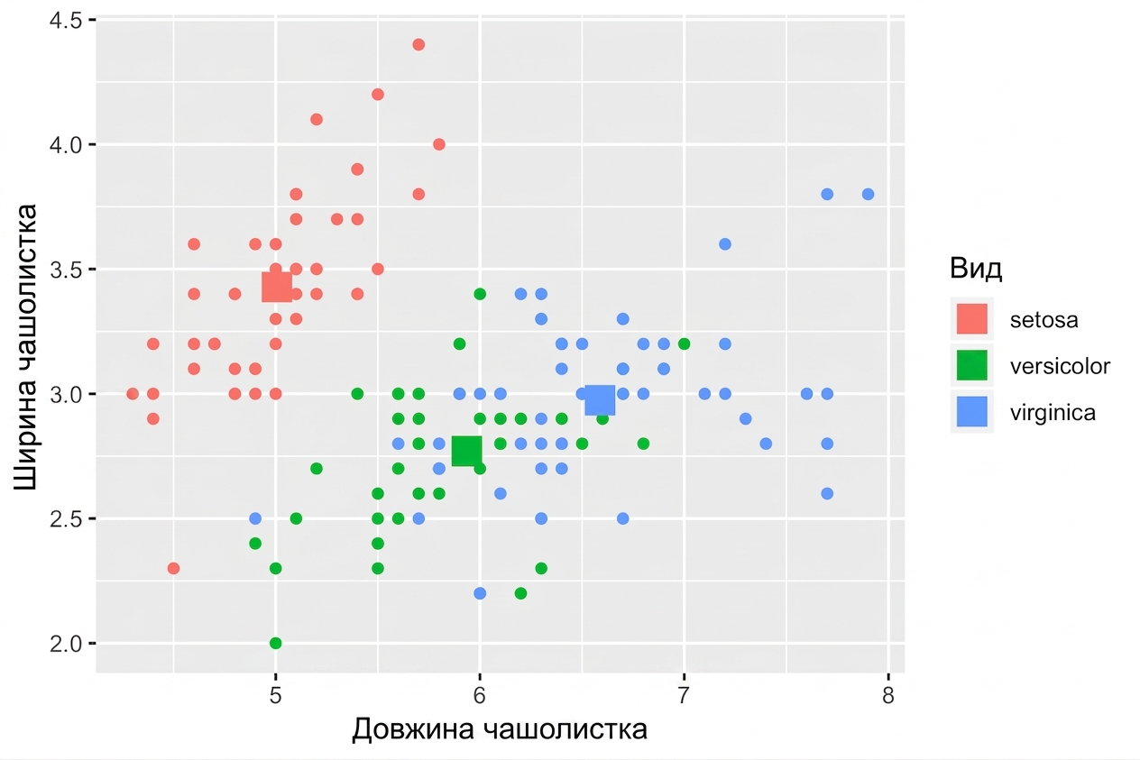
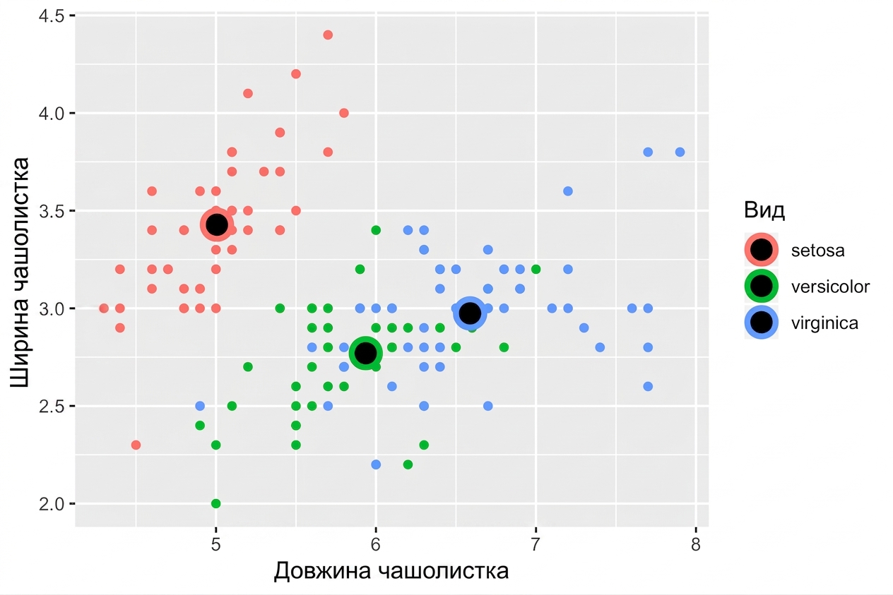
ggplot(iris, aes(x = Sepal.Length, y = Sepal.Width, col = Species)) +
  # Успадковує і дані, і aes з ggplot() 
  geom_point() + 
  # Інші дані, але успадкований aes
  geom_point(data = iris.summary, shape = 15, size = 5)
Вступ до візуалізації даних з ggplot2

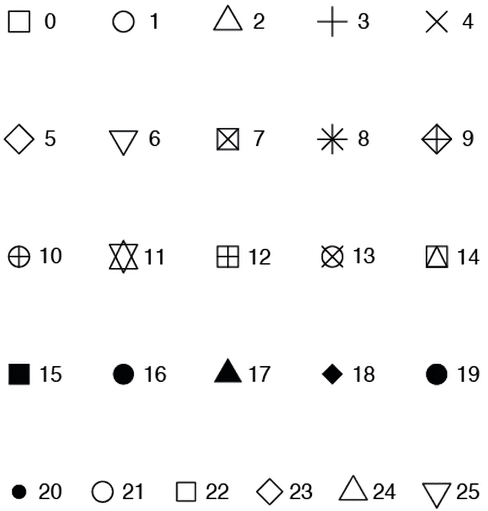
Значення атрибуту shape

Вступ до візуалізації даних з ggplot2

Приклад

ggplot(iris, aes(x = Sepal.Length, y = Sepal.Width, col = Species)) + 
  geom_point() +
  geom_point(data = iris.summary, shape = 21, size = 5, 
             fill = "black", stroke = 2)
Вступ до візуалізації даних з ggplot2

Статистика «на льоту» в ggplot2

  • Дивіться другий курс щодо шару статистики.
  • Примітка: не показуйте лише середнє без міри розкиду, напр. стандартного відхилення.

Вступ до візуалізації даних з ggplot2

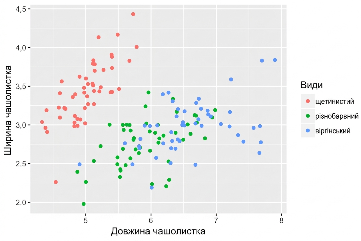
position = "jitter"

ggplot(iris, aes(x = Sepal.Length, y = Sepal.Width, col = Species)) + 
  geom_point(position = "jitter")
Вступ до візуалізації даних з ggplot2

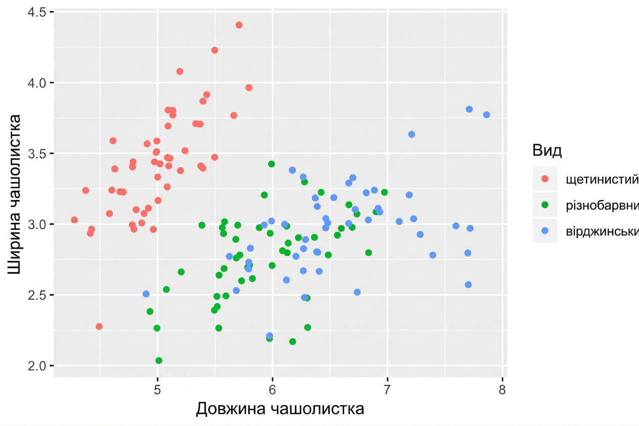
geom_jitter()

Скорочення до geom_point(position = "jitter")

ggplot(iris, aes(x = Sepal.Length, y = Sepal.Width, col = Species)) + 
  geom_jitter()
Вступ до візуалізації даних з ggplot2

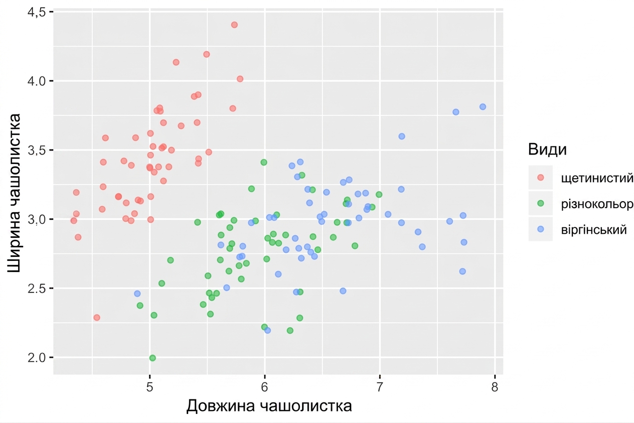
Не забудьте налаштувати alpha

  • За потреби поєднуйте джиттер із прозорістю (alpha)
ggplot(iris, aes(x = Sepal.Length, y = Sepal.Width, col = Species)) + 
  geom_jitter(alpha = 0.6)
Вступ до візуалізації даних з ggplot2

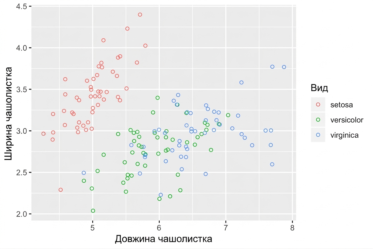
Порожні кола теж допомагають

  • shape = 1 — це порожнє коло.
  • Не обов'язково додавати прозорість.
ggplot(iris, aes(x = Sepal.Length, y = Sepal.Width, col = Species)) + 
  geom_jitter(shape = 1)
Вступ до візуалізації даних з ggplot2

Давайте потренуємось!

Вступ до візуалізації даних з ggplot2

Preparing Video For Download...