ggplot2 के साथ डेटा विज़ुअलाइज़ेशन परिचय
Rick Scavetta
Founder, Scavetta Academy
| Plot type | Possible Geoms |
|---|---|
| स्कैटर प्लॉट्स | points, jitter, abline, smooth, count |
| बार प्लॉट्स | histogram, bar, col, errorbar |
| लाइन प्लॉट्स | line, path |
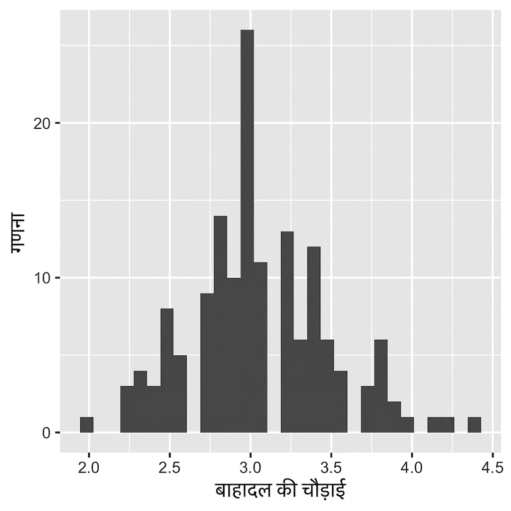
ggplot(iris, aes(x = Sepal.Width)) +
geom_histogram()
`stat_bin()` using `bins = 30`.
Pick better value with `binwidth`.

ggplot(iris, aes(x = Sepal.Width)) +
geom_histogram()
# डिफ़ॉल्ट बिन चौड़ाई:
diff(range(iris$Sepal.Width))/30
[1] 0.08

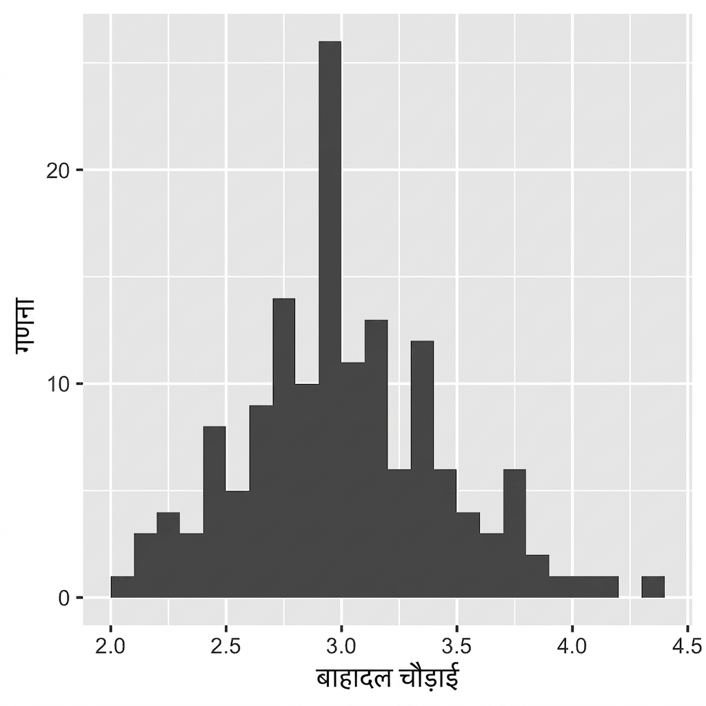
ggplot(iris, aes(x = Sepal.Width)) +
geom_histogram(binwidth = 0.1)
अपने डेटा के लिए अर्थपूर्ण बिन चौड़ाई हमेशा सेट करें.
बार्स के बीच कोई स्पेस नहीं.

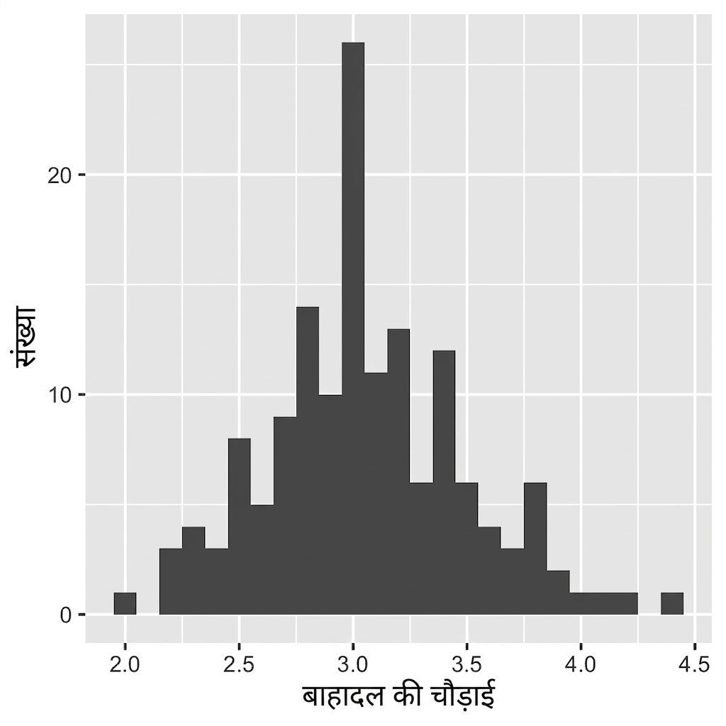
ggplot(iris, aes(x = Sepal.Width)) +
geom_histogram(binwidth = 0.1,
center = 0.05)
अपने डेटा के लिए अर्थपूर्ण बिन चौड़ाई हमेशा सेट करें.
बार्स के बीच कोई स्पेस नहीं.
X अक्ष के लेबल बार्स के बीच आते हैं.

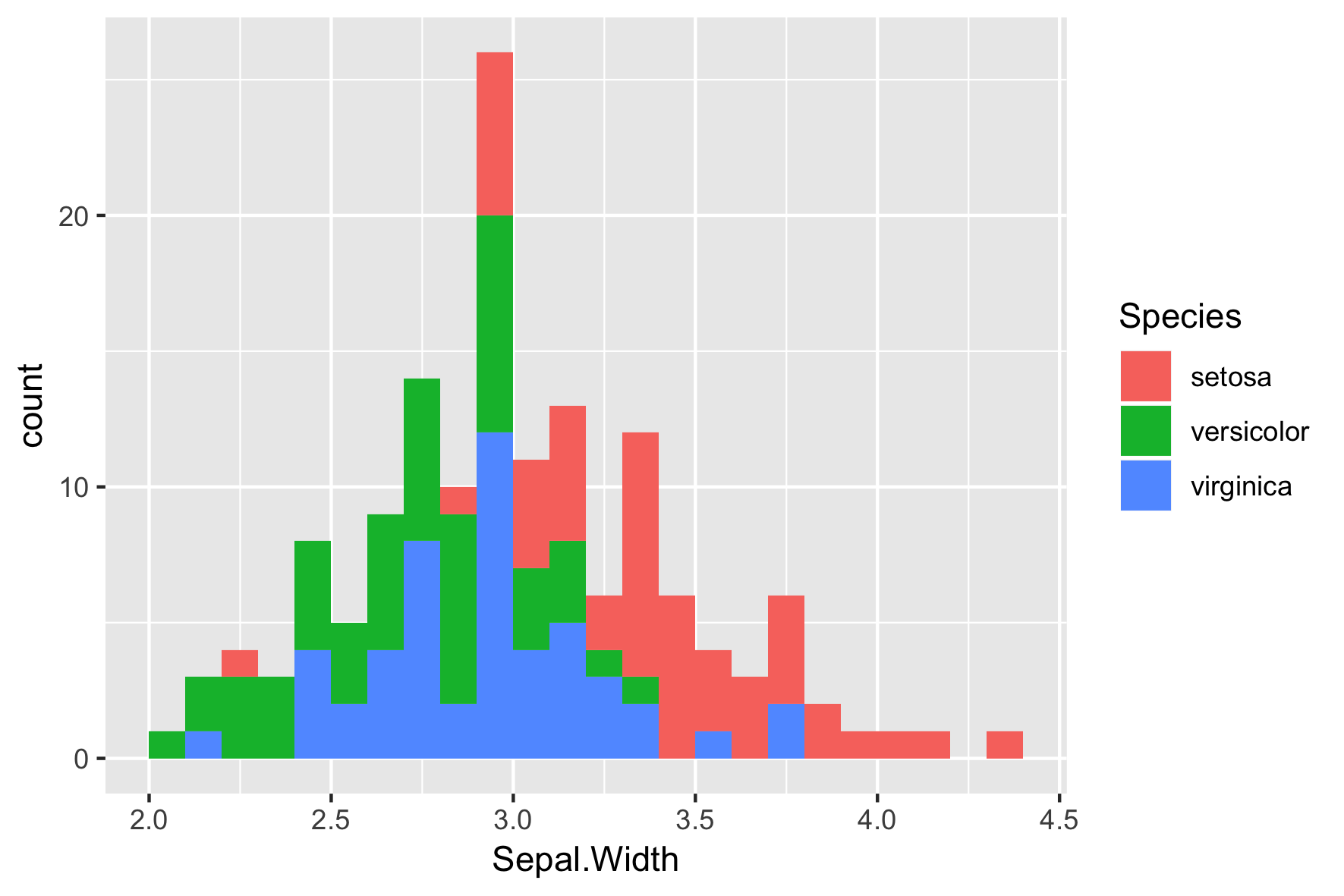
ggplot(iris, aes(x = Sepal.Width,
fill = Species)) +
geom_histogram(binwidth = .1,
center = 0.05)

ggplot(iris, aes(x = Sepal.Width,
fill = Species)) +
geom_histogram(binwidth = .1,
center = 0.05,
position = "stack")

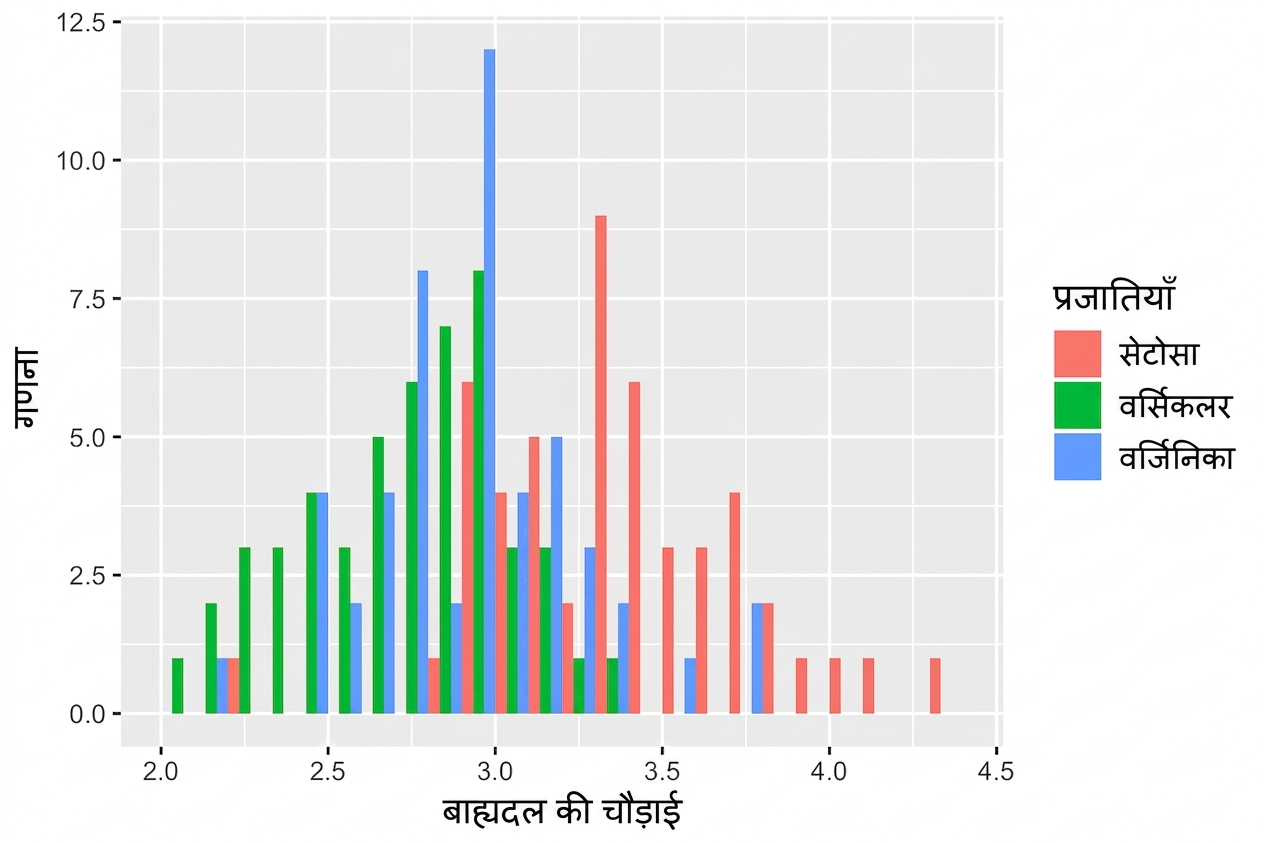
ggplot(iris, aes(x = Sepal.Width,
fill = Species)) +
geom_histogram(binwidth = .1,
center = 0.05,
position = "dodge")

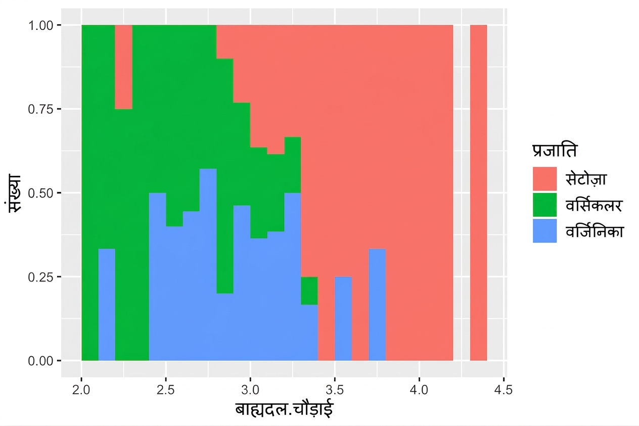
ggplot(iris, aes(x = Sepal.Width,
fill = Species)) +
geom_histogram(binwidth = .1,
center = 0.05,
position = "fill")

ggplot2 के साथ डेटा विज़ुअलाइज़ेशन परिचय