การแสดงผลข้อมูลด้วย ggplot2 เบื้องต้น
Rick Scavetta
Founder, Scavetta Academy
| ประเภทกราฟ | Geoms ที่ใช้ได้ |
|---|---|
| Scatter plots | points, jitter, abline, smooth, count |
| Bar plots | histogram, bar, col, errorbar |
| Line plots | line, path |
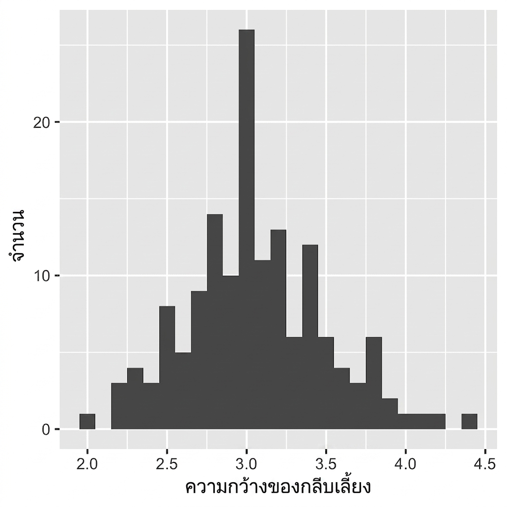
ggplot(iris, aes(x = Sepal.Width)) +
geom_histogram()
`stat_bin()` using `bins = 30`.
Pick better value with `binwidth`.

ggplot(iris, aes(x = Sepal.Width)) +
geom_histogram()
# Default bin width:
diff(range(iris$Sepal.Width))/30
[1] 0.08

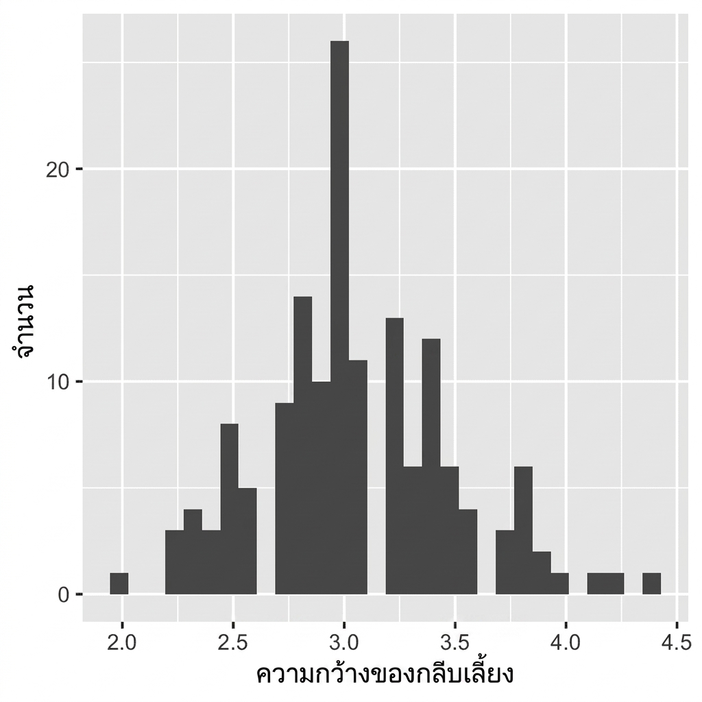
ggplot(iris, aes(x = Sepal.Width)) +
geom_histogram(binwidth = 0.1)
ควรกำหนดความกว้าง bin ให้เหมาะสมกับข้อมูลเสมอ
ไม่มีช่องว่างระหว่างแท่ง

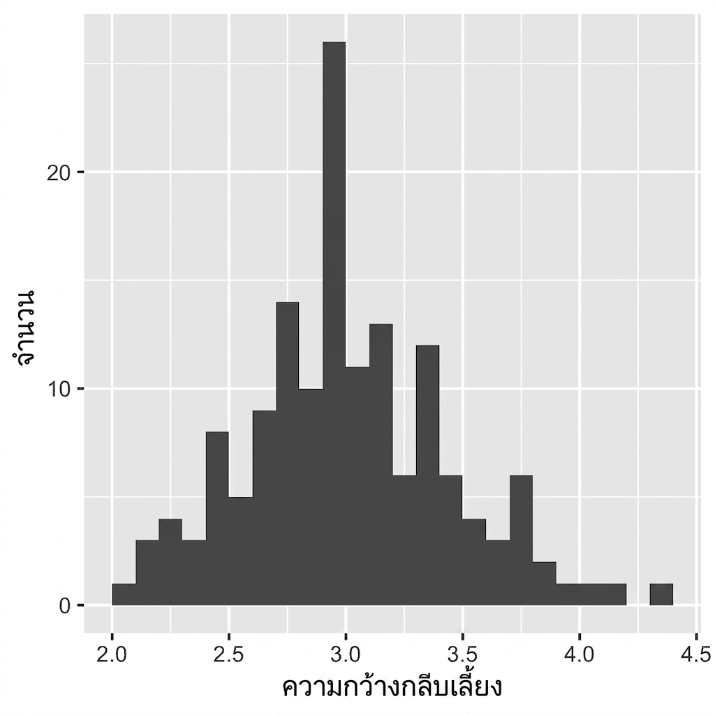
ggplot(iris, aes(x = Sepal.Width)) +
geom_histogram(binwidth = 0.1,
center = 0.05)
ควรกำหนดความกว้าง bin ให้เหมาะสมกับข้อมูลเสมอ
ไม่มีช่องว่างระหว่างแท่ง
ป้ายกำกับแกน X อยู่ระหว่างแท่ง

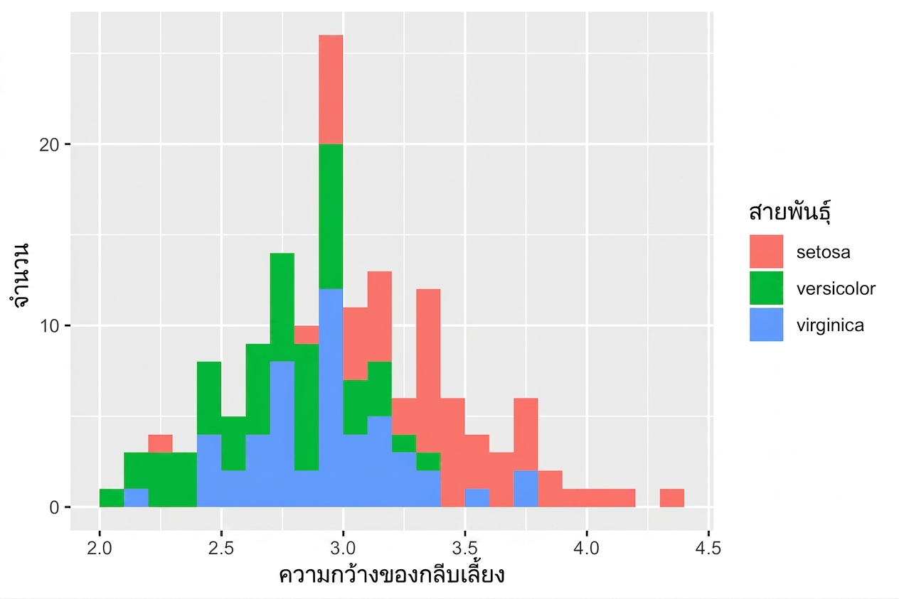
ggplot(iris, aes(x = Sepal.Width,
fill = Species)) +
geom_histogram(binwidth = .1,
center = 0.05)

ggplot(iris, aes(x = Sepal.Width,
fill = Species)) +
geom_histogram(binwidth = .1,
center = 0.05,
position = "stack")

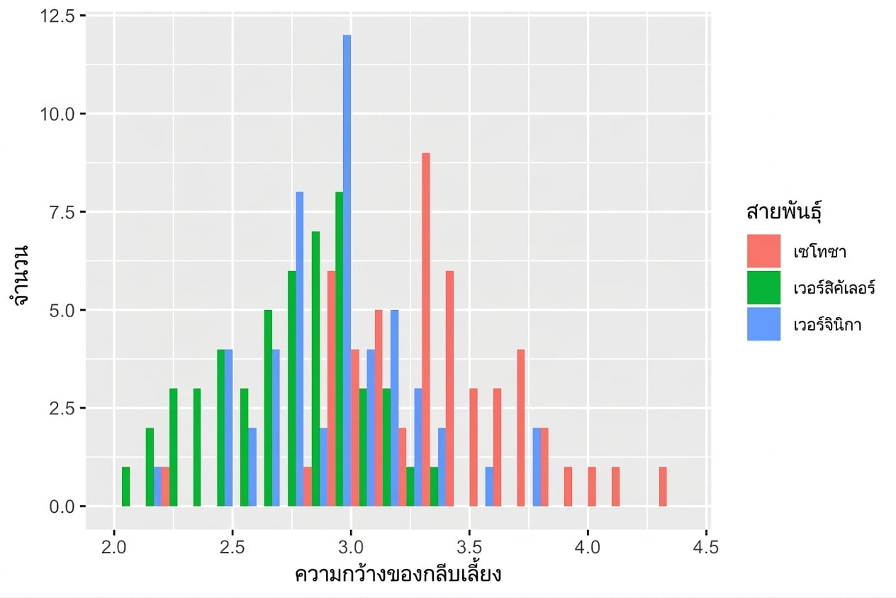
ggplot(iris, aes(x = Sepal.Width,
fill = Species)) +
geom_histogram(binwidth = .1,
center = 0.05,
position = "dodge")

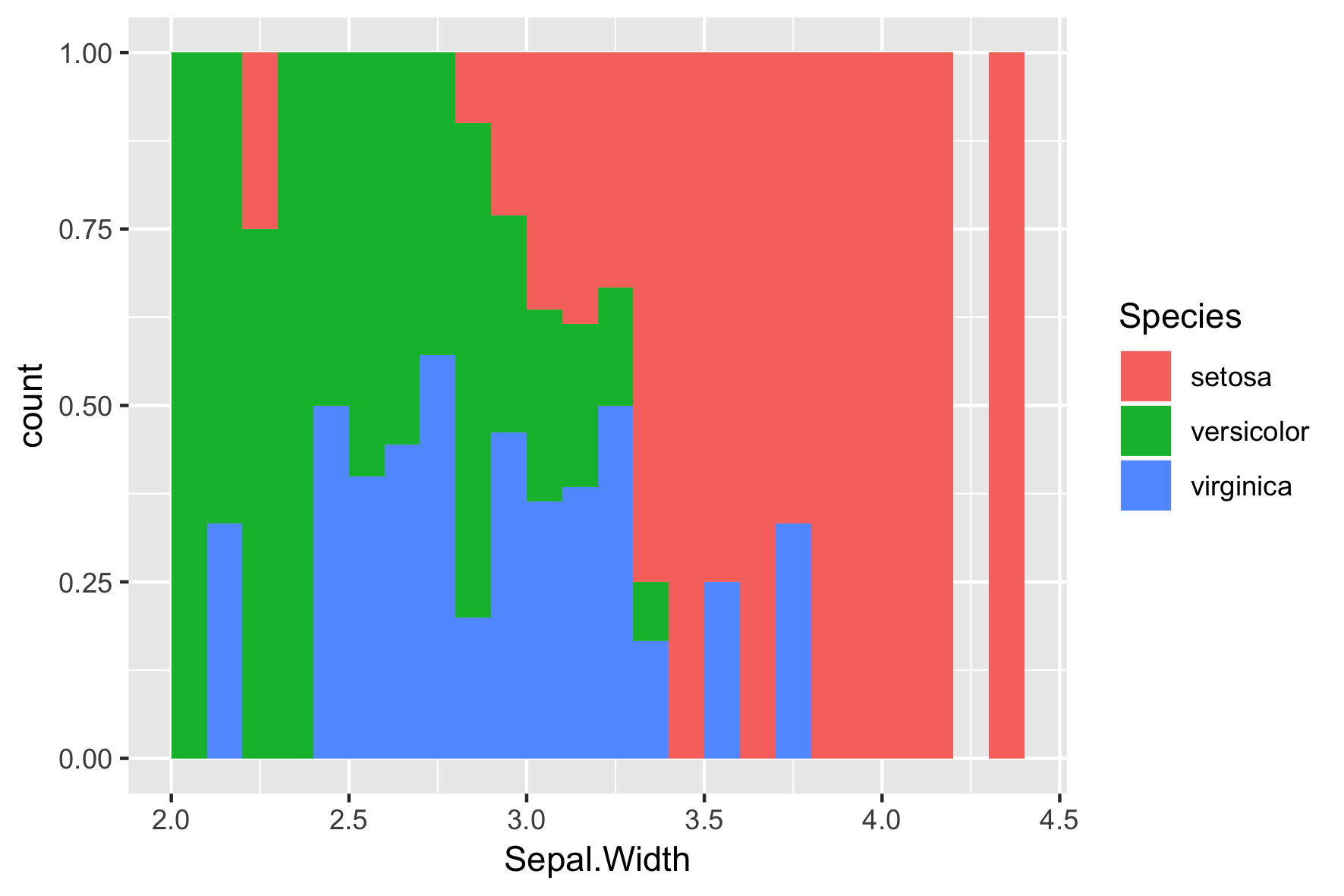
ggplot(iris, aes(x = Sepal.Width,
fill = Species)) +
geom_histogram(binwidth = .1,
center = 0.05,
position = "fill")

การแสดงผลข้อมูลด้วย ggplot2 เบื้องต้น