ความสัมพันธ์และการกระจายของตัวแปรแบบแบ่งกลุ่ม

การวิเคราะห์ข้อมูลเชิงสำรวจด้วย Python

Izzy Weber

Curriculum Manager, DataCamp

ระดับการศึกษา: คู่สมรสชาย

divorce["education_man"].value_counts()
Professional    1313
Preparatory      501
Secondary        288
Primary          100
None               4
Other              3
Name: education_man, dtype: int64
การวิเคราะห์ข้อมูลเชิงสำรวจด้วย Python

สำรวจความสัมพันธ์ของตัวแปรแบบแบ่งกลุ่ม

sns.histplot(data=divorce, x="marriage_duration", binwidth=1)
plt.show()
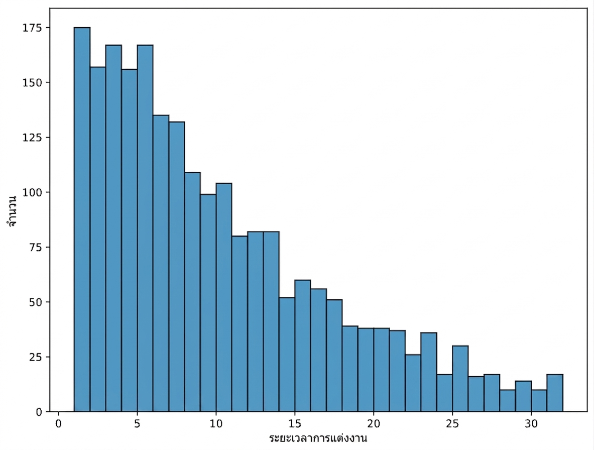
ฮิสโตแกรมของระยะเวลาการสมรส

การวิเคราะห์ข้อมูลเชิงสำรวจด้วย Python

สำรวจความสัมพันธ์ของตัวแปรแบบแบ่งกลุ่ม

sns.histplot(data=divorce, x="marriage_duration", hue="education_man", binwidth=1)
plt.show()
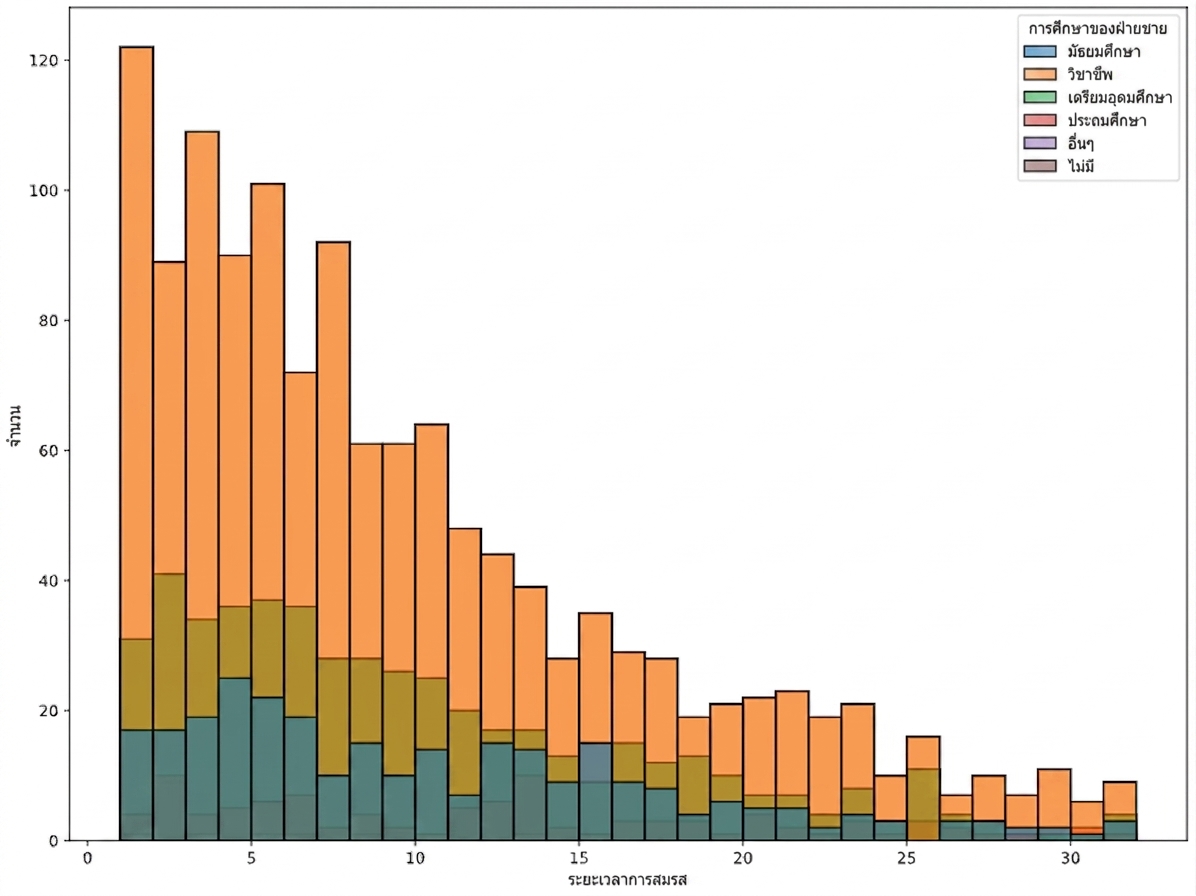
ฮิสโตแกรมของระยะเวลาการสมรสแบ่งสีตาม education_man

การวิเคราะห์ข้อมูลเชิงสำรวจด้วย Python

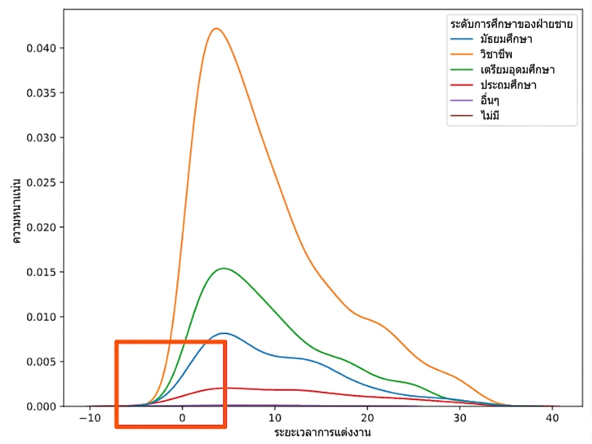
กราฟ Kernel Density Estimate (KDE)

sns.kdeplot(data=divorce, x="marriage_duration", hue="education_man")
plt.show()

กราฟ KDE ของระยะเวลาการสมรสแบ่งสีตาม education_man

การวิเคราะห์ข้อมูลเชิงสำรวจด้วย Python

กราฟ Kernel Density Estimate (KDE)

กราฟ KDE ของระยะเวลาการสมรสแบ่งสีตาม education_man ซูมเข้าที่ marriage_duration เป็นศูนย์

การวิเคราะห์ข้อมูลเชิงสำรวจด้วย Python

กราฟ Kernel Density Estimate (KDE)

sns.kdeplot(data=divorce, x="marriage_duration", hue="education_man", cut=0)
plt.show()
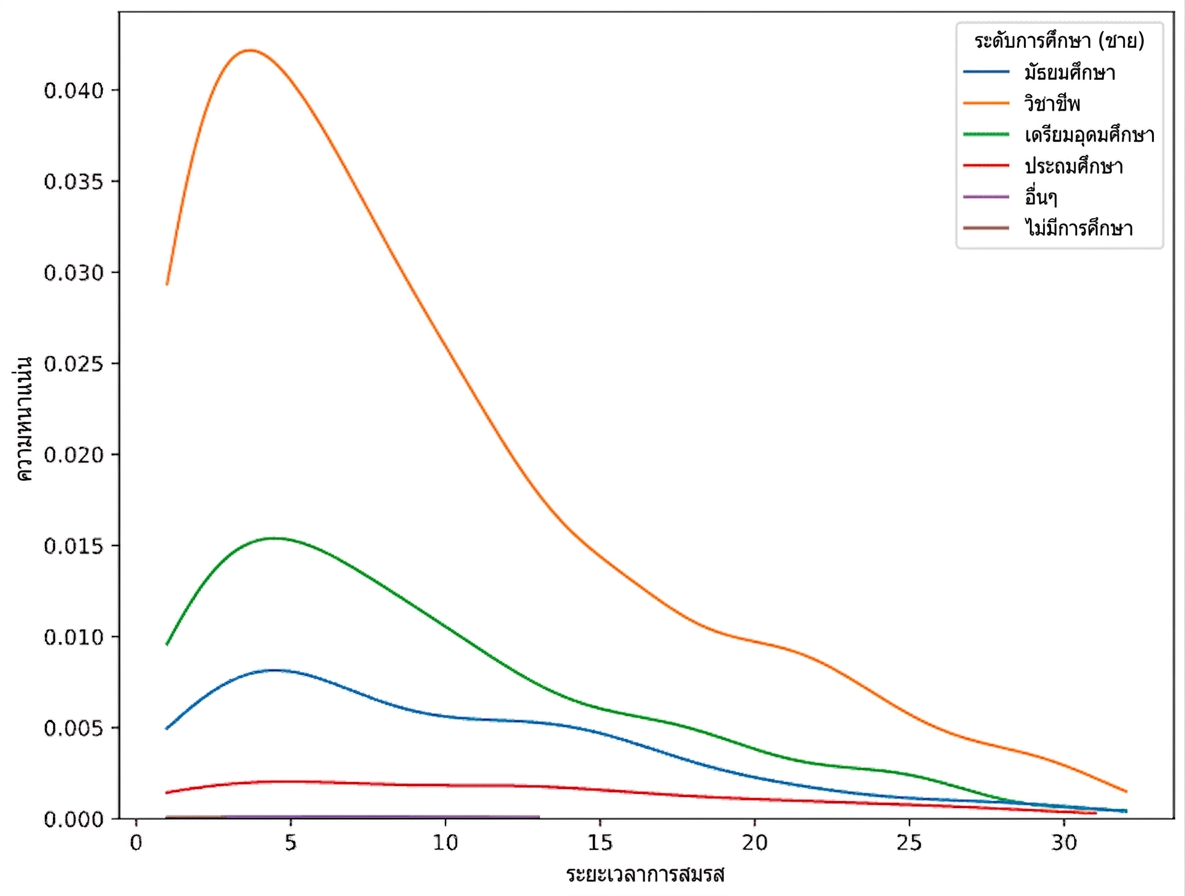
กราฟ KDE ของระยะเวลาการสมรสแบ่งสีตาม education_man และ cut เท่ากับศูนย์

การวิเคราะห์ข้อมูลเชิงสำรวจด้วย Python

กราฟ KDE แบบสะสม

sns.kdeplot(data=divorce, x="marriage_duration", hue="education_man", cut=0, cumulative=True)
plt.show()

ฟังก์ชันการกระจายสะสมของระยะเวลาการสมรสแบ่งสีตาม education_man และ cut เท่ากับศูนย์

การวิเคราะห์ข้อมูลเชิงสำรวจด้วย Python

ความสัมพันธ์ระหว่างอายุเมื่อแต่งงานกับระดับการศึกษา

  • อายุเมื่อแต่งงานมีความสัมพันธ์กับระดับการศึกษาหรือไม่?
divorce["man_age_marriage"] = divorce["marriage_year"] - divorce["dob_man"].dt.year
divorce["woman_age_marriage"] = divorce["marriage_year"] - divorce["dob_woman"].dt.year
การวิเคราะห์ข้อมูลเชิงสำรวจด้วย Python

กราฟกระจายกับตัวแปรแบบแบ่งกลุ่ม

sns.scatterplot(data=divorce, x="woman_age_marriage", y="man_age_marriage")
plt.show()
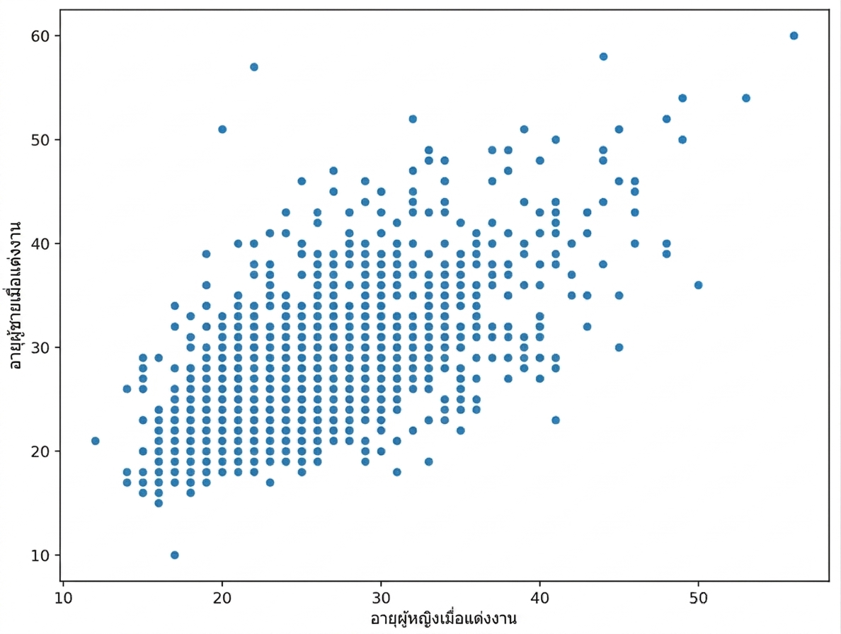
กราฟกระจายของ woman_age_marriage และ man_age_marriage

การวิเคราะห์ข้อมูลเชิงสำรวจด้วย Python

กราฟกระจายกับตัวแปรแบบแบ่งกลุ่ม

sns.scatterplot(data=divorce, 
                x="woman_age_marriage",
                y="man_age_marriage", 
                hue="education_man")
plt.show()

กราฟกระจายของ woman_age_marriage และ man_age_marriage แบ่งสีตาม education_man

การวิเคราะห์ข้อมูลเชิงสำรวจด้วย Python

มาฝึกกันเถอะ!

การวิเคราะห์ข้อมูลเชิงสำรวจด้วย Python

Preparing Video For Download...