Введение в визуализацию данных с ggplot2
Rick Scavetta
Founder, Scavetta Academy
| Тип графика | Возможные геомы |
|---|---|
| Точечные графики | points, jitter, abline, smooth, count |
| Столбчатые графики | histogram, bar, col, errorbar |
| Линейные графики | line, path |
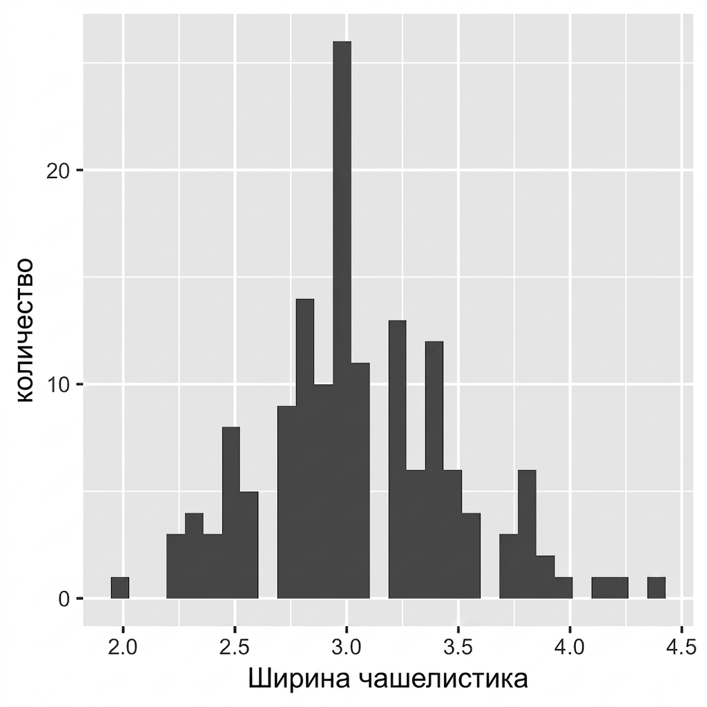
ggplot(iris, aes(x = Sepal.Width)) +
geom_histogram()
`stat_bin()` using `bins = 30`.
Pick better value with `binwidth`.

ggplot(iris, aes(x = Sepal.Width)) +
geom_histogram()
# Default bin width:
diff(range(iris$Sepal.Width))/30
[1] 0.08

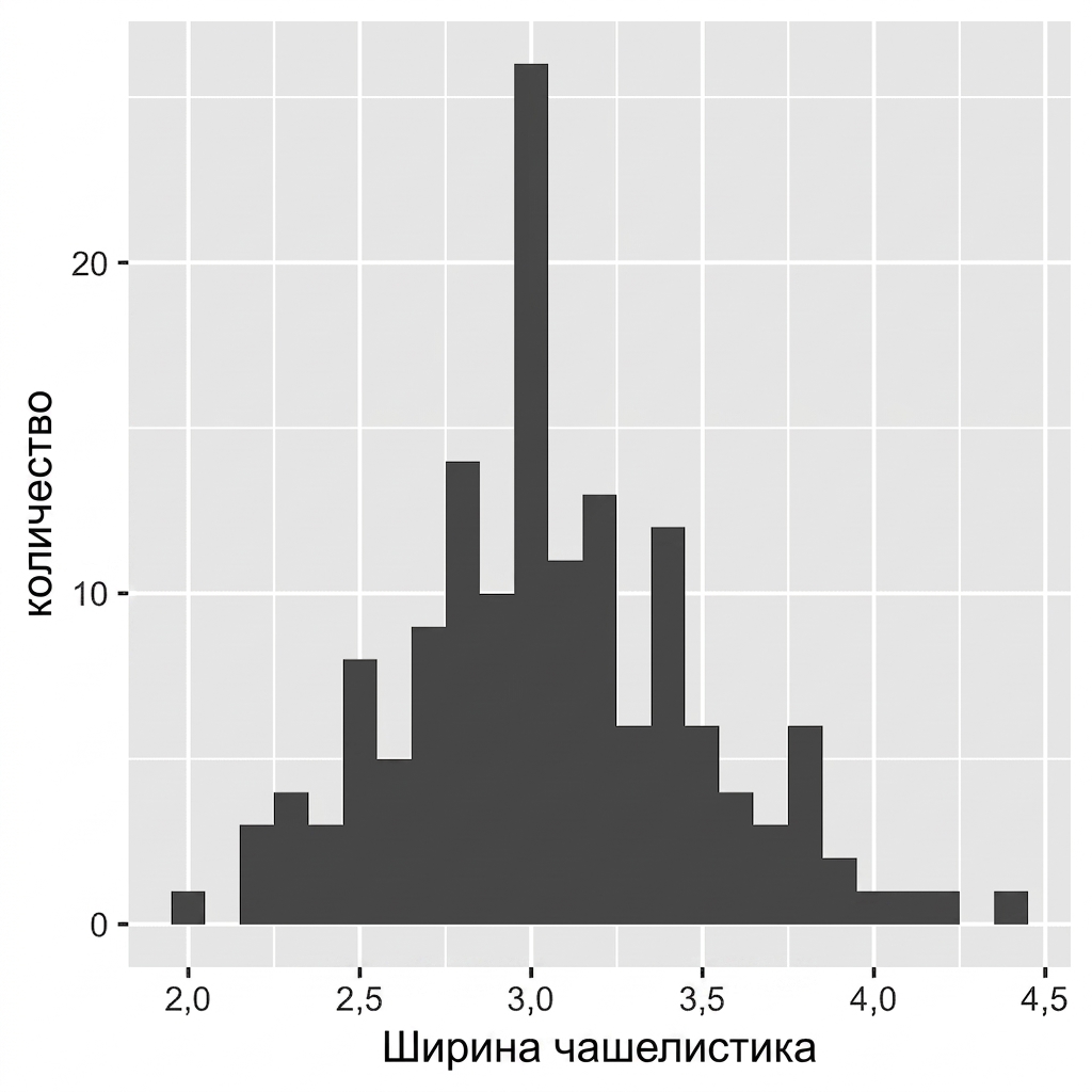
ggplot(iris, aes(x = Sepal.Width)) +
geom_histogram(binwidth = 0.1)
Всегда задавайте осмысленную ширину интервала для ваших данных.
Между столбцами нет пробелов.

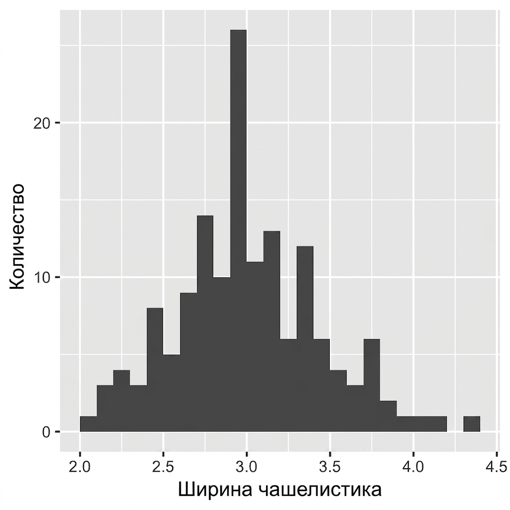
ggplot(iris, aes(x = Sepal.Width)) +
geom_histogram(binwidth = 0.1,
center = 0.05)
Всегда задавайте осмысленную ширину интервала для ваших данных.
Между столбцами нет пробелов.
Метки оси X расположены между столбцами.

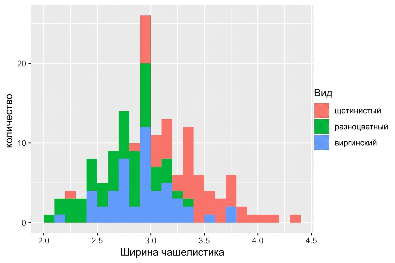
ggplot(iris, aes(x = Sepal.Width,
fill = Species)) +
geom_histogram(binwidth = .1,
center = 0.05)

ggplot(iris, aes(x = Sepal.Width,
fill = Species)) +
geom_histogram(binwidth = .1,
center = 0.05,
position = "stack")

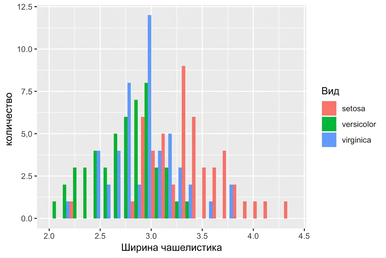
ggplot(iris, aes(x = Sepal.Width,
fill = Species)) +
geom_histogram(binwidth = .1,
center = 0.05,
position = "dodge")

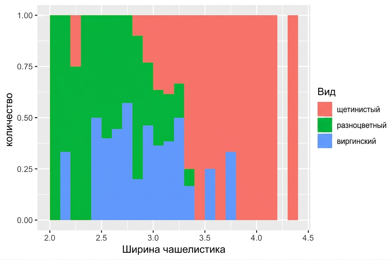
ggplot(iris, aes(x = Sepal.Width,
fill = Species)) +
geom_histogram(binwidth = .1,
center = 0.05,
position = "fill")

Введение в визуализацию данных с ggplot2