ยินดีด้วย
ทำความเข้าใจการแสดงผลข้อมูล

Richie Cotton
Data Evangelist at DataCamp
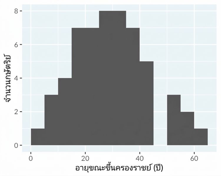
ฮิสโตแกรม: แสดงการกระจายข้อมูล
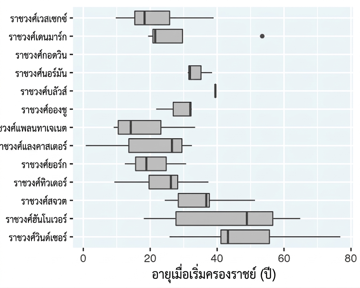
Box plot: แสดงการกระจายข้อมูลหลายชุด
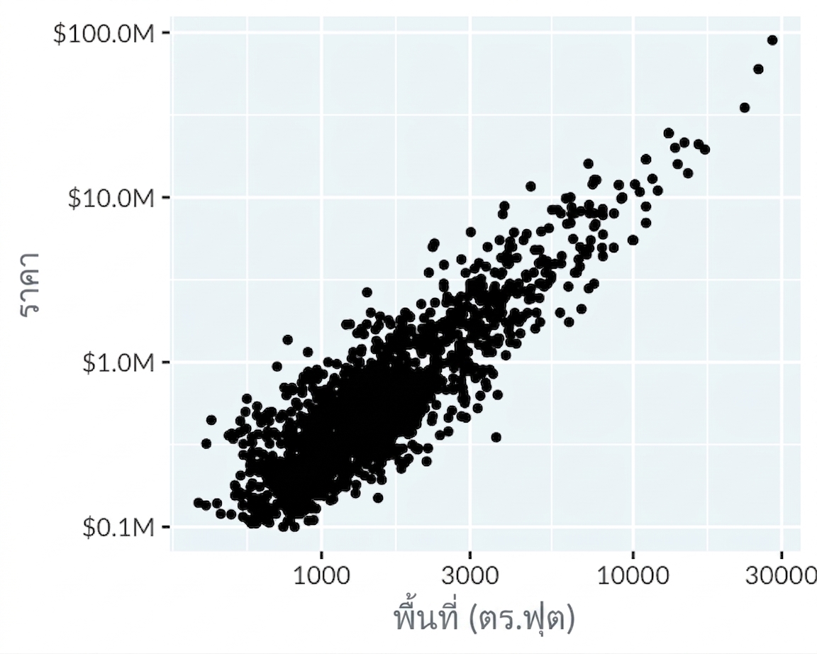
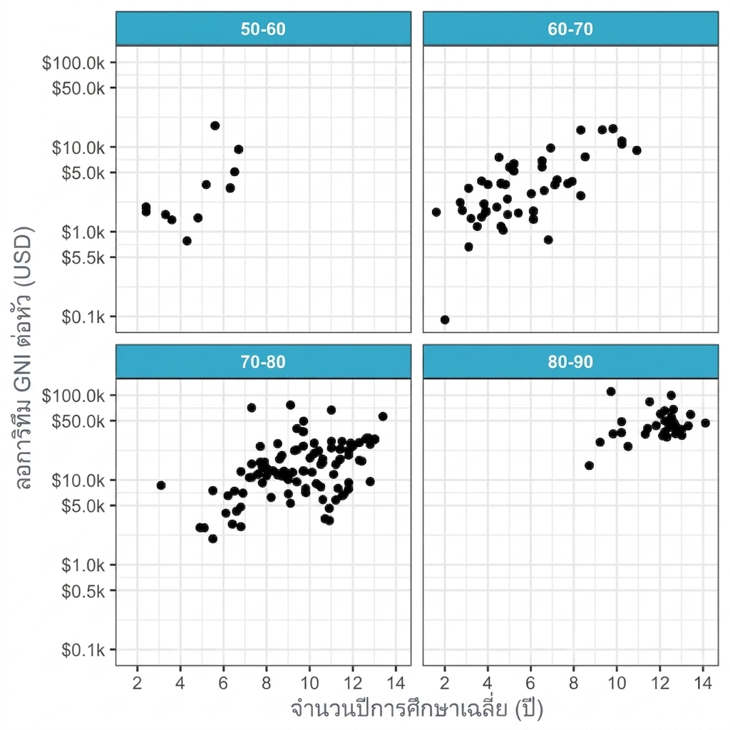
Scatter plot: เปรียบเทียบตัวแปรตัวเลขสองตัว
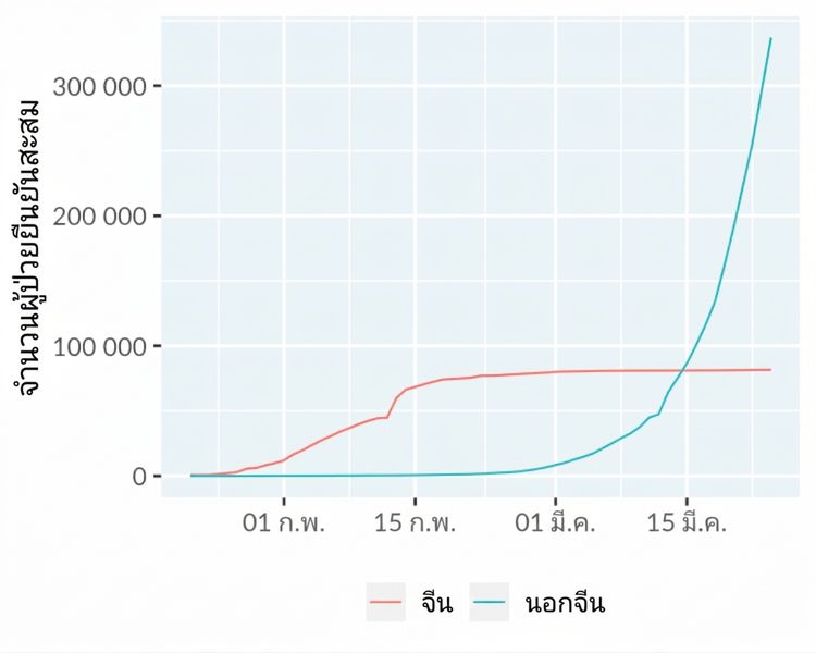
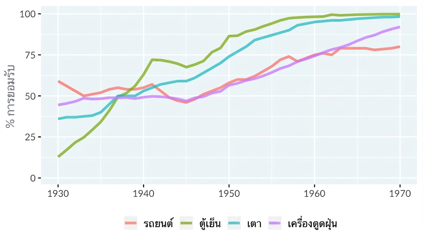
Line plot: แสดงแนวโน้มตามเวลา
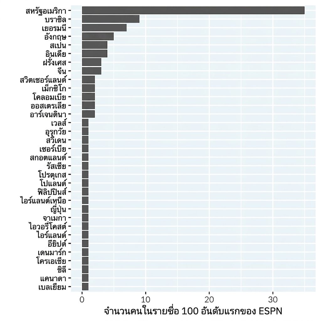
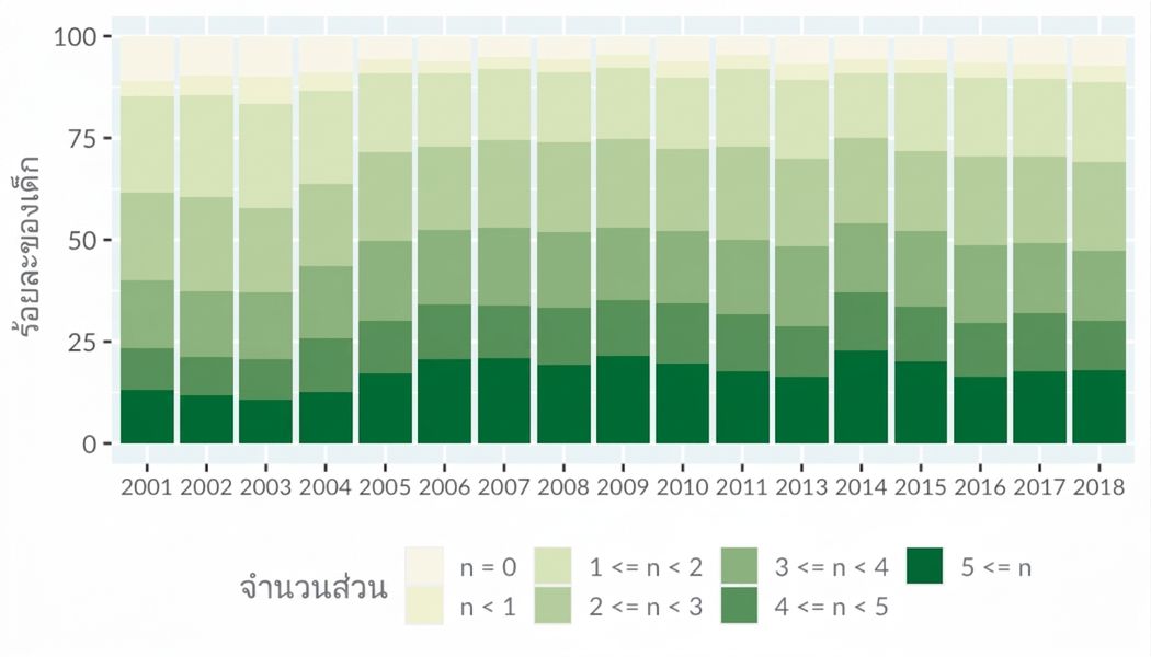
Bar plot: แสดงจำนวนตามหมวดหมู่
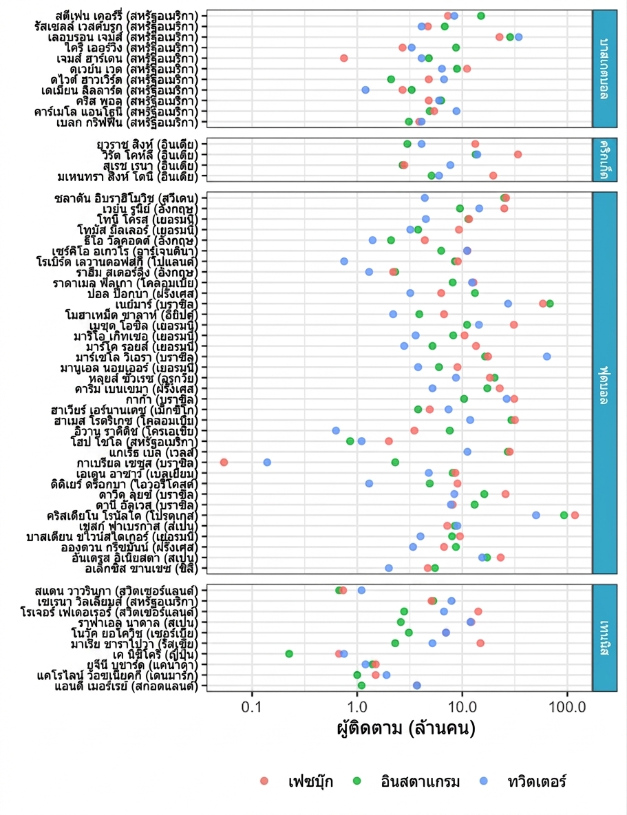
Dot plot: แสดงเมตริกสเกลลอการิทึมตามหมวดหมู่
มิติข้อมูลเพิ่มเติม
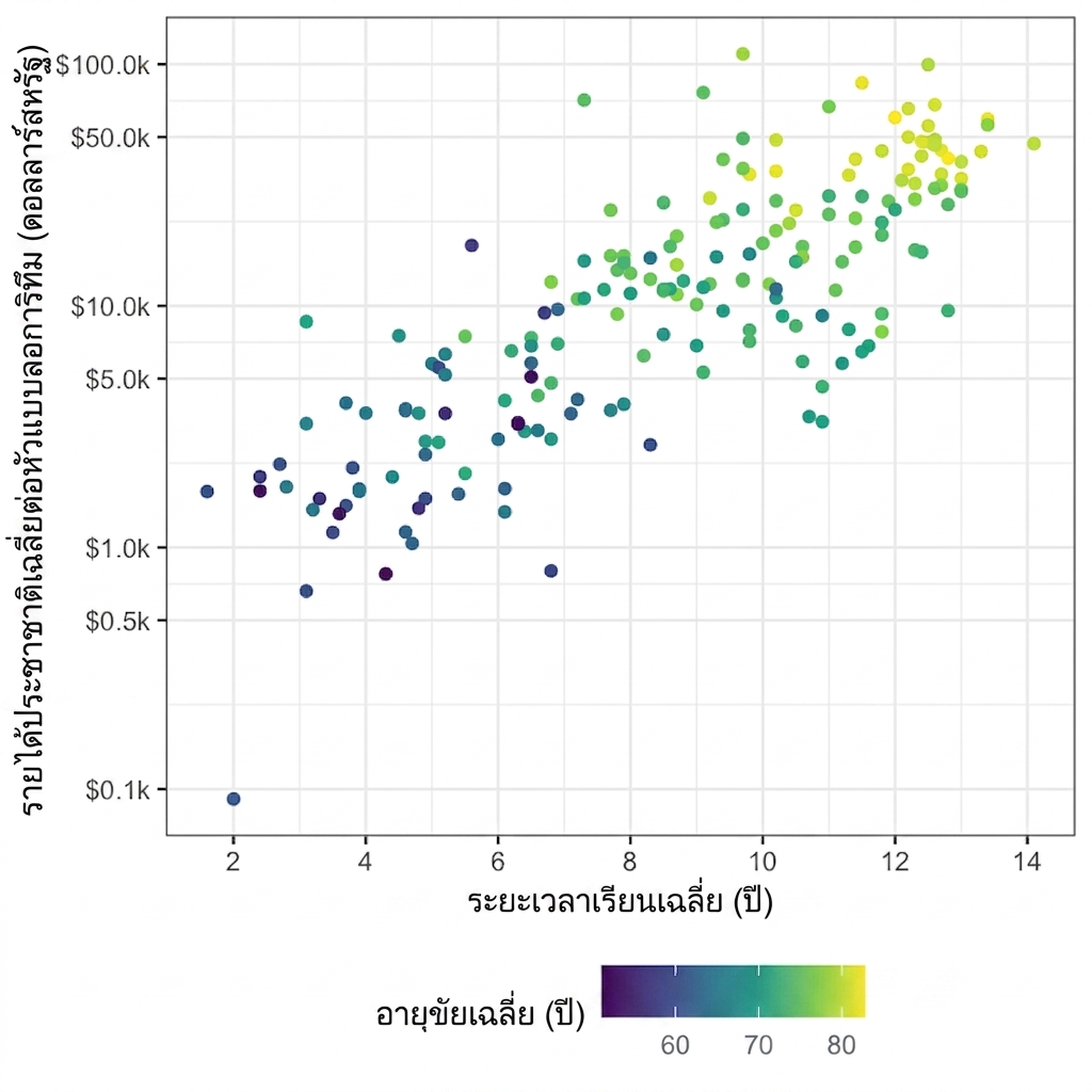
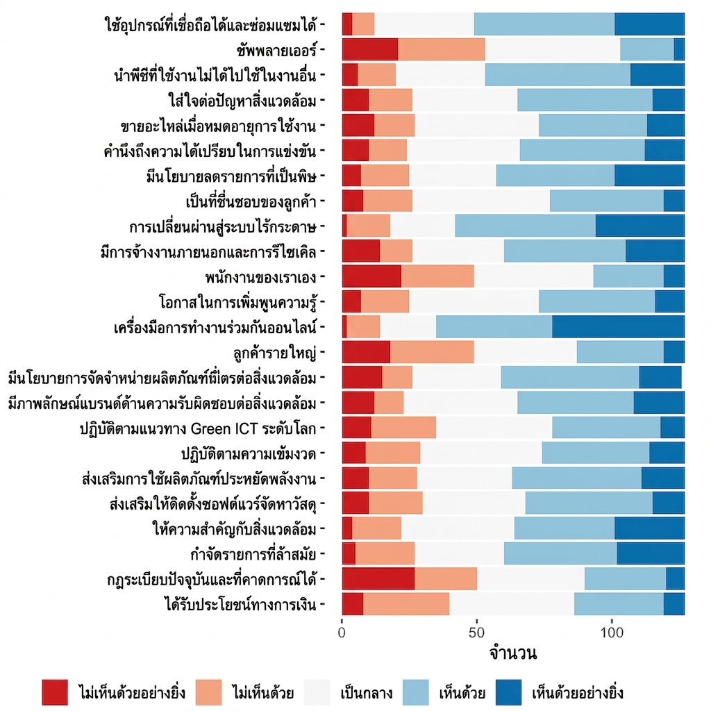
สเกลสี 3 ประเภท
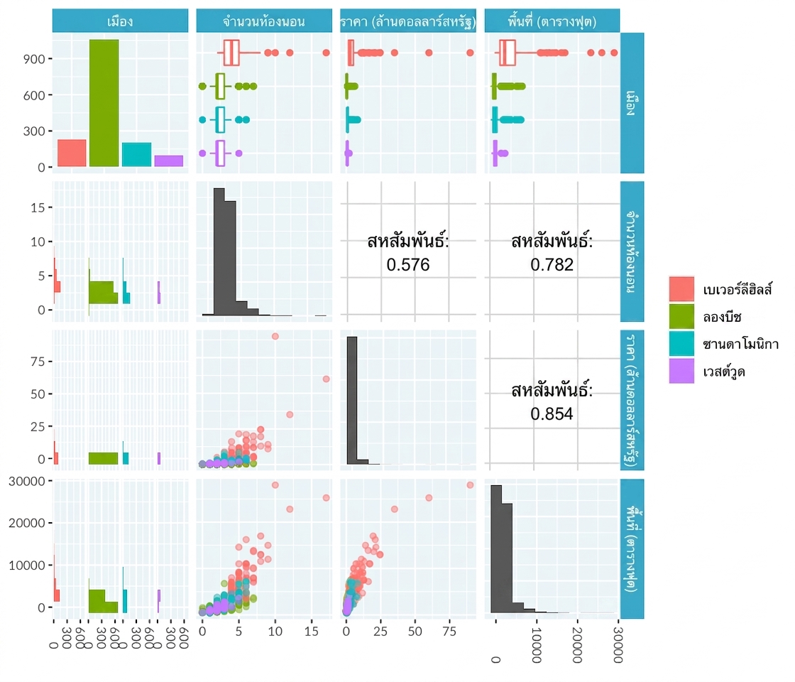
Pair plot: เปรียบเทียบตัวแปรหลายตัว
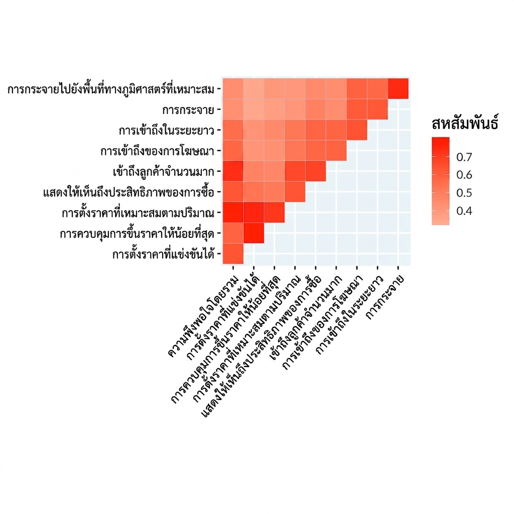
Correlation heatmap: แสดงความสัมพันธ์ระหว่างตัวแปร
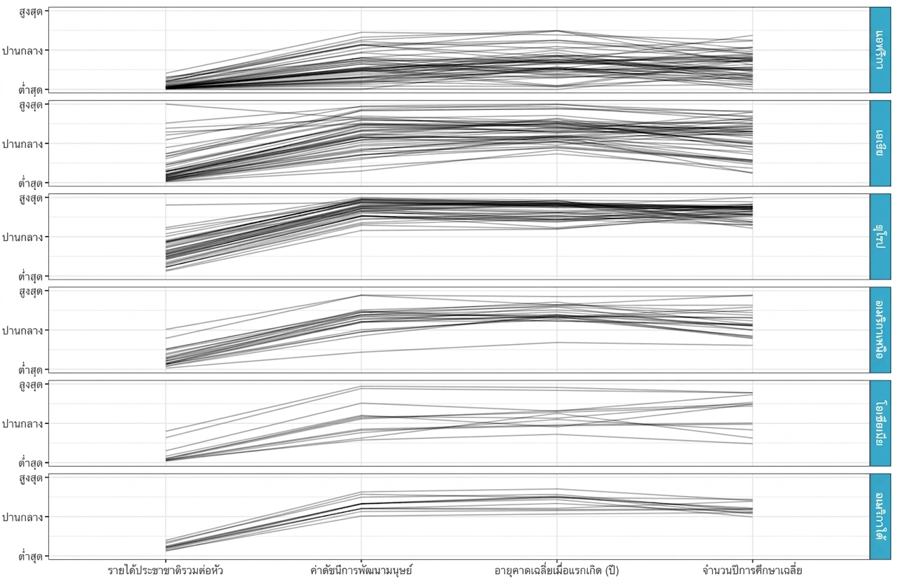
Parallel coordinates plot: ค้นหารูปแบบข้ามตัวแปร
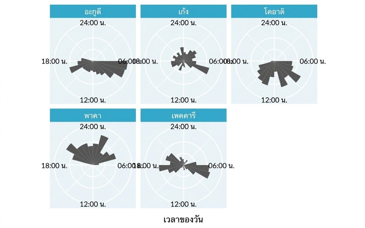
Rose plot: แสดงการกระจายแบบวนซ้ำ
แกนคู่ไม่ใช่ทางเลือกที่ดี


กำจัด chartjunk