Personnaliser les nuages de points
Introduction à la visualisation de données avec Seaborn

Content Team
DataCamp
Sous-groupes par taille de point
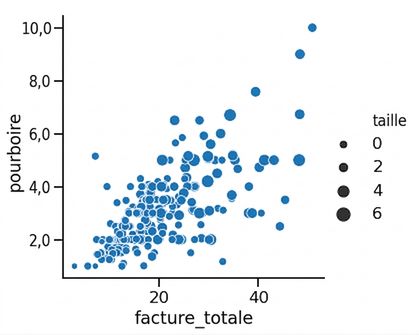
1 Waskom, M. L. (2021). seaborn: statistical data visualization. https://seaborn.pydata.org/
Taille et teinte des points
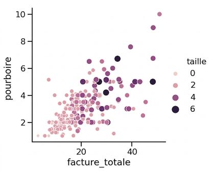
1 Waskom, M. L. (2021). seaborn: statistical data visualization. https://seaborn.pydata.org/
Sous-groupes par style de point
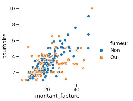
1 Waskom, M. L. (2021). seaborn: statistical data visualization. https://seaborn.pydata.org/
Modifier la transparence des points
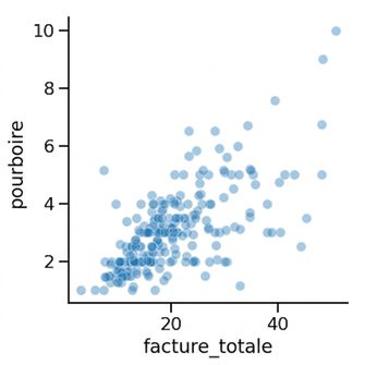
1 Waskom, M. L. (2021). seaborn: statistical data visualization. https://seaborn.pydata.org/

