Introduction à Python pour la finance
Adina Howe
Professor
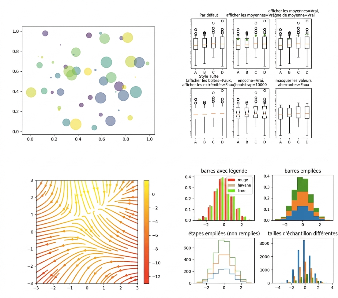
Parcourez plus d'exemples de la galerie Matplotlib en cliquant sur ce lien.
import matplotlib.pyplot as plt
plt.plot()
plt.show()
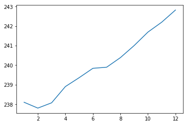
import matplotlib.pyplot as plt
plt.plot(months, prices)
plt.show()

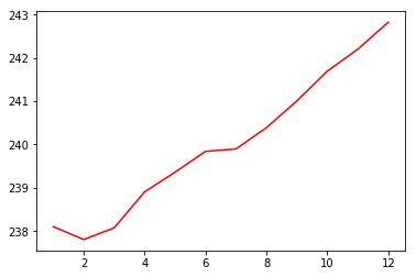
import matplotlib.pyplot as plt
plt.plot(months, prices, color = 'red')
plt.show()

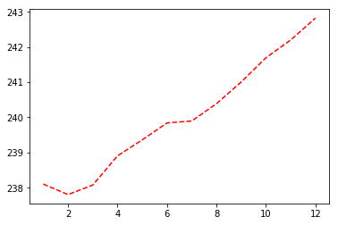
import matplotlib.pyplot as plt
plt.plot(months, prices, color = 'red', linestyle = '--')
plt.show()

| couleur | |
|---|---|
| 'green' | vert |
| 'red' | rouge |
| 'cyan' | cyan |
| 'blue' | bleu |
| style de ligne | |
|---|---|
| '-' | pleine |
| '--' | en tirets |
| '-.' | tirets-point |
| ':' | pointillée |
Plus de détails sur les couleurs et lignes se trouvent ici.
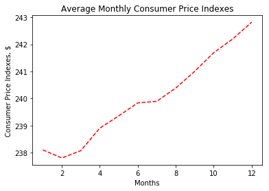
import matplotlib.pyplot as plt
plt.plot(months, prices, color = 'red', linestyle = '--')
# Add labels
plt.xlabel('Months')
plt.ylabel('Consumer Price Indexes, $')
plt.title('Average Monthly Consumer Price Indexes')
# Show plot
plt.show()

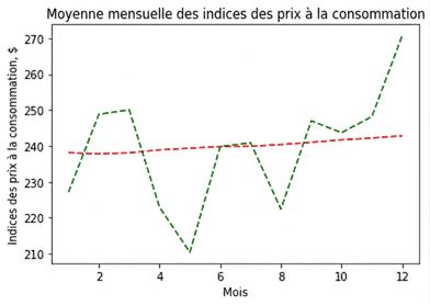
import matplotlib.pyplot as plt
plt.plot(months, prices, color = 'red', linestyle = '--')
# adding an additional line
plt.plot(months, prices_new, color = 'green', linestyle = '--')
plt.xlabel('Months')
plt.ylabel('Consumer Price Indexes, $')
plt.title('Average Monthly Consumer Price Indexes')
plt.show()

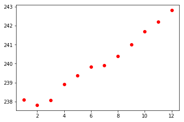
import matplotlib.pyplot as plt
plt.scatter(x = months, y = prices, color = 'red')
plt.show()

Introduction à Python pour la finance