अपनी प्लॉट्स को कस्टमाइज़ करें
Matplotlib के साथ डेटा विज़ुअलाइज़ेशन परिचय

Ariel Rokem
Data Scientist
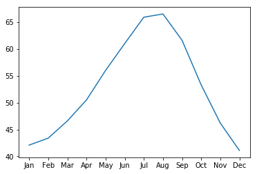
डेटा की रूप-रेखा कस्टमाइज़ करना
ax.plot(seattle_weather["MONTH"],
        seattle_weather["MLY-PRCP-NORMAL"])
plt.show()
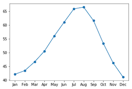
मार्कर जोड़ना
ax.plot(seattle_weather["MONTH"],
        seattle_weather["MLY-PRCP-NORMAL"],
        marker="o")
plt.show()
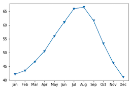
मार्कर चुनना
ax.plot(seattle_weather["MONTH"],
        seattle_weather["MLY-PRCP-NORMAL"],
        marker="v")
plt.show()
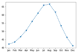
Linestyle सेट करना
fig, ax = plt.subplots()
ax.plot(seattle_weather["MONTH"],
        seattle_weather["MLY-TAVG-NORMAL"],
        marker="v", linestyle="--")
plt.show()

Linestyle से लाइनों को हटाना
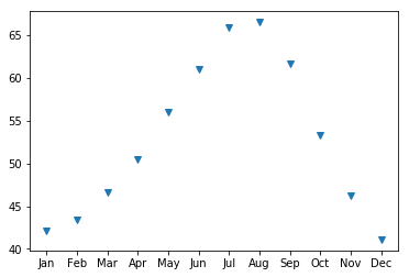
fig, ax = plt.subplots()
ax.plot(seattle_weather["MONTH"],
        seattle_weather["MLY-TAVG-NORMAL"],
        marker="v", linestyle="None")
plt.show()
रंग चुनना
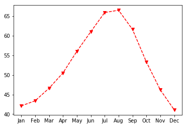
fig, ax = plt.subplots()
ax.plot(seattle_weather["MONTH"],
        seattle_weather["MLY-TAVG-NORMAL"],
        marker="v", linestyle="--", color="r")
plt.show()
अक्ष लेबल कस्टमाइज़ करना
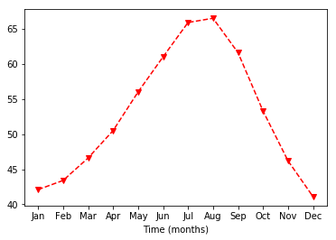
ax.set_xlabel("Time (months)")
plt.show()
Y-अक्ष लेबल सेट करना
ax.set_xlabel("Time (months)")
ax.set_ylabel("Average temperature (Fahrenheit degrees)")
plt.show()

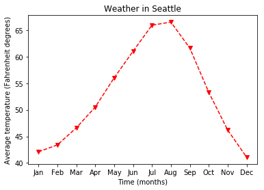
शीर्षक जोड़ना
ax.set_title("Weather in Seattle")
plt.show()