मात्रात्मक तुलना: स्कैटर प्लॉट्स

Matplotlib के साथ डेटा विज़ुअलाइज़ेशन परिचय

Ariel Rokem

Data Scientist

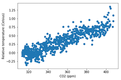
स्कैटर प्लॉट्स का परिचय

fig, ax = plt.subplots()

ax.scatter(climate_change["co2"], climate_change["relative_temp"])
ax.set_xlabel("CO2 (ppm)") ax.set_ylabel("Relative temperature (Celsius)") plt.show()
Matplotlib के साथ डेटा विज़ुअलाइज़ेशन परिचय

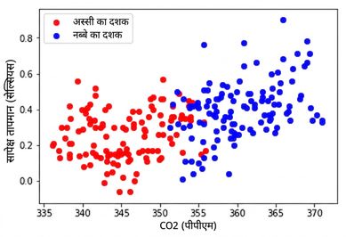
स्कैटर प्लॉट्स को कस्टमाइज़ करना

eighties = climate_change["1980-01-01":"1989-12-31"]
nineties = climate_change["1990-01-01":"1999-12-31"]

fig, ax = plt.subplots()
ax.scatter(eighties["co2"], eighties["relative_temp"], color="red", label="eighties")
ax.scatter(nineties["co2"], nineties["relative_temp"], color="blue", label="nineties")
ax.legend() ax.set_xlabel("CO2 (ppm)") ax.set_ylabel("Relative temperature (Celsius)") plt.show()
Matplotlib के साथ डेटा विज़ुअलाइज़ेशन परिचय

रंग से तुलना एन्कोड करना

Matplotlib के साथ डेटा विज़ुअलाइज़ेशन परिचय

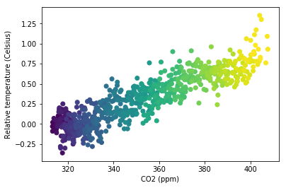
तीसरा वैरिएबल रंग से एन्कोड करना

fig, ax = plt.subplots()

ax.scatter(climate_change["co2"], climate_change["relative_temp"], c=climate_change.index)
ax.set_xlabel("CO2 (ppm)") ax.set_ylabel("Relative temperature (Celsius)") plt.show()
Matplotlib के साथ डेटा विज़ुअलाइज़ेशन परिचय

रंग में समय एन्कोड करना

Matplotlib के साथ डेटा विज़ुअलाइज़ेशन परिचय

अपने स्कैटर प्लॉट्स बनाकर अभ्यास करें!

Matplotlib के साथ डेटा विज़ुअलाइज़ेशन परिचय

Preparing Video For Download...