Kvantitativa jämförelser: punktdiagram

Introduktion till datavisualisering med Matplotlib

Ariel Rokem

Data Scientist

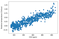
Introduktion till punktdiagram

fig, ax = plt.subplots()

ax.scatter(climate_change["co2"], climate_change["relative_temp"])
ax.set_xlabel("CO2 (ppm)") ax.set_ylabel("Relative temperature (Celsius)") plt.show()
Introduktion till datavisualisering med Matplotlib

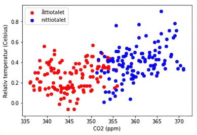
Anpassa punktdiagram

eighties = climate_change["1980-01-01":"1989-12-31"]
nineties = climate_change["1990-01-01":"1999-12-31"]

fig, ax = plt.subplots()
ax.scatter(eighties["co2"], eighties["relative_temp"], color="red", label="eighties")
ax.scatter(nineties["co2"], nineties["relative_temp"], color="blue", label="nineties")
ax.legend() ax.set_xlabel("CO2 (ppm)") ax.set_ylabel("Relative temperature (Celsius)") plt.show()
Introduktion till datavisualisering med Matplotlib

Koda jämförelser med färg

Introduktion till datavisualisering med Matplotlib

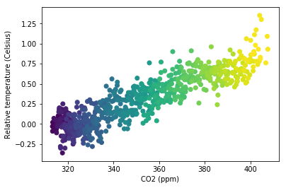
Koda en tredje variabel med färg

fig, ax = plt.subplots()

ax.scatter(climate_change["co2"], climate_change["relative_temp"], c=climate_change.index)
ax.set_xlabel("CO2 (ppm)") ax.set_ylabel("Relative temperature (Celsius)") plt.show()
Introduktion till datavisualisering med Matplotlib

Koda tid med färg

Introduktion till datavisualisering med Matplotlib

Nu kör vi en övning!

Introduktion till datavisualisering med Matplotlib

Preparing Video For Download...