Настройка графиков
Введение в визуализацию данных с Matplotlib

Ariel Rokem
Data Scientist
Настройка внешнего вида данных
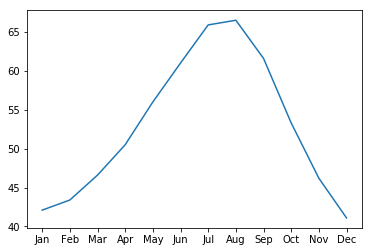
ax.plot(seattle_weather["MONTH"],
        seattle_weather["MLY-PRCP-NORMAL"])
plt.show()
Добавление маркеров
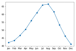
ax.plot(seattle_weather["MONTH"],
        seattle_weather["MLY-PRCP-NORMAL"],
        marker="o")
plt.show()
Выбор маркеров
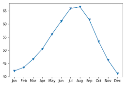
ax.plot(seattle_weather["MONTH"],
        seattle_weather["MLY-PRCP-NORMAL"],
        marker="v")
plt.show()
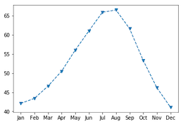
Настройка стиля линии
fig, ax = plt.subplots()
ax.plot(seattle_weather["MONTH"],
        seattle_weather["MLY-TAVG-NORMAL"],
        marker="v", linestyle="--")
plt.show()

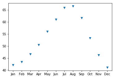
Удаление линий с помощью linestyle
fig, ax = plt.subplots()
ax.plot(seattle_weather["MONTH"],
        seattle_weather["MLY-TAVG-NORMAL"],
        marker="v", linestyle="None")
plt.show()
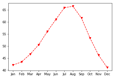
Выбор цвета
fig, ax = plt.subplots()
ax.plot(seattle_weather["MONTH"],
        seattle_weather["MLY-TAVG-NORMAL"],
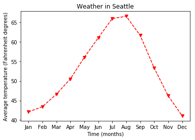
        marker="v", linestyle="--", color="r")
plt.show()
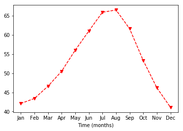
Настройка подписей осей
ax.set_xlabel("Time (months)")
plt.show()
Подпись оси Y
ax.set_xlabel("Time (months)")
ax.set_ylabel("Average temperature (Fahrenheit degrees)")
plt.show()

Добавление заголовка
ax.set_title("Weather in Seattle")
plt.show()