Point plots

การสร้างภาพข้อมูลด้วย Seaborn เบื้องต้น

Content Team

DataCamp

Point plots คืออะไร?
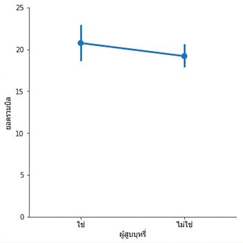
  • จุดแสดงค่าเฉลี่ยของตัวแปรเชิงปริมาณ
  • เส้นแนวตั้งแสดงช่วงความเชื่อมั่น 95%

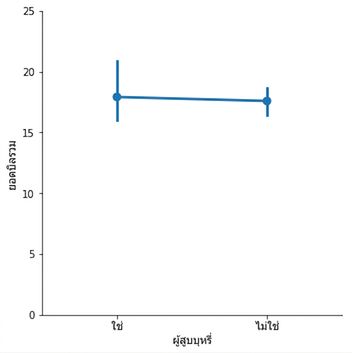
Point plot แสดงค่าเฉลี่ยบิลของผู้สูบบุหรี่และไม่สูบบุหรี่

1 Waskom, M. L. (2021). seaborn: statistical data visualization. https://seaborn.pydata.org/
การสร้างภาพข้อมูลด้วย Seaborn เบื้องต้น

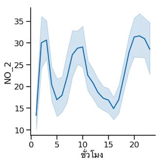
Line plot: ระดับเฉลี่ยของไนโตรเจนไดออกไซด์ตามช่วงเวลา Line plot แสดงไนโตรเจนไดออกไซด์ตามช่วงเวลา
Point plot: ค่าเฉลี่ยบิลร้านอาหาร เปรียบเทียบผู้สูบและไม่สูบบุหรี่ Point plot แสดงค่าเฉลี่ยบิลของผู้สูบบุหรี่และไม่สูบบุหรี่

1 Waskom, M. L. (2021). seaborn: statistical data visualization. https://seaborn.pydata.org/
การสร้างภาพข้อมูลด้วย Seaborn เบื้องต้น

Point plots vs. line plots

ทั้งคู่แสดง:

  • ค่าเฉลี่ยของตัวแปรเชิงปริมาณ
  • ช่วงความเชื่อมั่น 95% ของค่าเฉลี่ย

ความแตกต่าง:

  • Line plot ใช้ตัวแปรเชิงปริมาณ (มักเป็นเวลา) บนแกน x
  • Point plot ใช้ตัวแปรเชิงหมวดหมู่ บนแกน x
การสร้างภาพข้อมูลด้วย Seaborn เบื้องต้น

Point plots vs. bar plots

ทั้งคู่แสดง:

  • ค่าเฉลี่ยของตัวแปรเชิงปริมาณ
  • ช่วงความเชื่อมั่น 95% ของค่าเฉลี่ย
การสร้างภาพข้อมูลด้วย Seaborn เบื้องต้น

Point plots vs. bar plots

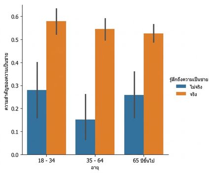
Bar plot แสดงความเป็นชายพร้อม hue

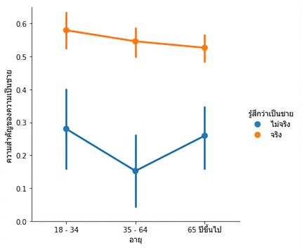
Point plot แสดงความเป็นชายพร้อม hue

การสร้างภาพข้อมูลด้วย Seaborn เบื้องต้น

การสร้าง point plot

import matplotlib.pyplot as plt
import seaborn as sns

sns.catplot(x="age", 
            y="masculinity_important", 
            data=masculinity_data,
            hue="feel_masculine",
            kind="point")

plt.show()

Point plot แสดงความเป็นชายพร้อม hue

การสร้างภาพข้อมูลด้วย Seaborn เบื้องต้น

การแยกจุดออกจากกัน

import matplotlib.pyplot as plt
import seaborn as sns

sns.catplot(x="age", 
            y="masculinity_important", 
            data=masculinity_data,
            hue="feel_masculine",
            kind="point",
            linestyle="none")

plt.show()

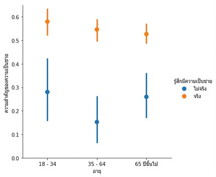
Point plot แสดงความเป็นชายพร้อม hue โดยจุดไม่เชื่อมกัน

การสร้างภาพข้อมูลด้วย Seaborn เบื้องต้น

การแสดงค่ามัธยฐาน

import matplotlib.pyplot as plt
import seaborn as sns

sns.catplot(x="smoker", 
            y="total_bill", 
            data=tips, 
            kind="point")

plt.show()

Point plot แสดงค่าเฉลี่ยบิลรวมของผู้สูบและไม่สูบบุหรี่

1 Waskom, M. L. (2021). seaborn: statistical data visualization. https://seaborn.pydata.org/
การสร้างภาพข้อมูลด้วย Seaborn เบื้องต้น

การแสดงค่ามัธยฐาน

import matplotlib.pyplot as plt
import seaborn as sns
from numpy import median

sns.catplot(x="smoker", 
            y="total_bill", 
            data=tips, 
            kind="point", 
            estimator=median)

plt.show()

Point plot แสดงค่ามัธยฐานบิลรวมของผู้สูบและไม่สูบบุหรี่

1 Waskom, M. L. (2021). seaborn: statistical data visualization. https://seaborn.pydata.org/
การสร้างภาพข้อมูลด้วย Seaborn เบื้องต้น

การปรับแต่งช่วงความเชื่อมั่น

import matplotlib.pyplot as plt
import seaborn as sns

sns.catplot(x="smoker", 
            y="total_bill", 
            data=tips, 
            kind="point",
            capsize=0.2)

plt.show()

Point plot ที่มีหัวลูกศรที่ช่วงความเชื่อมั่น

1 Waskom, M. L. (2021). seaborn: statistical data visualization. https://seaborn.pydata.org/
การสร้างภาพข้อมูลด้วย Seaborn เบื้องต้น

การปิดช่วงความเชื่อมั่น

import matplotlib.pyplot as plt
import seaborn as sns

sns.catplot(x="smoker", 
            y="total_bill", 
            data=tips, 
            kind="point",
            errorbar=None)

plt.show()

Point plot ที่ไม่มีช่วงความเชื่อมั่น

1 Waskom, M. L. (2021). seaborn: statistical data visualization. https://seaborn.pydata.org/
การสร้างภาพข้อมูลด้วย Seaborn เบื้องต้น

มาฝึกกันเถอะ!

การสร้างภาพข้อมูลด้วย Seaborn เบื้องต้น

Preparing Video For Download...