การปรับแต่ง scatter plot
การสร้างภาพข้อมูลด้วย Seaborn เบื้องต้น

Content Team
DataCamp
กลุ่มย่อยด้วยขนาดจุด

1 Waskom, M. L. (2021). seaborn: statistical data visualization. https://seaborn.pydata.org/
ขนาดจุดและ hue
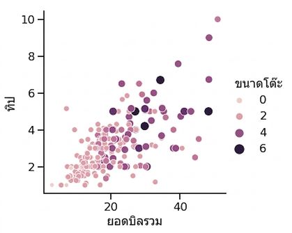
1 Waskom, M. L. (2021). seaborn: statistical data visualization. https://seaborn.pydata.org/
กลุ่มย่อยด้วยรูปแบบจุด

1 Waskom, M. L. (2021). seaborn: statistical data visualization. https://seaborn.pydata.org/
การปรับความโปร่งใสของจุด
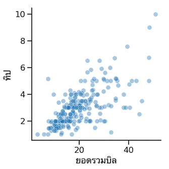
1 Waskom, M. L. (2021). seaborn: statistical data visualization. https://seaborn.pydata.org/

