การเปลี่ยนสไตล์และสีของกราฟ

การสร้างภาพข้อมูลด้วย Seaborn เบื้องต้น

Content Team

DataCamp

ทำไมต้องปรับแต่ง?

เหตุผลในการเปลี่ยนสไตล์:

  • ความชอบส่วนตัว
  • เพิ่มความอ่านง่าย
  • ช่วยในการตีความ
การสร้างภาพข้อมูลด้วย Seaborn เบื้องต้น

การเปลี่ยนสไตล์ Figure

  • "style" ของ Figure ครอบคลุมพื้นหลังและแกน
  • ตัวเลือกสำเร็จรูป: "white", "dark", "whitegrid", "darkgrid", "ticks"
  • sns.set_style()
การสร้างภาพข้อมูลด้วย Seaborn เบื้องต้น

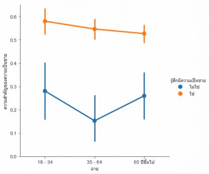
สไตล์ Figure เริ่มต้น ("white")

sns.catplot(x="age", 
            y="masculinity_important",
            data=masculinity_data,
            hue="feel_masculine",
            kind="point")

plt.show()

Point plot ของแบบสำรวจความเป็นชาย

การสร้างภาพข้อมูลด้วย Seaborn เบื้องต้น

สไตล์ Figure: "whitegrid"

sns.set_style("whitegrid")

sns.catplot(x="age", 
            y="masculinity_important",
            data=masculinity_data,
            hue="feel_masculine",
            kind="point")

plt.show()

Point plot พร้อมพื้นหลัง whitegrid

การสร้างภาพข้อมูลด้วย Seaborn เบื้องต้น

สไตล์อื่น ๆ

sns.set_style("ticks")

sns.catplot(x="age", 
            y="masculinity_important",
            data=masculinity_data,
            hue="feel_masculine",
            kind="point")

plt.show()

Point plot พร้อม ticks

การสร้างภาพข้อมูลด้วย Seaborn เบื้องต้น

สไตล์อื่น ๆ

sns.set_style("dark")

sns.catplot(x="age", 
            y="masculinity_important",
            data=masculinity_data,
            hue="feel_masculine",
            kind="point")

plt.show()

Point plot พร้อมพื้นหลังสีเข้ม

การสร้างภาพข้อมูลด้วย Seaborn เบื้องต้น

สไตล์อื่น ๆ

sns.set_style("darkgrid")

sns.catplot(x="age", 
            y="masculinity_important",
            data=masculinity_data,
            hue="feel_masculine",
            kind="point")

plt.show()

Point plot พร้อมพื้นหลัง darkgrid

การสร้างภาพข้อมูลด้วย Seaborn เบื้องต้น

การเปลี่ยน palette

  • "palette" ของ Figure เปลี่ยนสีขององค์ประกอบหลักในกราฟ
  • sns.set_palette()
  • ใช้ palette สำเร็จรูปหรือสร้าง palette เองได้
การสร้างภาพข้อมูลด้วย Seaborn เบื้องต้น

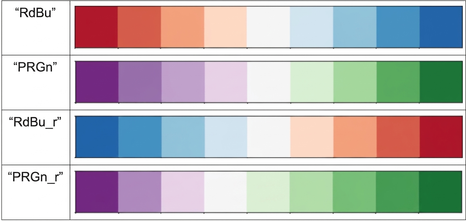
Diverging palettes

ตัวอย่าง diverging palette 4 แบบ

การสร้างภาพข้อมูลด้วย Seaborn เบื้องต้น

ตัวอย่าง (palette เริ่มต้น)

category_order = ["No answer", 
                  "Not at all",
                  "Not very", 
                  "Somewhat", 
                  "Very"]

sns.catplot(x="how_masculine",
            data=masculinity_data,
            kind="count",
            order=category_order)

plt.show()

Count plot ของคำตอบแบบสำรวจ

การสร้างภาพข้อมูลด้วย Seaborn เบื้องต้น

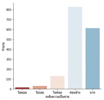
ตัวอย่าง (diverging palette)

sns.set_palette("RdBu")

category_order = ["No answer", 
                  "Not at all",
                  "Not very", 
                  "Somewhat", 
                  "Very"]

sns.catplot(x="how_masculine",
            data=masculinity_data,
            kind="count",
            order=category_order)

plt.show()

Count plot พร้อม diverging palette

การสร้างภาพข้อมูลด้วย Seaborn เบื้องต้น

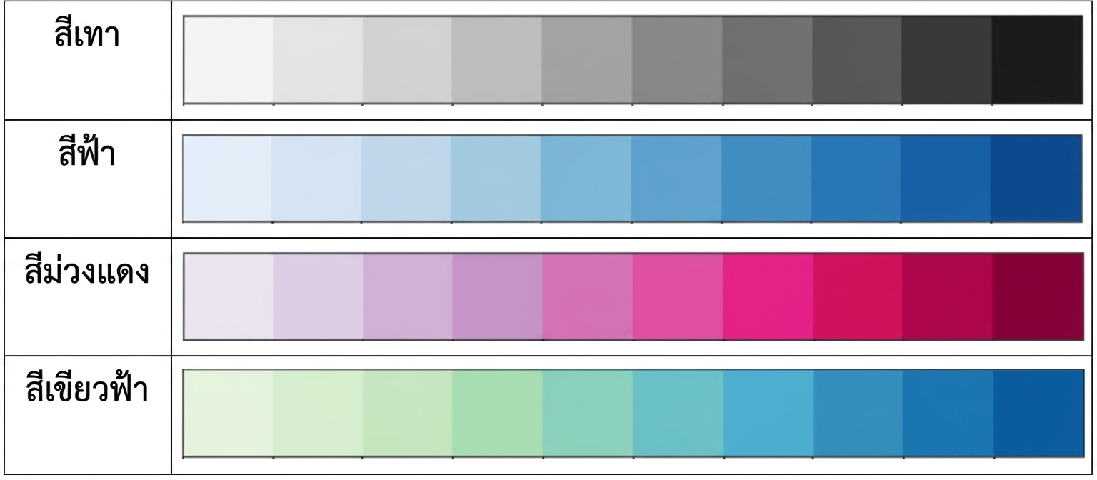
Sequential palettes

ตัวอย่าง sequential palette 4 แบบ

การสร้างภาพข้อมูลด้วย Seaborn เบื้องต้น

ตัวอย่าง sequential palette

Scatter plot ของ horsepower vs. mpg พร้อม sequential palette

1 Waskom, M. L. (2021). seaborn: statistical data visualization. https://seaborn.pydata.org/
การสร้างภาพข้อมูลด้วย Seaborn เบื้องต้น

Custom palettes

custom_palette = ["red", "green", "orange", "blue",
                  "yellow", "purple"]

sns.set_palette(custom_palette)

Custom palette ด้วยชื่อสี

การสร้างภาพข้อมูลด้วย Seaborn เบื้องต้น

Custom palettes

custom_palette = ['#FBB4AE', '#B3CDE3', '#CCEBC5', 
                  '#DECBE4', '#FED9A6', '#FFFFCC', 
                  '#E5D8BD', '#FDDAEC', '#F2F2F2']

sns.set_palette(custom_palette)

Custom palette ด้วย hex code

การสร้างภาพข้อมูลด้วย Seaborn เบื้องต้น

การเปลี่ยนขนาด

  • "context" ของ Figure เปลี่ยนขนาดของส่วนประกอบและป้ายชื่อในกราฟ
  • sns.set_context()
  • เล็กสุดถึงใหญ่สุด: "paper", "notebook", "talk", "poster"
การสร้างภาพข้อมูลด้วย Seaborn เบื้องต้น

Context เริ่มต้น: "paper"

sns.catplot(x="age", 
            y="masculinity_important",
            data=masculinity_data,
            hue="feel_masculine",
            kind="point")

plt.show()

Point plot พร้อม context แบบ notebook

การสร้างภาพข้อมูลด้วย Seaborn เบื้องต้น

Context ขนาดใหญ่: "talk"

sns.set_context("talk")

sns.catplot(x="age", 
            y="masculinity_important",
            data=masculinity_data,
            hue="feel_masculine",
            kind="point")

plt.show()

Point plot พร้อม context ขนาดใหญ่ขึ้น

การสร้างภาพข้อมูลด้วย Seaborn เบื้องต้น

มาฝึกกันเถอะ!

การสร้างภาพข้อมูลด้วย Seaborn เบื้องต้น

Preparing Video For Download...