การเปรียบเทียบเชิงปริมาณ: scatter plots

การสร้างภาพข้อมูลด้วย Matplotlib เบื้องต้น

Ariel Rokem

Data Scientist

แนะนำ scatter plots

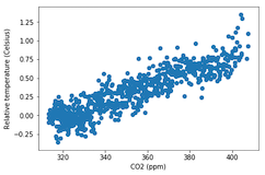
fig, ax = plt.subplots()

ax.scatter(climate_change["co2"], climate_change["relative_temp"])
ax.set_xlabel("CO2 (ppm)") ax.set_ylabel("Relative temperature (Celsius)") plt.show()
การสร้างภาพข้อมูลด้วย Matplotlib เบื้องต้น

ปรับแต่ง scatter plots

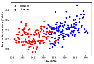
eighties = climate_change["1980-01-01":"1989-12-31"]
nineties = climate_change["1990-01-01":"1999-12-31"]

fig, ax = plt.subplots()
ax.scatter(eighties["co2"], eighties["relative_temp"], color="red", label="eighties")
ax.scatter(nineties["co2"], nineties["relative_temp"], color="blue", label="nineties")
ax.legend() ax.set_xlabel("CO2 (ppm)") ax.set_ylabel("Relative temperature (Celsius)") plt.show()
การสร้างภาพข้อมูลด้วย Matplotlib เบื้องต้น

เข้ารหัสการเปรียบเทียบด้วยสี

การสร้างภาพข้อมูลด้วย Matplotlib เบื้องต้น

เข้ารหัสตัวแปรที่สามด้วยสี

fig, ax = plt.subplots()

ax.scatter(climate_change["co2"], climate_change["relative_temp"], c=climate_change.index)
ax.set_xlabel("CO2 (ppm)") ax.set_ylabel("Relative temperature (Celsius)") plt.show()
การสร้างภาพข้อมูลด้วย Matplotlib เบื้องต้น

เข้ารหัสเวลาด้วยสี

การสร้างภาพข้อมูลด้วย Matplotlib เบื้องต้น

มาฝึกสร้าง scatter plots กันเถอะ!

การสร้างภาพข้อมูลด้วย Matplotlib เบื้องต้น

Preparing Video For Download...