catplot() 的更多选项

在 Python 中处理分类数据

Kasey Jones

Research Data Scientist

分类图的难点

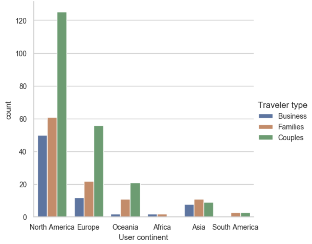
一个使用 seaborn 创建的计数图,按用户洲别和出行者类型统计评论次数。

在 Python 中处理分类数据

使用 catplot() 的 FacetGrid

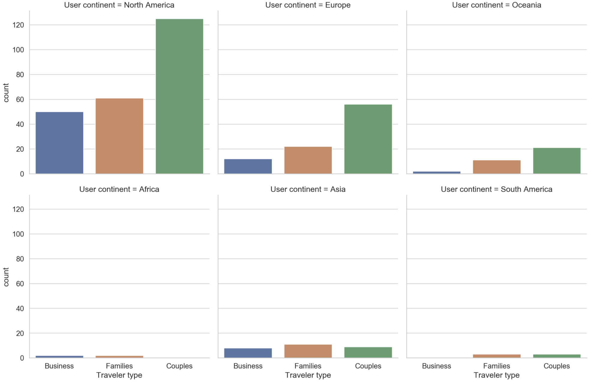
使用 seaborn 在列的不同类别上创建相同可视化的示例。与前一图包含相同信息,但现在每个用户洲别各一图。

在 Python 中处理分类数据

使用不同参数

sns.catplot(x="Traveler type", kind="count",

col="User continent",
col_wrap=3,
palette=sns.color_palette("Set1"), data=reviews)
  • x"Traveler type"
  • kind"count"
  • col"User continent"
  • col_wrap3
  • palettesns.color_palette("Set1")
  • 常用配色:"Set1""Set2""Tab10""Paired"
1 http://seaborn.pydata.org/tutorial/color_palettes.html
在 Python 中处理分类数据

再看一眼

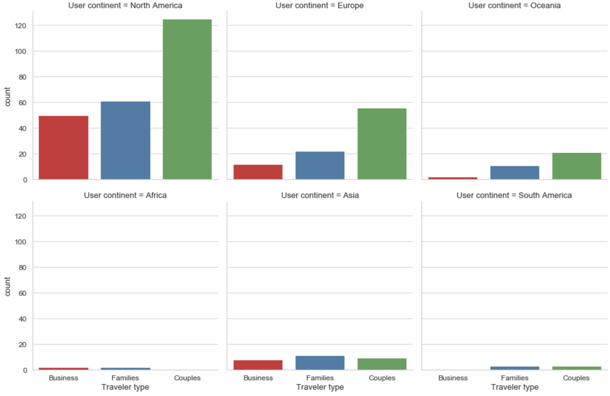
基于前一页更新的配色方案。每个用户洲别各有一个计数图。

在 Python 中处理分类数据

更新图形

  • 设置:将图形保存为对象:ax
  • 图标题:ax.fig.suptitle("My title")
  • 轴标签:ax.set_axis_labels("x-axis-label", "y-axis-label")
  • 标题高度:plt.subplots_adjust(top=.9)
ax = sns.catplot(x="Traveler type", col="User continent", col_wrap=3,
    kind="count", palette=sns.color_palette("Set1"), data=reviews)
ax.fig.suptitle("Hotel Score by Traveler Type & User Continent")
ax.set_axis_labels("Traveler Type", "Number of Reviews")
plt.subplots_adjust(top=.9)
plt.show()
在 Python 中处理分类数据

最终成品

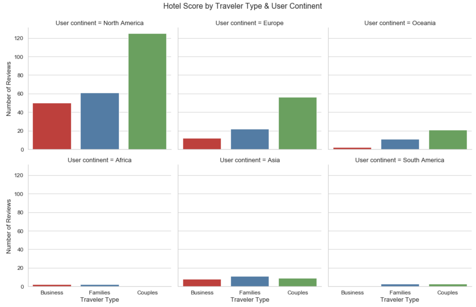
本章最终可视化。已更新轴标签和标题。

在 Python 中处理分类数据

catplot() 练习

在 Python 中处理分类数据

Preparing Video For Download...