子图

Python 中的 Plotly 数据可视化入门

Alex Scriven

Data Scientist

什么是子图?


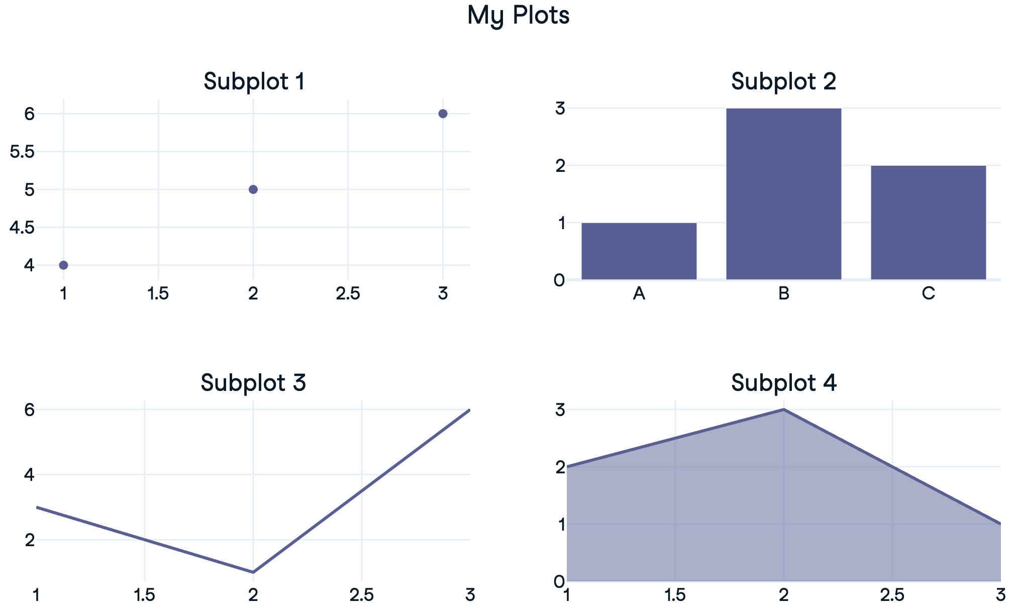
  • 子图:按网格排布的"迷你图"

$$

  • 可展示不同图表类型(同一数据)或不同数据子集


子图示意

Python 中的 Plotly 数据可视化入门

回顾:trace


  • Plotly 图形包含 traces 列表——数据与类型

  • 通过 fig.data[0]fig.data[1] 访问

    • 可用 .add_trace() 添加到子图

$$

px_fig = px.scatter(df...)
print(px_fig)
Figure({'data': [trace1], 'layout': {...}})
Python 中的 Plotly 数据可视化入门

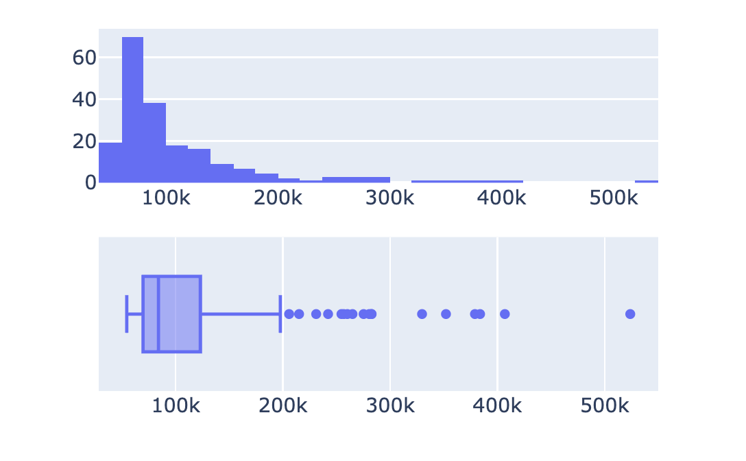
创建 1x2 子图

import plotly.express as px
from plotly.subplots import make_subplots

# Create a subplot grid
fig = make_subplots(rows=2, cols=1)

# Create plotly express figures hist = px.histogram(revenues, x='Revenue') box = px.box(revenues, x='Revenue')
# Extract traces and add to subplots fig.add_trace(hist.data[0], row=1, col=1) fig.add_trace(box.data[0], row=2, col=1) fig.show()


财务子图示例

Python 中的 Plotly 数据可视化入门

自定义子图


  • 无总标题
  • 无子图标题

$$

$$

$$

  • ✨ 打造成可展示的图表


简易财务子图

Python 中的 Plotly 数据可视化入门

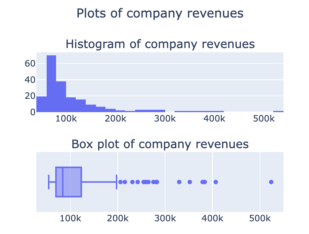
子图标题

from plotly.subplots import make_subplots

fig = make_subplots(rows=2, cols=1,
    subplot_titles=[
    'Histogram of company revenues', 
    'Box plot of company revenues'])

## Add in traces (fig.add_trace())
fig.update_layout({'title': {'text': 'Plots of company revenues', 'x': 0.5, 'y': 0.9}}) fig.show()

已设置子图标题

更多选项见文档

Python 中的 Plotly 数据可视化入门

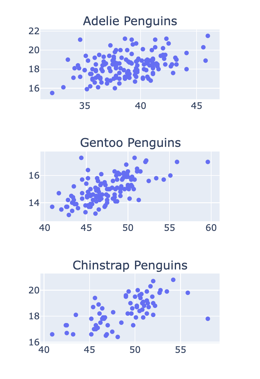
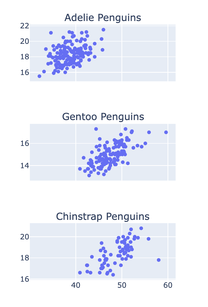
纵向堆叠子图

$$

fig = make_subplots(rows=3, cols=1, 
  subplot_titles=['Adelie Penguins'
  , 'Gentoo Penguins', 'Chinstrap Penguins'])

row_num = 1 for species in ['Adelie', 'Gentoo', 'Chinstrap']: # Filter data for this species df = penguins[penguins['Species'] == species]
scatter = px.scatter(df, x='Culmen Length (mm)' , y='Culmen Depth (mm)') # Add the trace to the subplot fig.add_trace(scatter.data[0] , row=row_num, col=1) row_num +=1

堆叠的企鹅子图

Python 中的 Plotly 数据可视化入门

共享坐标轴的子图


  • 使 x 轴"共享":
fig = make_subplots(
    rows=3, cols=1
    , shared_xaxes=True)

共享 x 轴的企鹅子图

Python 中的 Plotly 数据可视化入门

Passons à la pratique !

Python 中的 Plotly 数据可视化入门

Preparing Video For Download...