Python 中的 Plotly 数据可视化入门
Alex Scriven
Data Scientist
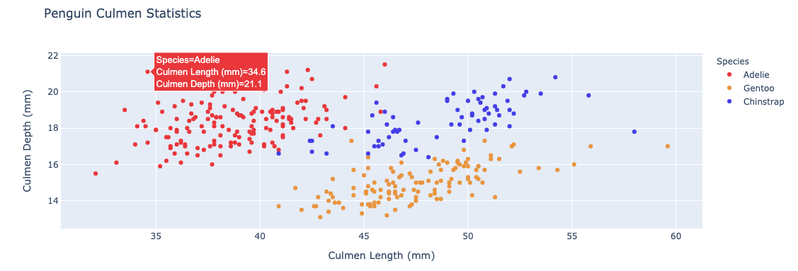
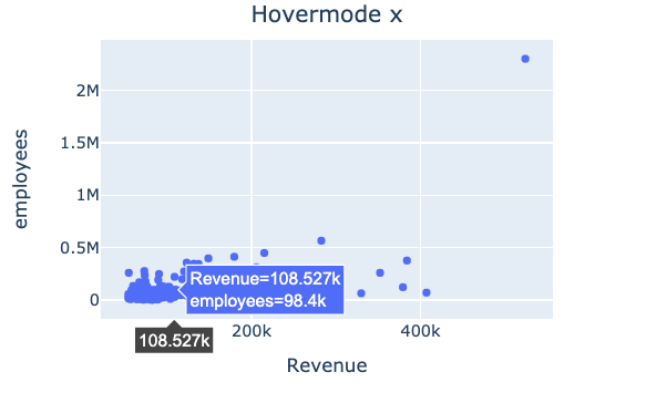
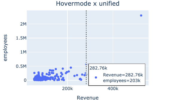
悬停信息:当鼠标移到数据点上出现的文本与数据
$$

默认 hovermode = "closest"
"x" 或 "y":在 x 或 y 轴上添加高亮$$
"x unified" / "y unified":显示一条线和一个悬停框,汇总该 x 或 y 轴上的所有值

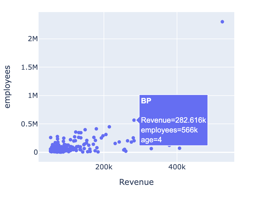
hover_name:指定列,将以粗体显示在悬停框顶部$$
hover_data:要包含的列的列表,或用于包含/排除列的字典{column_name: False}(将排除 column_name)💡 悬停列无需出现在图中
$$
fig = px.scatter(revenues,
x="Revenue",
y="employees",
hover_name="Company",
hover_data=["age"])
fig.show()

hoverlabel$$
hovertemplate$$

$$
update_layout() 控制图例$$
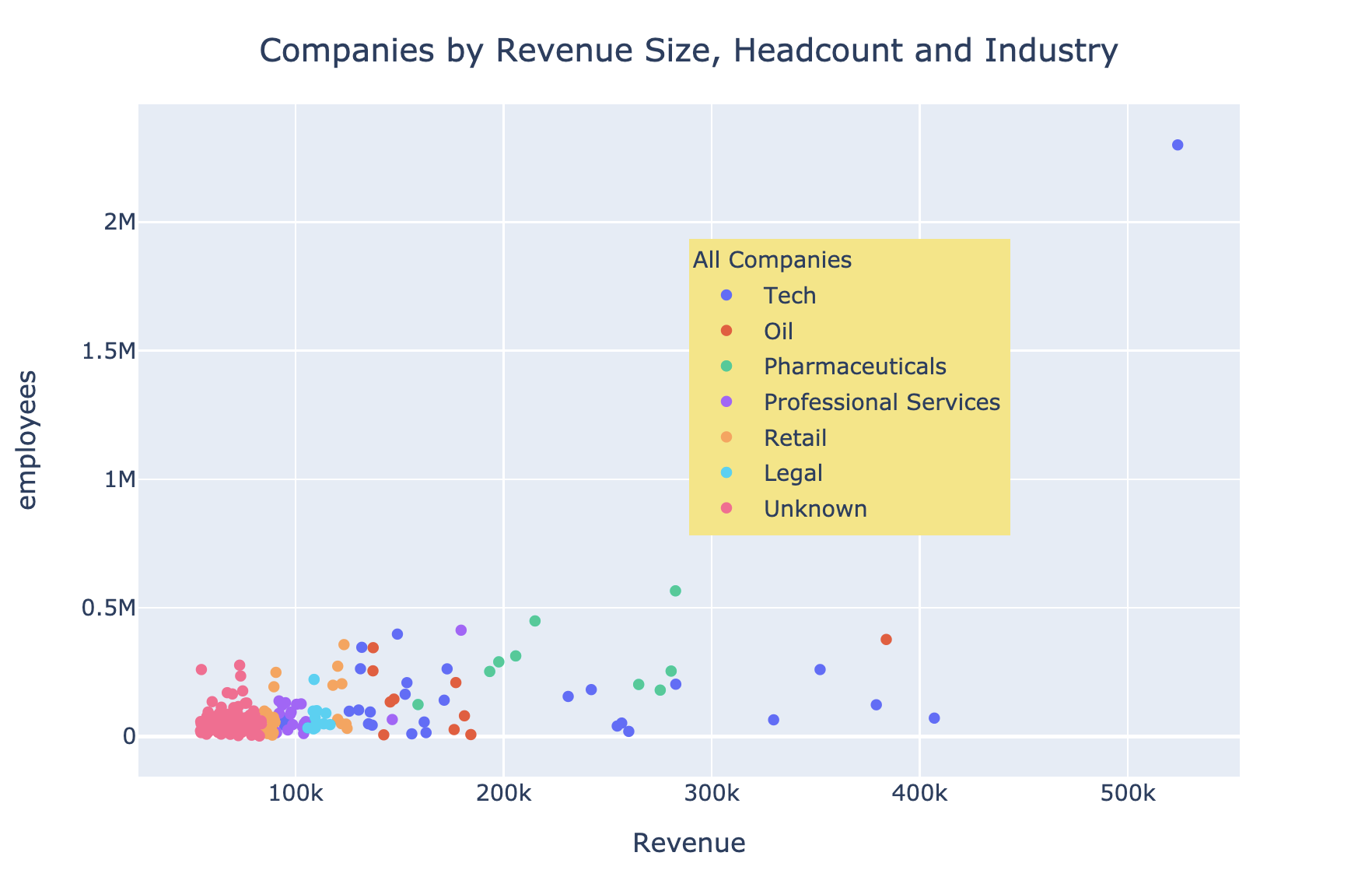
showlegend = True 显示默认图例legend:接受属性字典x、y 在图内定位图例(范围 0 到 1)bgcolor(背景色)、borderwidth、font$$
参见文档了解更多
$$
$$
fig.update_layout( "showlegend": True,legend_title_text="All Companies"legend=dict( x=0.7, y=0.8, bgcolor="rgb(246,228,129)")) })

Python 中的 Plotly 数据可视化入门