Tidyverse 的数据建模
Albert Y. Kim
Assistant Professor of Statistical and Data Sciences

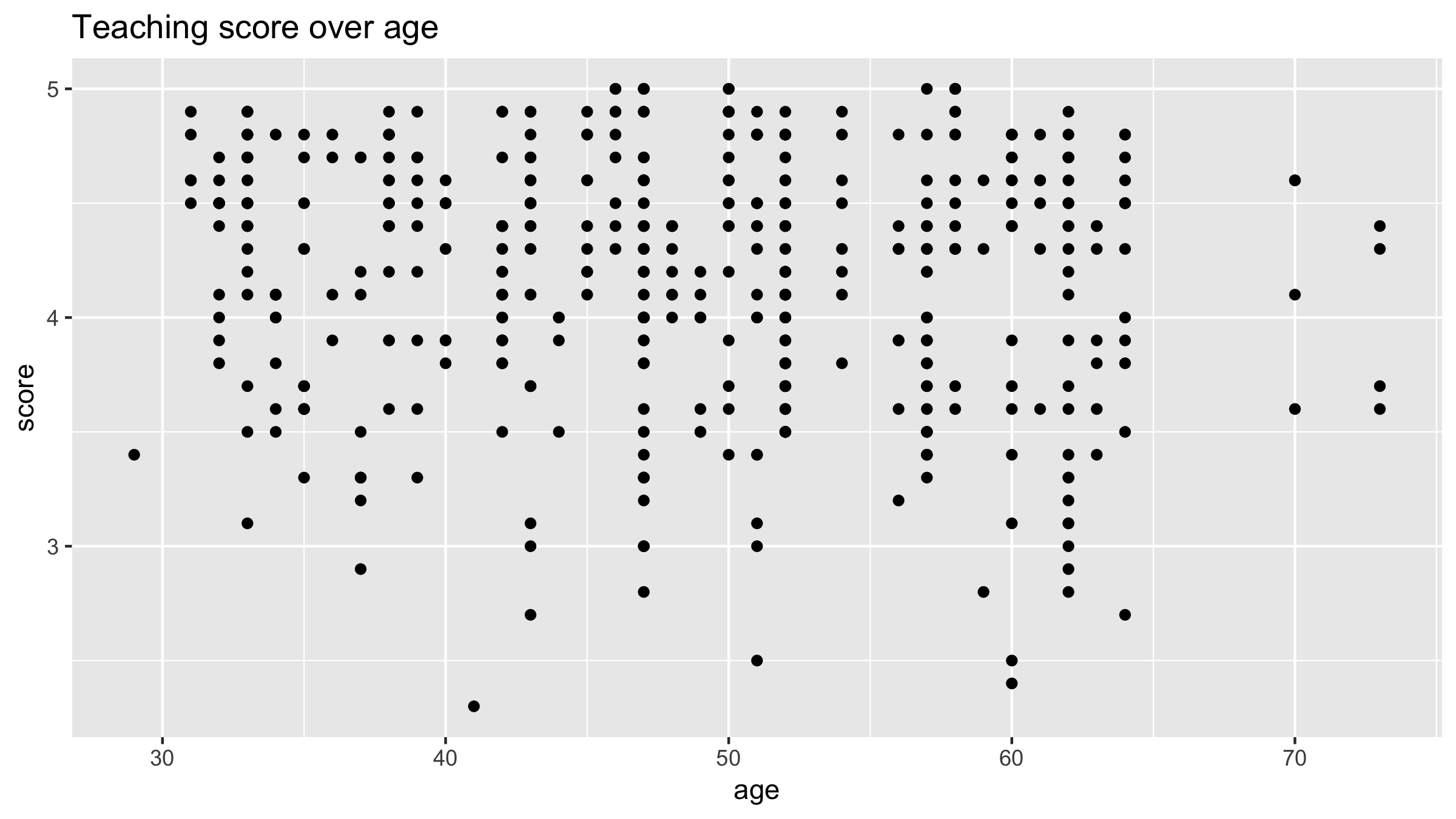
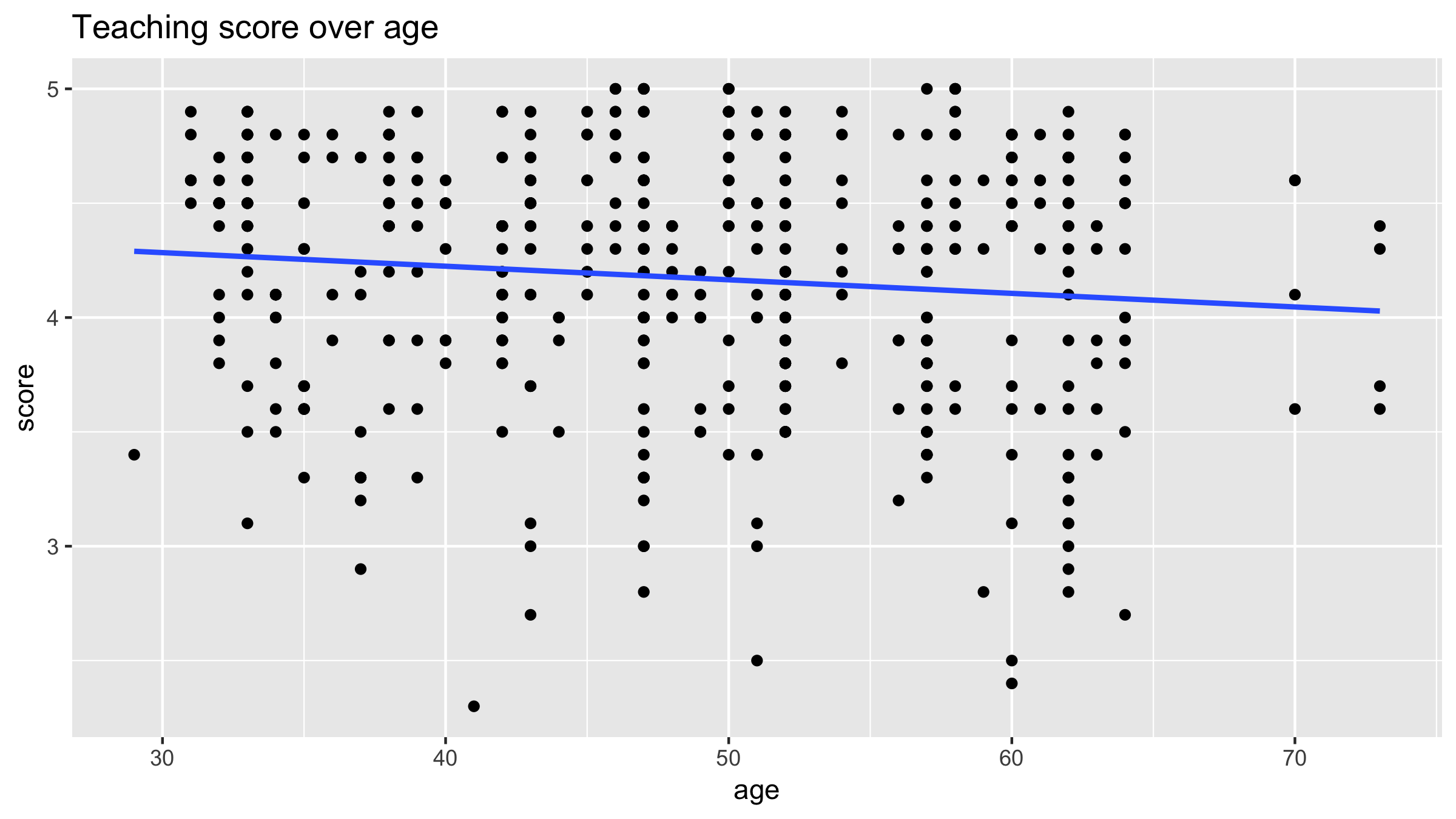
# 创建散点图的代码 ggplot(evals, aes(x = age, y = score)) + geom_point() + labs(x = "age", y = "score", title = "教学评分随年龄变化")# 添加"最佳拟合"直线 ggplot(evals, aes(x = age, y = score)) + geom_point() + labs(x = "age", y = "score", title = "教学评分随年龄变化") + geom_smooth(method = "lm", se = FALSE)

拟合的蓝色回归线方程:$\hat{y} = \hat{f}(\vec{x}) = \hat{\beta}_0 + \hat{\beta}_1 \cdot x$

使用公式形式 y ~ x:
# 使用 y ~ x 形式拟合回归模型 model_score_1 <- lm(score ~ age, data = evals)# 输出内容 model_score_1
Call:
lm(formula = score ~ age, data = evals)
Coefficients:
(Intercept) age
4.461932 -0.005938
使用公式形式 y ~ x,相当于 $\hat{y}= \hat{f}(\vec{x})$
# 使用 y ~ x 形式拟合回归模型
model_score_1 <- lm(score ~ age, data = evals)
# 用包装函数输出回归表:
get_regression_table(model_score_1)
# A tibble: 2 x 7
term estimate std_error statistic p_value...
<chr> <dbl> <dbl> <dbl> <dbl>...
1 intercept 4.46 0.127 35.2 0...
2 age -0.006 0.003 -2.31 0.021...
Tidyverse 的数据建模