使用 Dash 和 Plotly 构建仪表板
Alex Scriven
Data Scientist
style
cellStyle
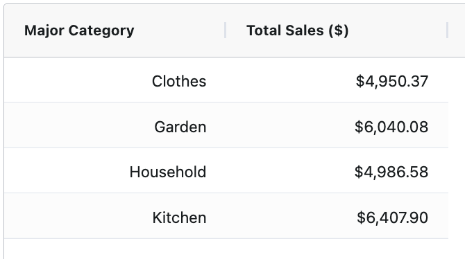
grid = AgGrid(
defaultColDef={
    "cellStyle":
    {"textAlign": "right"}}
)
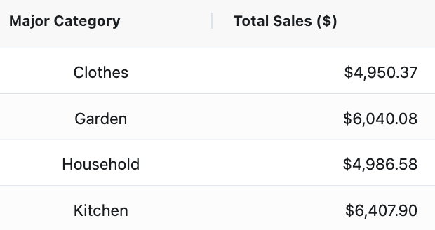
column_defs = [
{"field": "Major Category"
, "cellStyle": {"textAlign": "center"}},
{"field": "Total Sales ($)"
, "valueFormatter": money_fmt
, "cellStyle": {"textAlign": "right"}}
]
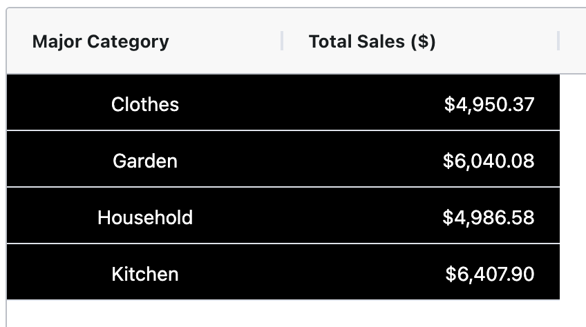
grid = AgGrid(
# 其他设置
defaultColDef={
"cellStyle": {
  "backgroundColor": "black",
   "color": "white"}
})
$$
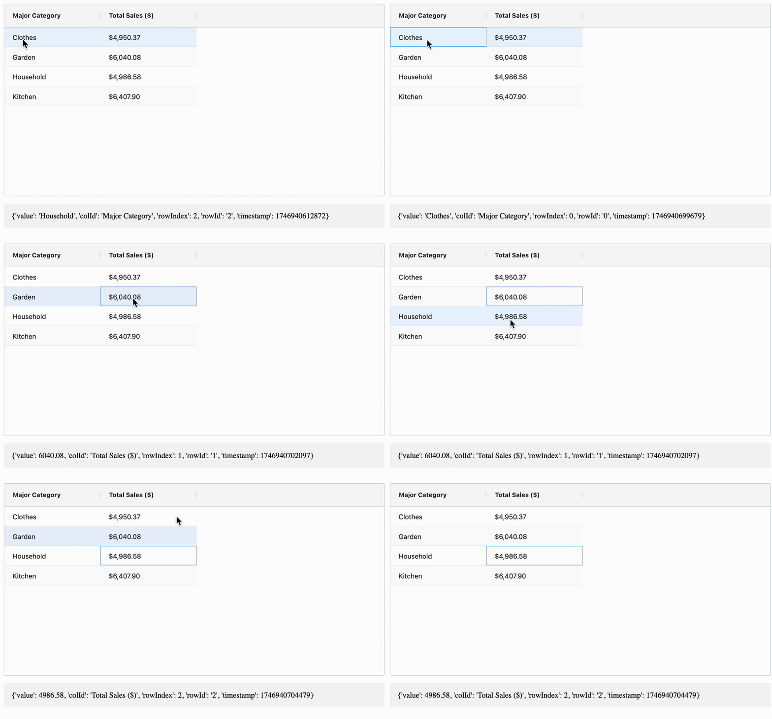
cellClicked
@callback(
    Output("test_text", "children"),
    Input("my_grid", "cellClicked")
)
def show_cell_info(cell_data):
    return str(cell_data)
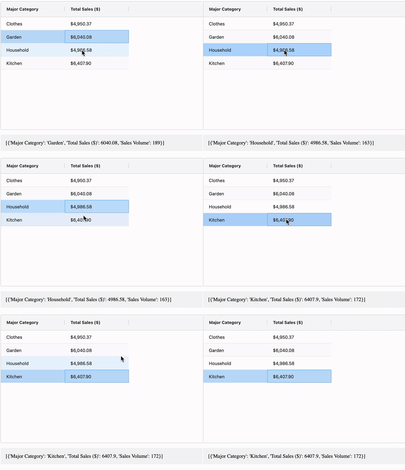
rowSelection
"single"
"multiple"
grid = AgGrid(
# 其他部分
dashGridOptions={
"rowSelection": "single"}
)

@callback(
Output("test_text", "children"),
Input("my_grid", "selectedRows")
)
grid = AgGrid( # 其他部分 dashGridOptions={ "rowSelection": "single"} )
@callback( Output("test_text", "children"), Input("my_grid", "selectedRows") )