定位 Dash 组件

使用 Dash 和 Plotly 构建仪表板

Alex Scriven

Data Scientist

HTML 与 Web


HTML:构建网站的语言

  • HTML:像房屋的木结构
    • 决定元素的位置
  • CSS:像房间的油漆颜色
    • 控制样式(如背景色)

官方 HTML 标志,蓝色字体写着 HTML

官方 CSS 标志,蓝色浮雕字体写着 CSS

使用 Dash 和 Plotly 构建仪表板

Div 与 H 标签


  • Dash 使用 dash.html 连接 HTML 与 Python

$$

两个重要的 HTML 结构("标签"):

  • Div 标签:用于页面结构
    • 可放入不同大小、不同内容的 div
  • H 标签:不同级别标题(H1 > H6)
使用 Dash 和 Plotly 构建仪表板

使用 Div 与 H 标签


$$

  • 外层 div(包住全部)
  • 内层红色背景 div
  • 浅蓝背景 div
    • 内含 H 标签
  • 暂时忽略 style —— CSS 稍后介绍


<div>
  <div style="background-color: red; 
              width:250; height:250;">
  </div>
  <div style="background-color: lightblue; 
              width:250; height:250;">
    <h1>This box</h1>
    <h2>Another Title</h2>
  </div>
</div>
使用 Dash 和 Plotly 构建仪表板

示例展示


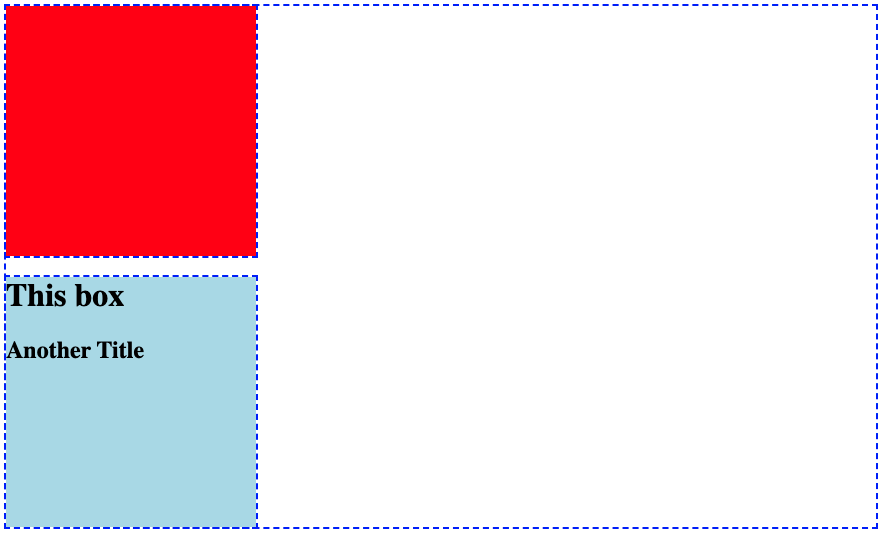
一张图片:蓝色虚线边框的大框;其左上角有实心红色小框;下方是实心蓝色框,内含 "This box" 和 "another title" 文本


请注意:

  • 红色背景的 div
  • 带 H 标签的蓝色背景 div
使用 Dash 和 Plotly 构建仪表板

在 Dash 中的示例


  • 用 Dash 重现 HTML 示例
from dash import Dash, html
app = Dash()
app.layout = [
    html.Div(style={'height':250, 'width':250, 'background-color':'red'}),
    html.Div(children=[
        html.H1("This box"),
        html.H2("Another Title")], 
        style={'background-color':'lightblue'})
    ]
使用 Dash 和 Plotly 构建仪表板

拆解布局


  • HTML 标签映射到 Dash 的 html.()
    • html.Div() = <div>
    • html.H1() = <h1>
  • 最后一个 div 有 children 参数
    • 放入的对象列表
  • 也可放入 dcc.Graph() 组件!


from dash import Dash, html
app.layout = [
  html.Div(
    style={'background-color':'red', 
           'height':250, 'width':250}),
  html.Div(
  children=[
      html.H1("This box"),
      html.H2("Another Title")]
    ,style={'background-color':'lightblue', 
              'height':250, 'width':250})
]
使用 Dash 和 Plotly 构建仪表板

将图表放入布局

bar_fig_country = px.bar(ecom_sales, 
 x='Total Sales ($)', y='Country',
 color='Country', color_discrete_map=
 {'United Kingdom':'lightblue', 
 'Germany':'orange', 'France':'darkblue', 
 'Australia':'green', 'Hong Kong':'red'})
app = Dash()

app.layout = [ html.H1("Sales Proportion by Country"), dcc.Graph(id='bar_graph', figure=bar_fig_country) ]

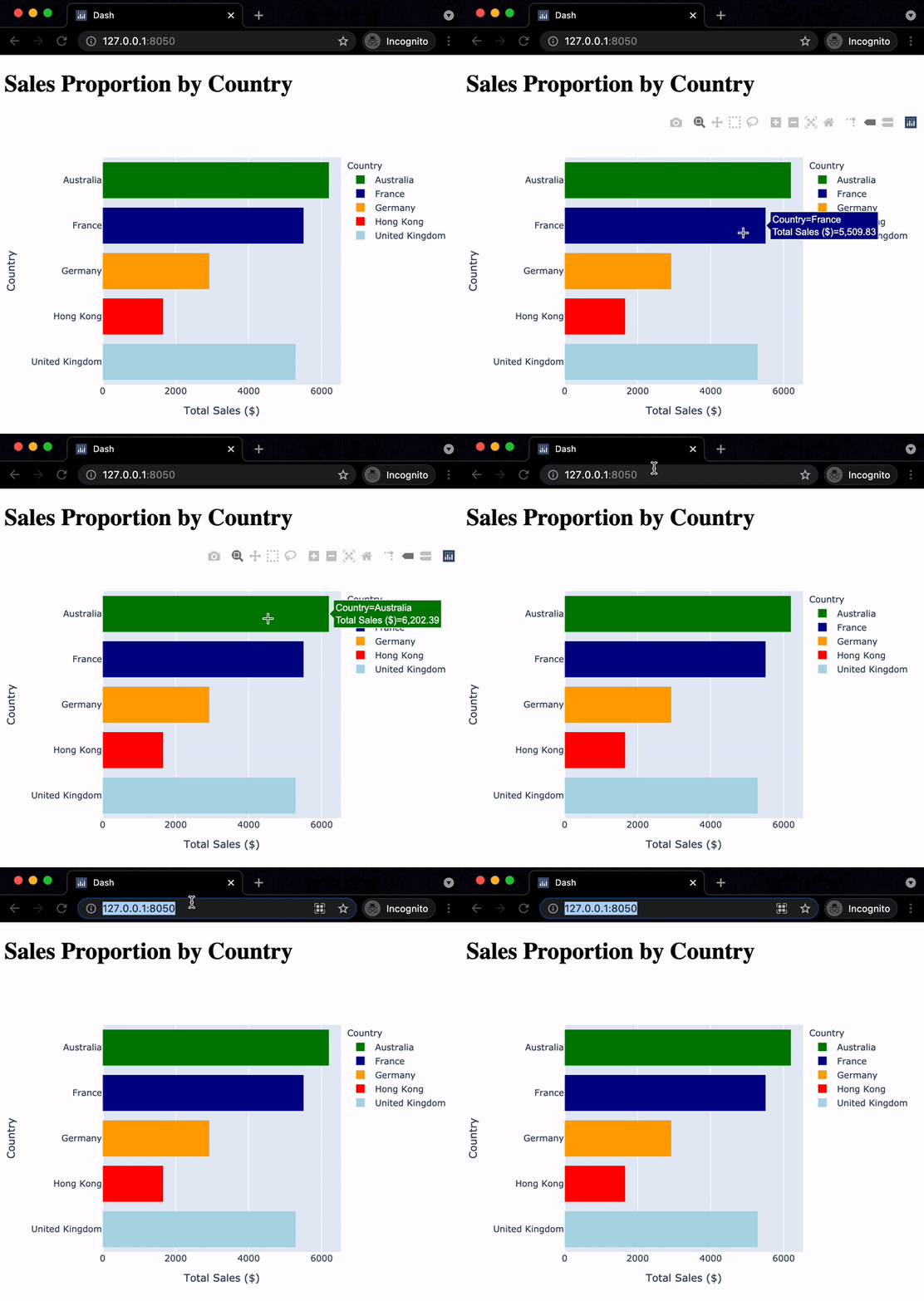
一个在 Chrome 浏览器中的水平条形图动图:x 轴为总销售额,y 轴为国家,各国家颜色不同。鼠标先悬停在图上,再移到带有服务器地址的 URL 栏

使用 Dash 和 Plotly 构建仪表板

增加更多结构

$$

app.layout = [
  html.Div(style={
    'width':150,'height':150, 
    'background-color':'lightblue'}),
  html.H1("Sales Proportion by Country"),
  dcc.Graph(id='bar_graph', 
            figure=bar_fig_country)
]

$$

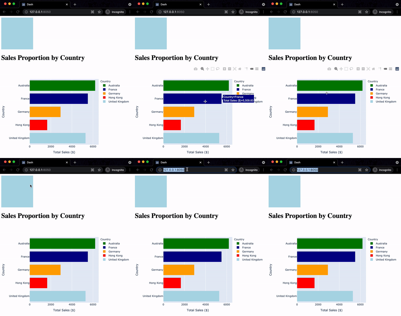
与上个练习相同的应用动图,但条形图被推到页面更下方,上方新增一个浅蓝色小方块

使用 Dash 和 Plotly 构建仪表板

Passons à la pratique !

使用 Dash 和 Plotly 构建仪表板

Preparing Video For Download...