使用 Dash 和 Plotly 构建仪表板
Alex Scriven
Data Scientist
$$
优点:
plotly.express
import plotly.express as px

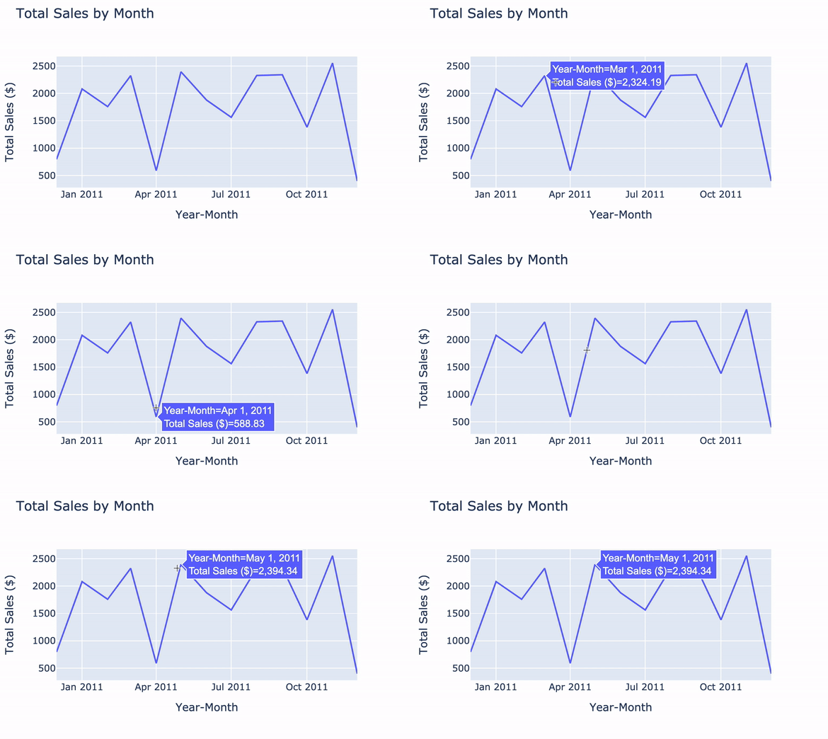
line_graph = px.line(

  data_frame=ecom_sales,
  x='Year-Month',
  y='Total Sales ($)',
  title='Total Sales by Month')

line_graph.show()
import plotly.express as px
line_graph = px.line(
data_frame=ecom_sales, x='Year-Month', y='Total Sales ($)', title='Total Sales by Month')
line_graph.show()
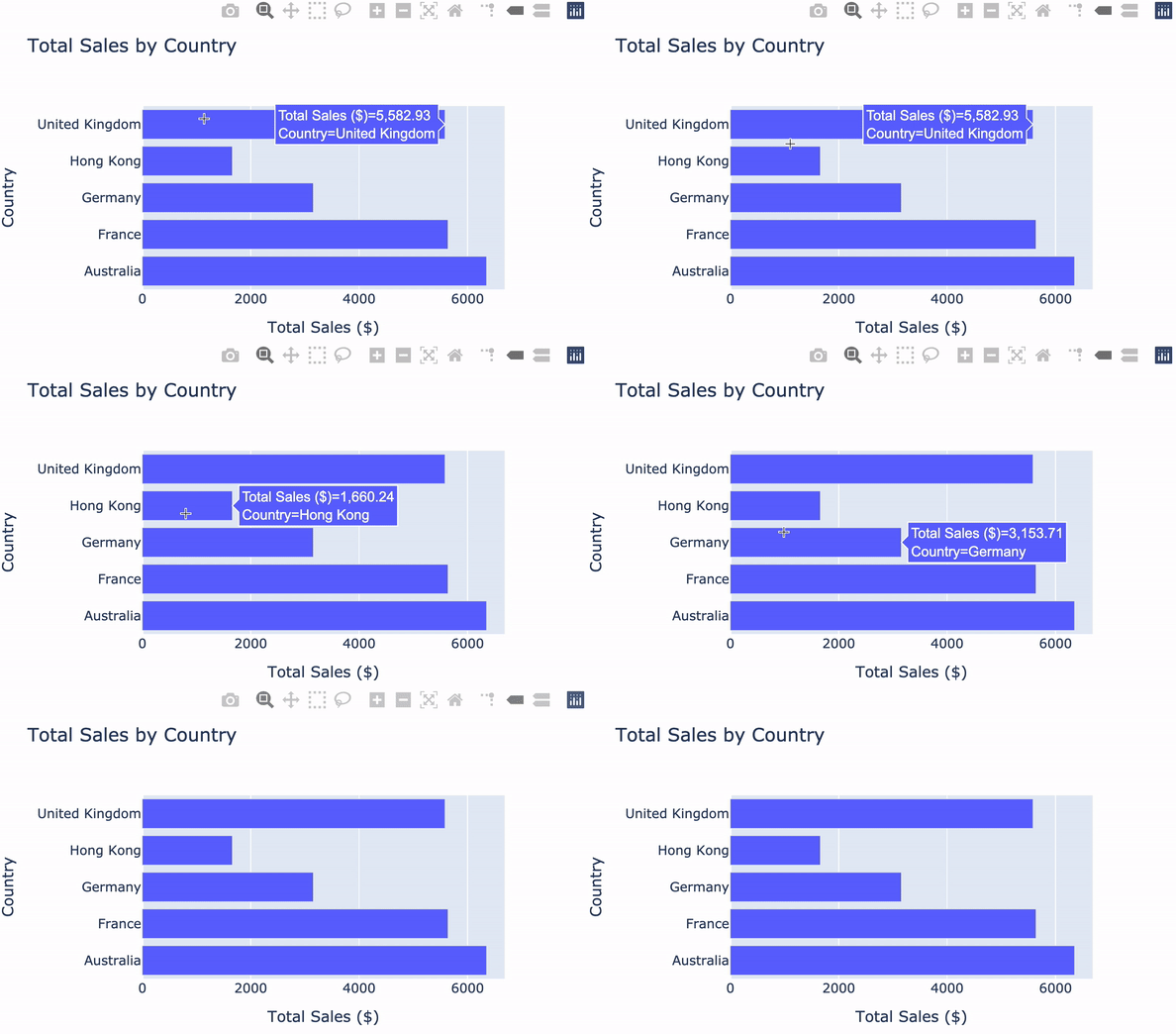
bar_fig = px.bar(
  data_frame=ecom_sales,
  x='Total Sales ($)',
  y='Country',
  title='Total Sales by Country',

  orientation='h')

bar_fig.show()
bar_fig = px.bar( data_frame=ecom_sales, x='Total Sales ($)', y='Country', title='Total Sales by Country',
orientation='h')
bar_fig.show()
调整柱宽:
bar_fig.update_layout({'bargap': 0.5})

bar_fig.show()
bar_fig.update_layout({'bargap': 0.5})
查看 Plotly 文档