可视化中的颜色
用 Python 提升数据可视化

Nick Strayer
Instructor
颜色的用法

颜色可以很美观
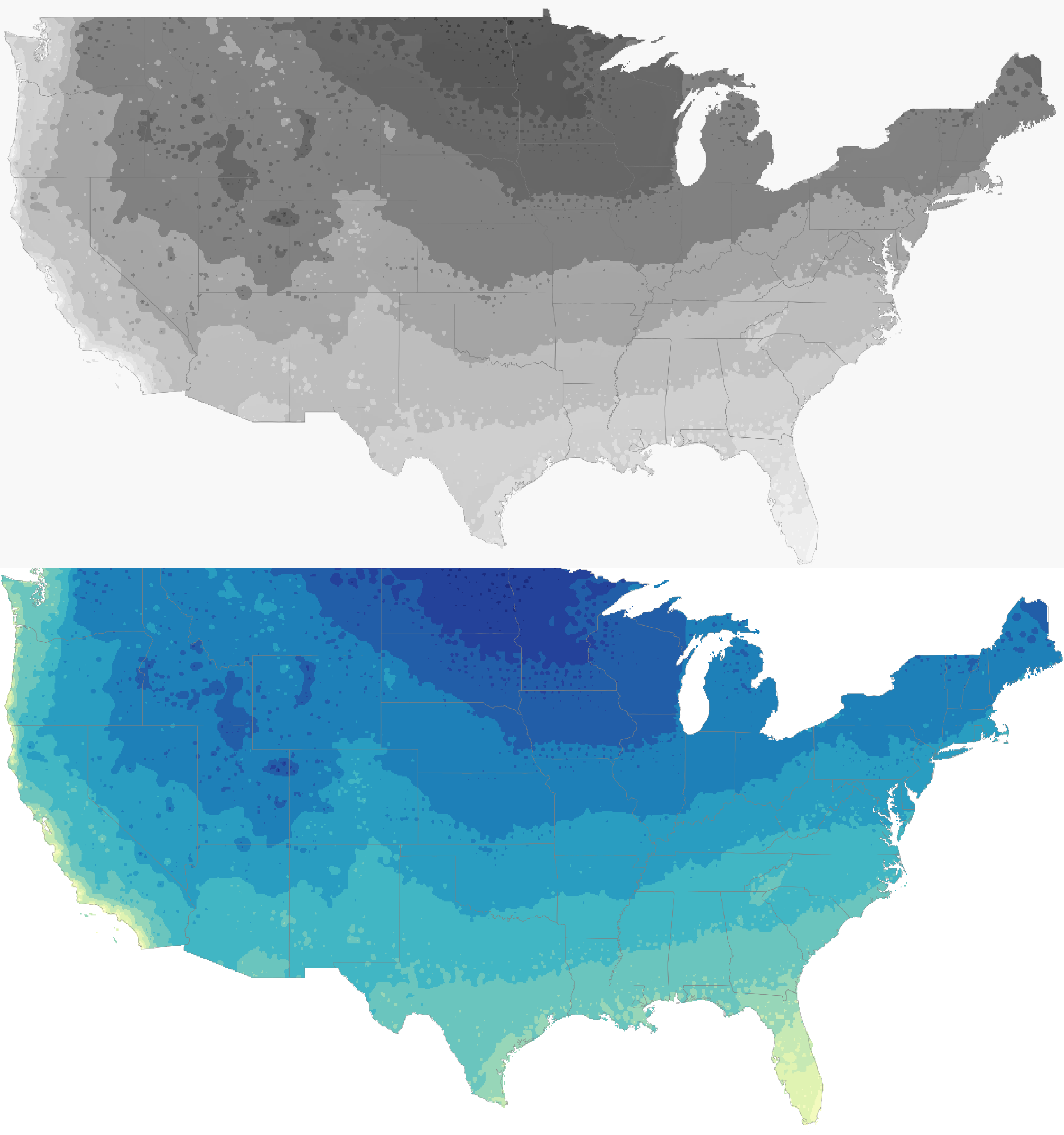
- 对颜色的含义常受文化/个人经验影响
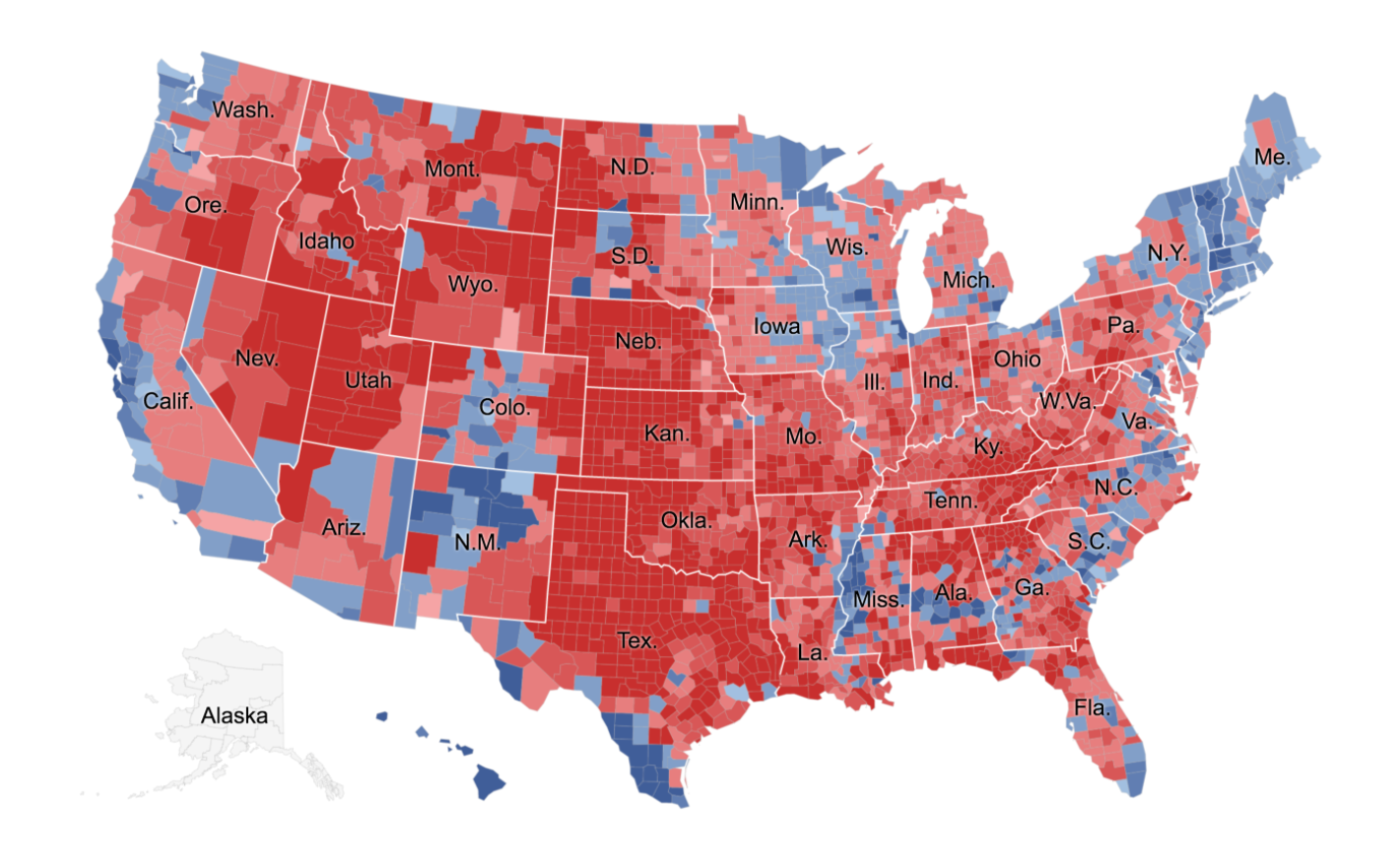
1 Parlapiano, A. (2016年11月1日) 映射选举结果的方法很多。我们几乎都试过。纽约时报。取自 https://www.nytimes.com/
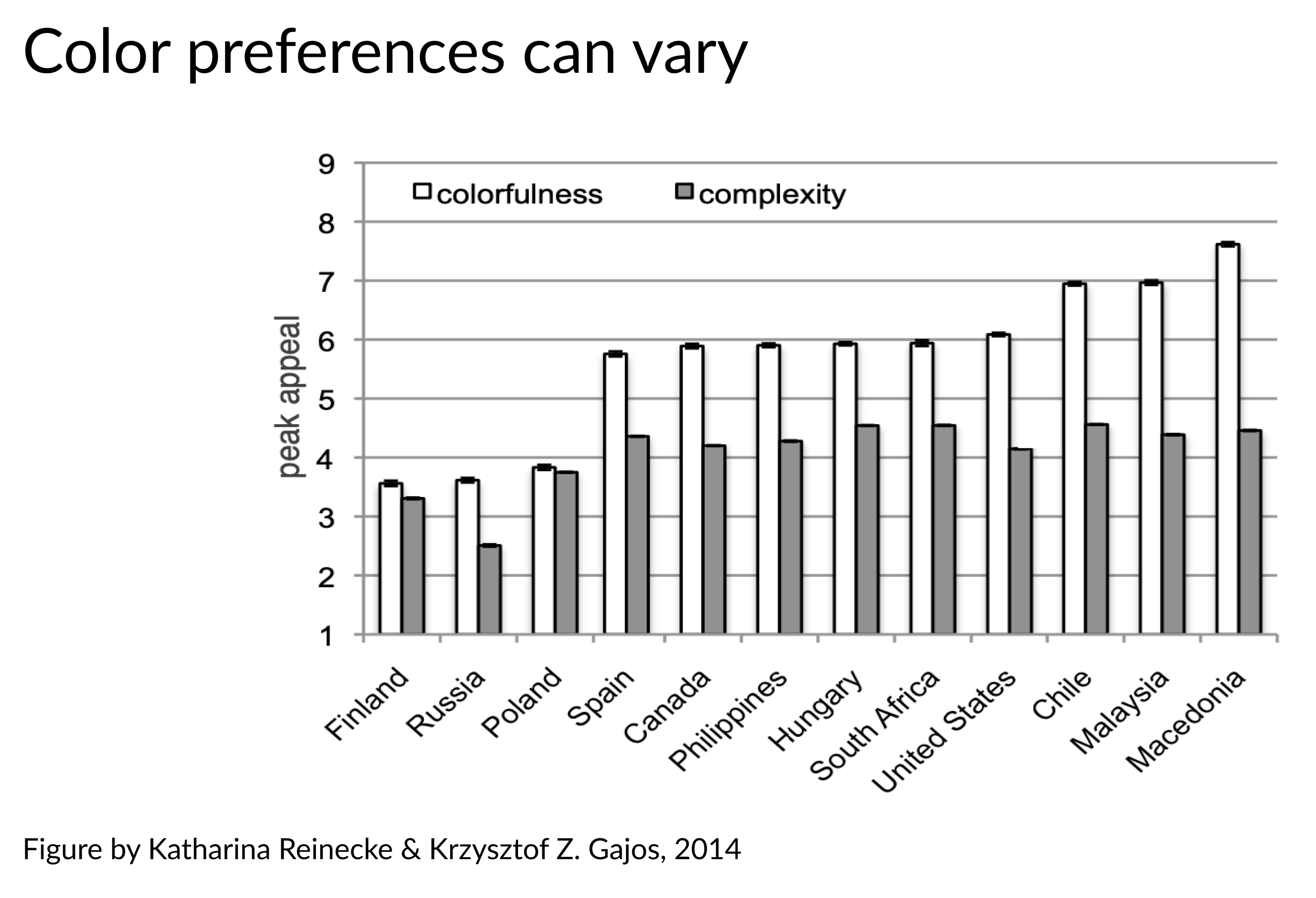
颜色可能会误导…
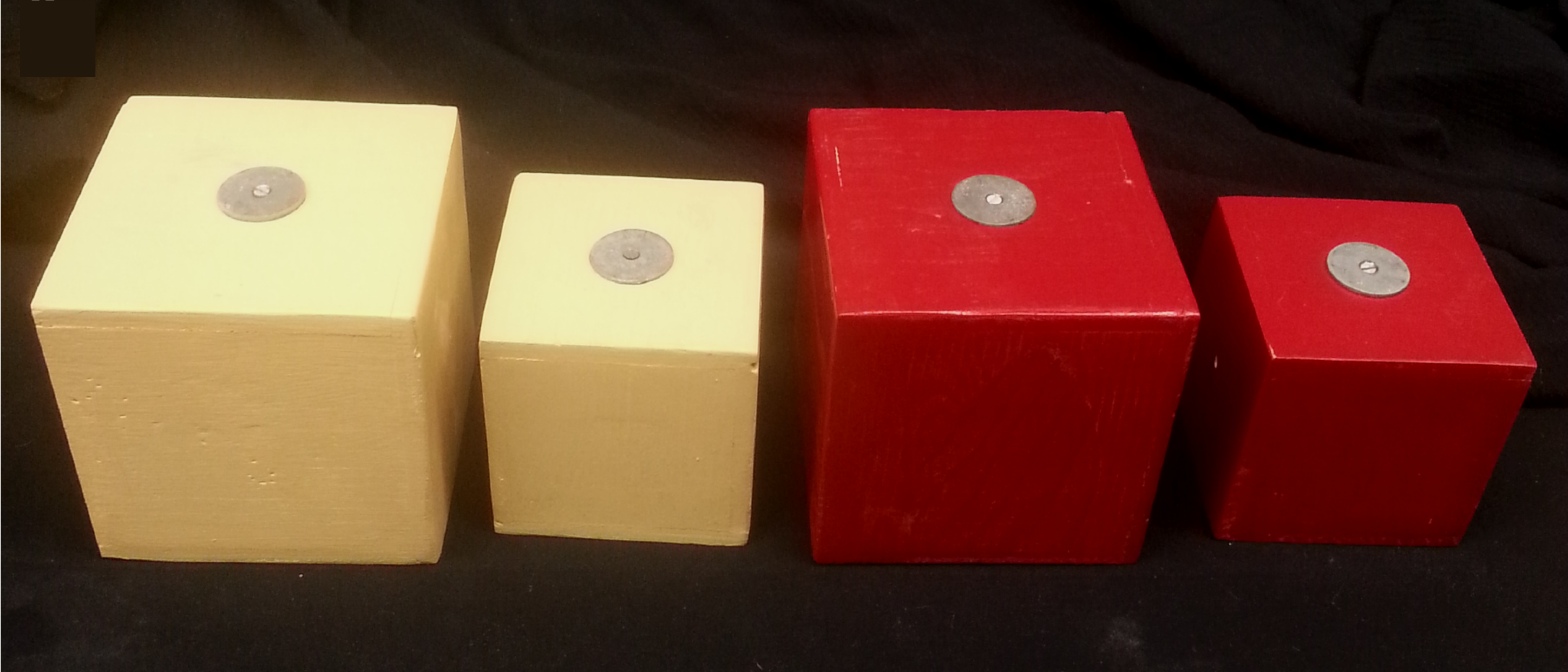
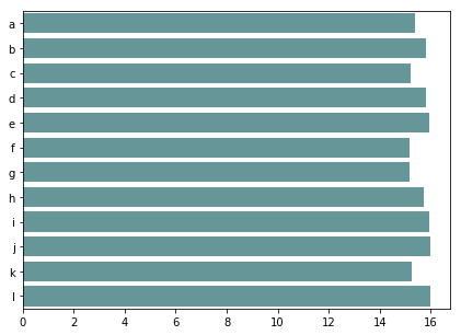
缓解颜色-大小错觉的方法
sns.barplot(x = values, y = ids)
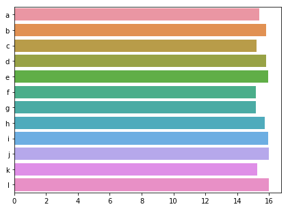
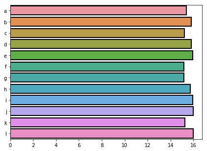
sns.barplot(x = values, y = ids,
            edgecolor = 'black')
sns.barplot(x = values, y = ids, color = 'cadetblue')