用 Python 提升数据可视化
Nick Strayer
Instructor


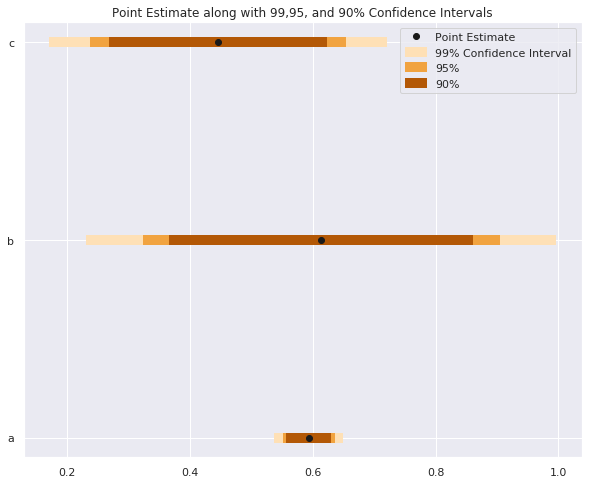
# 设置区间大小 sizes = ['99%', '95%', '90%'] Z_scores = [2.58, 1.96, 1.67] colors = ['#fee0b6','#f1a340', '#b35806']for size, z, color in zip(sizes, Z_scores, colors): plt.hlines(y = data.y, # 计算上下界 xmin = data['est'] - z*data['std_err'], xmax = data['est'] + z*data['std_err'], # 按区间大小着色 color = color,# 加粗以便可见 linewidth = 7,# 标注以便图例清晰 label = size)plt.plot('est', 'y', 'ko', data = data, label = 'Point Estimate') plt.legend()


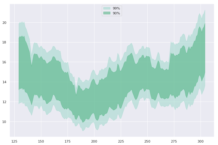
widths = [ '99%', '90%'] z_scores = [ 2.58, 1.67] colors = ['#99d8c9', '#41ae76'] for percent, Z, color in zip(widths, z_scores, colors): # 设定颜色区分带 plt.fill_between( x=data.day, y1=data['mean'] - Z*data['std_err'], y2=data['mean'] + Z*data['std_err'] color=color,# 降低不透明度以显示网格 alpha=0.5,# 为图例提供标签 label=percent)

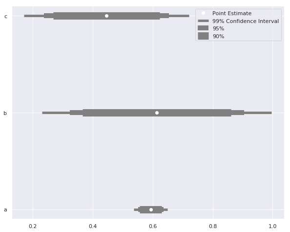
sizes = ['99% Confidence Interval', '95%', '90%'] # 为区间设置不同线宽 widths = [ 5, 10, 15] Z_scores = [2.58, 1.96, 1.67] for size, z, width in zip(sizes, Z_scores, widths): plt.hlines( y = data.y, label = size, xmin = data['est'] - z*data['std_err'], xmax = data['est'] + z*data['std_err'], color = 'grey'# 按区间调整线宽 linewidth = width)plt.plot('est', 'y', 'wo', data = data, label = 'Point Estimate') plt.legend()
用 Python 提升数据可视化