在多元时间序列中发现关系

用 Python 可视化时间序列数据

Thomas Vincent

Head of Data Science, Getty Images

两个变量的相关性

  • 在统计学中,相关系数用于衡量两个变量之间关系的强弱或是否相关:
    • 皮尔逊系数用于线性关系的变量
    • Kendall Tau 或 Spearman 等级相关用于非线性关系的变量
用 Python 可视化时间序列数据

计算相关系数

from scipy.stats.stats import pearsonr
from scipy.stats.stats import spearmanr
from scipy.stats.stats import kendalltau
x = [1, 2, 4, 7]
y = [1, 3, 4, 8]
pearsonr(x, y)
SpearmanrResult(correlation=0.9843, pvalue=0.01569)
spearmanr(x, y)
SpearmanrResult(correlation=1.0, pvalue=0.0)
kendalltau(x, y)
KendalltauResult(correlation=1.0, pvalue=0.0415)
用 Python 可视化时间序列数据

什么是相关矩阵?

  • 超过两个变量时,会得到相关矩阵:
    • 范围:[-1, 1]
    • 0:无关系
    • 1:强正相关
    • -1:强负相关
用 Python 可视化时间序列数据

什么是相关矩阵?

  • 相关矩阵总是对称的
  • 对角线值恒为 1
   x     y     z
x  1.00 -0.46  0.49
y -0.46  1.00 -0.61
z  0.49 -0.61  1.00
用 Python 可视化时间序列数据

用 Pandas 计算相关矩阵

corr_p = meat[['beef', 'veal','turkey']].corr(method='pearson')
print(corr_p)
          beef     veal     turkey
beef      1.000   -0.829    0.738
veal     -0.829    1.000   -0.768
turkey    0.738   -0.768    1.000
corr_s = meat[['beef', 'veal','turkey']].corr(method='spearman')
print(corr_s)
          beef     veal     turkey
beef      1.000   -0.812    0.778
veal     -0.812    1.000   -0.829
turkey    0.778   -0.829    1.000
用 Python 可视化时间序列数据

用 Pandas 计算相关矩阵

corr_mat = meat.corr(method='pearson')
用 Python 可视化时间序列数据

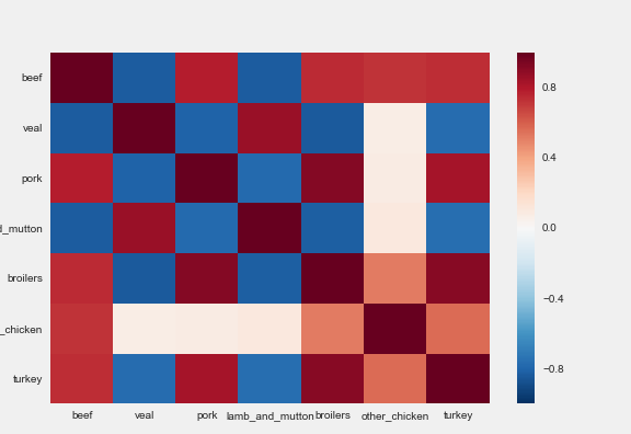
热力图

import seaborn as sns

sns.heatmap(corr_mat)
用 Python 可视化时间序列数据

热力图

相关矩阵的热力图

用 Python 可视化时间序列数据

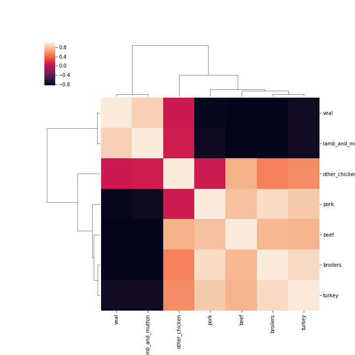
聚类热图

sns.clustermap(corr_mat)
用 Python 可视化时间序列数据

相关矩阵的聚类热图

用 Python 可视化时间序列数据

Passons à la pratique !

用 Python 可视化时间序列数据

Preparing Video For Download...