用 Python 可视化时间序列数据
Thomas Vincent
Head of Data Science, Getty Images
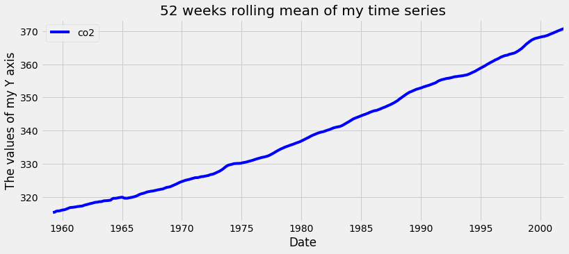
co2_levels_mean = co2_levels.rolling(window=52).mean()

ax = co2_levels_mean.plot()
ax.set_xlabel("Date")
ax.set_ylabel("The values of my Y axis")
ax.set_title("52 weeks rolling mean of my time series")

plt.show()
co2_levels.index
DatetimeIndex(['1958-03-29', '1958-04-05',...],
              dtype='datetime64[ns]', name='datestamp',
              length=2284, freq=None)
print(co2_levels.index.month)
array([ 3, 4, 4, ..., 12, 12, 12], dtype=int32)
print(co2_levels.index.year)
array([1958, 1958, 1958, ..., 2001,
      2001, 2001], dtype=int32)
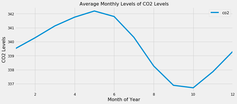
index_month = co2_levels.index.month
co2_levels_by_month = co2_levels.groupby(index_month).mean()
co2_levels_by_month.plot()

plt.show()