绘制多条时间序列

用 Python 可视化时间序列数据

Thomas Vincent

Head of Data Science, Getty Images

清晰为先

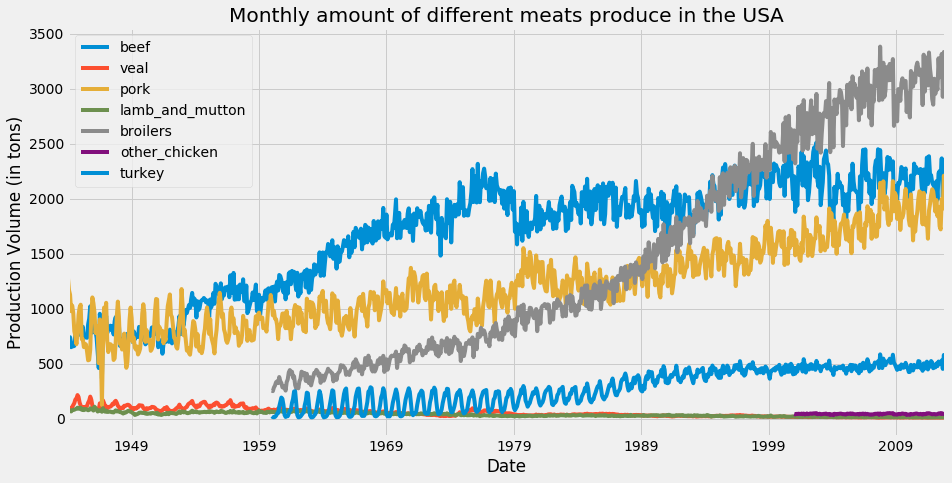
在此图中,默认的 matplotlib 配色将 beefturkey 两条时间序列分配为相同颜色。

matplotlib 中的颜色循环

用 Python 可视化时间序列数据

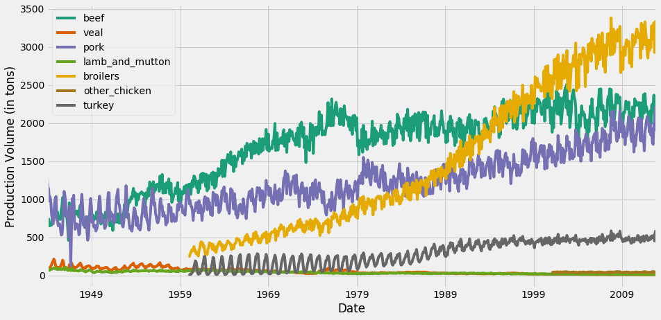
colormap 参数

ax = df.plot(colormap='Dark2', figsize=(14, 7))
ax.set_xlabel('Date')
ax.set_ylabel('Production Volume (in tons)')

plt.show()

完整的色图列表请点击此处

用 Python 可视化时间序列数据

用 colormap 更改线条颜色

为时间序列可视化更换配色方案

用 Python 可视化时间序列数据

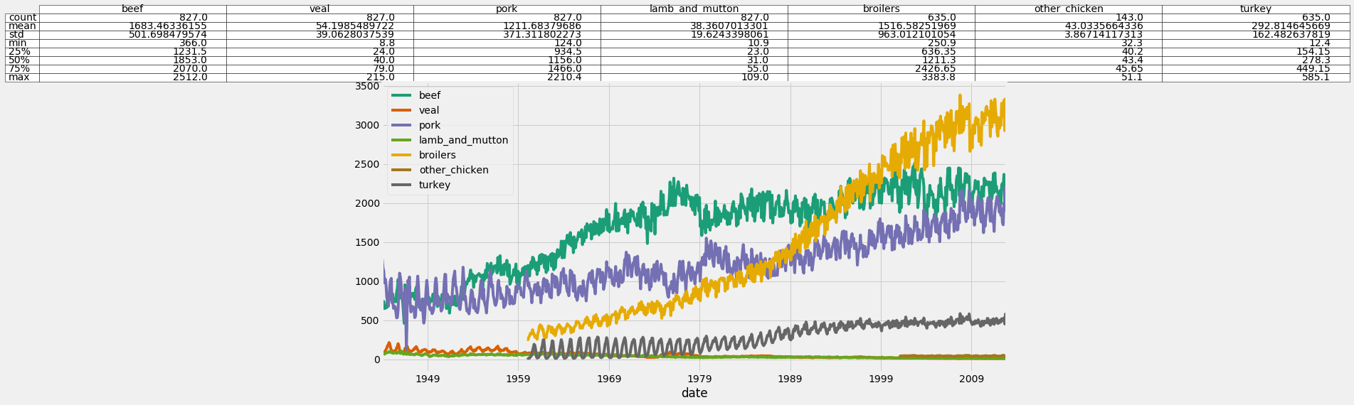
为图表补充信息

ax = df.plot(colormap='Dark2', figsize=(14, 7))

df_summary = df.describe() # Specify values of cells in the table ax.table(cellText=df_summary.values, # Specify width of the table colWidths=[0.3]*len(df.columns), # Specify row labels rowLabels=df_summary.index, # Specify column labels colLabels=df_summary.columns, # Specify location of the table loc='top') plt.show()
用 Python 可视化时间序列数据

在图表中添加统计摘要

在图表中添加统计摘要

用 Python 可视化时间序列数据

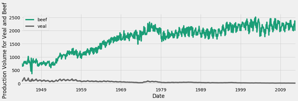
处理不同量纲

牛肉和小牛肉的时间序列

用 Python 可视化时间序列数据

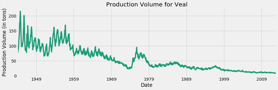
仅小牛肉

仅小牛肉的时间序列

用 Python 可视化时间序列数据

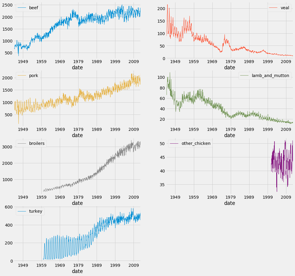
分面图

df.plot(subplots=True,
                linewidth=0.5,
                layout=(2, 4),
                figsize=(16, 10),
                sharex=False,
                sharey=False)

plt.show()
用 Python 可视化时间序列数据

分面图

用 Python 可视化时间序列数据

动手时间!

用 Python 可视化时间序列数据

Preparing Video For Download...