R 中的可视化最佳实践
Nick Strayer
Instructor
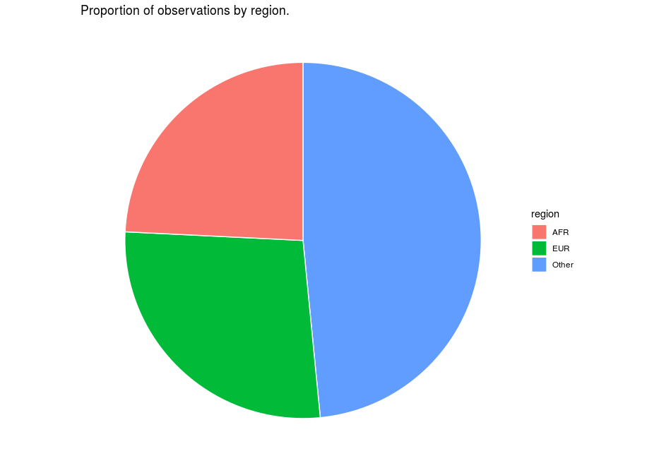
who_disease %>%
  mutate(
    region = ifelse(
      region %in% c('EUR', 'AFR'),
      region, 'Other')
  ) %>%
  ggplot(aes(x = 1, fill = region)) +
    geom_bar(color = 'white') +
    coord_polar(theta = "y") +
    theme_void()
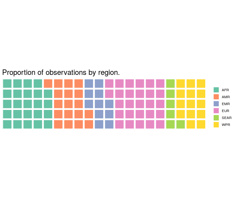
obs_by_region <- who_disease %>%
  group_by(region) %>% summarise(num_obs = n()) %>%
  mutate(percent = round(num_obs/sum(num_obs)*100))

# Array of rounded percentages
percent_by_region <- obs_by_region$percent
names(percent_by_region) <- obs_by_region$region

# Send array of percentages to waffle plot function
waffle::waffle(percent_by_region, rows = 5)