可视化财务比率以便比较
用 Python 分析财务报表

Rohan Chatterjee
Risk Modeler
绘制两家公司的比率
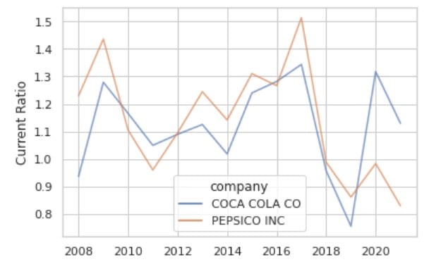
使用 sns.lineplot() 时的拥挤问题
该图在很小空间内包含过多信息,显得拥挤
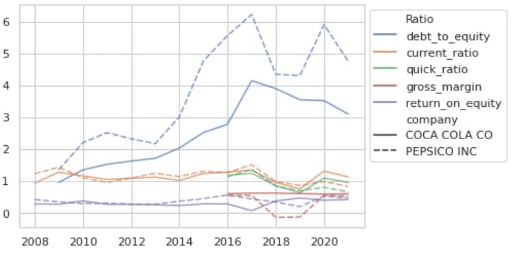
介绍 sns.relplot()
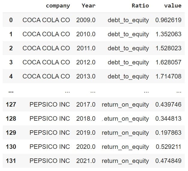
第一步:对 DataFrame 执行 melt,得到长格式数据。
"未 melt"的 DataFrame:
plot_df.head()
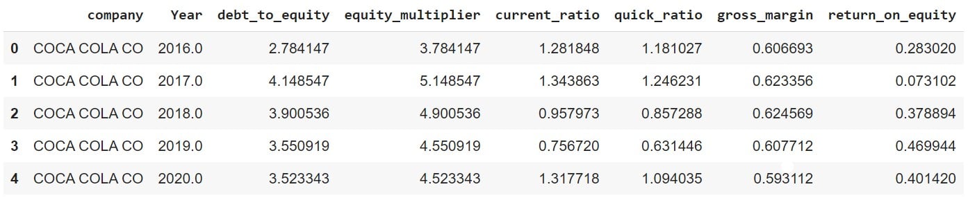
现在对 DataFrame 执行 melt
plot_df_melt = plot_df.melt(id_vars = ['company','Year'], var_name = "Ratio")
使用 sns.relplot() 绘制比率
ax = sns.relplot(data=df_melt, x="Year",
                 y="value", hue="Ratio",
                 alpha=0.7,
                 col='company',
                 kind='line')
ax.set_ylabels('')
ax.set_xlabels('')
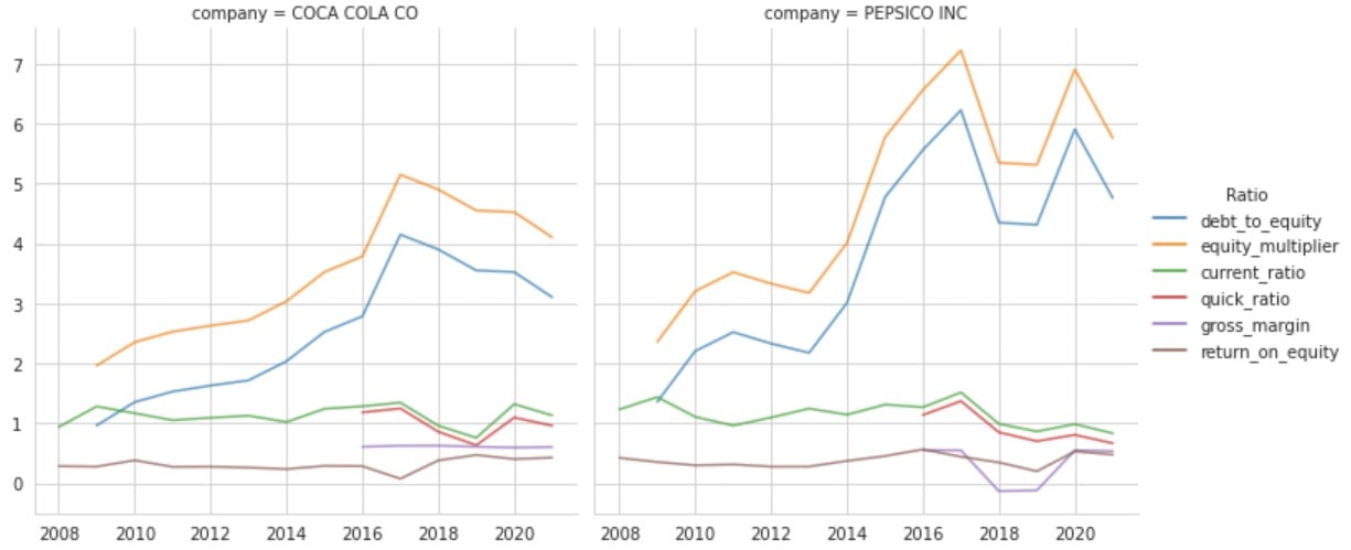
放大查看图表

