import matplotlib.pyplot as plt
import numpy as np
# 绘图

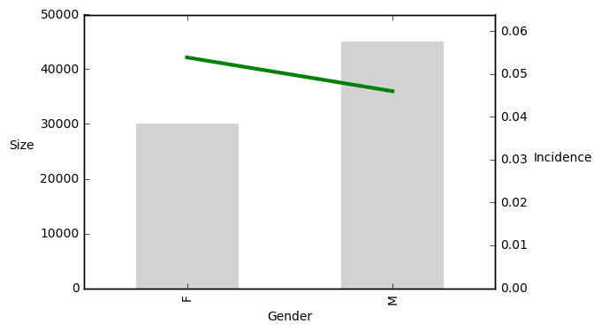
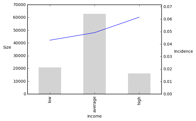
plt.ylabel("Size", rotation = 0,rotation_mode="anchor", ha = "right" )

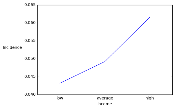
pig_table["Incidence"].plot(secondary_y = True)

pig_table["Size"].plot(kind='bar', width = 0.5,
                color = "lightgray", edgecolor = "none") ## 添加柱形

# 显示组名
plt.xticks(np.arange(len(pig_table)), pig_table["income"])
# 使组名居中
plt.xlim([-0.5, len(pt)-0.5])
plt.ylabel("Incidence", rotation = 0, rotation_mode="anchor", ha = "right"
plt.xlabel("Income")
plt.show()