在 Tidyverse 中用数据进行沟通
Timo Grossenbacher
Data Journalist


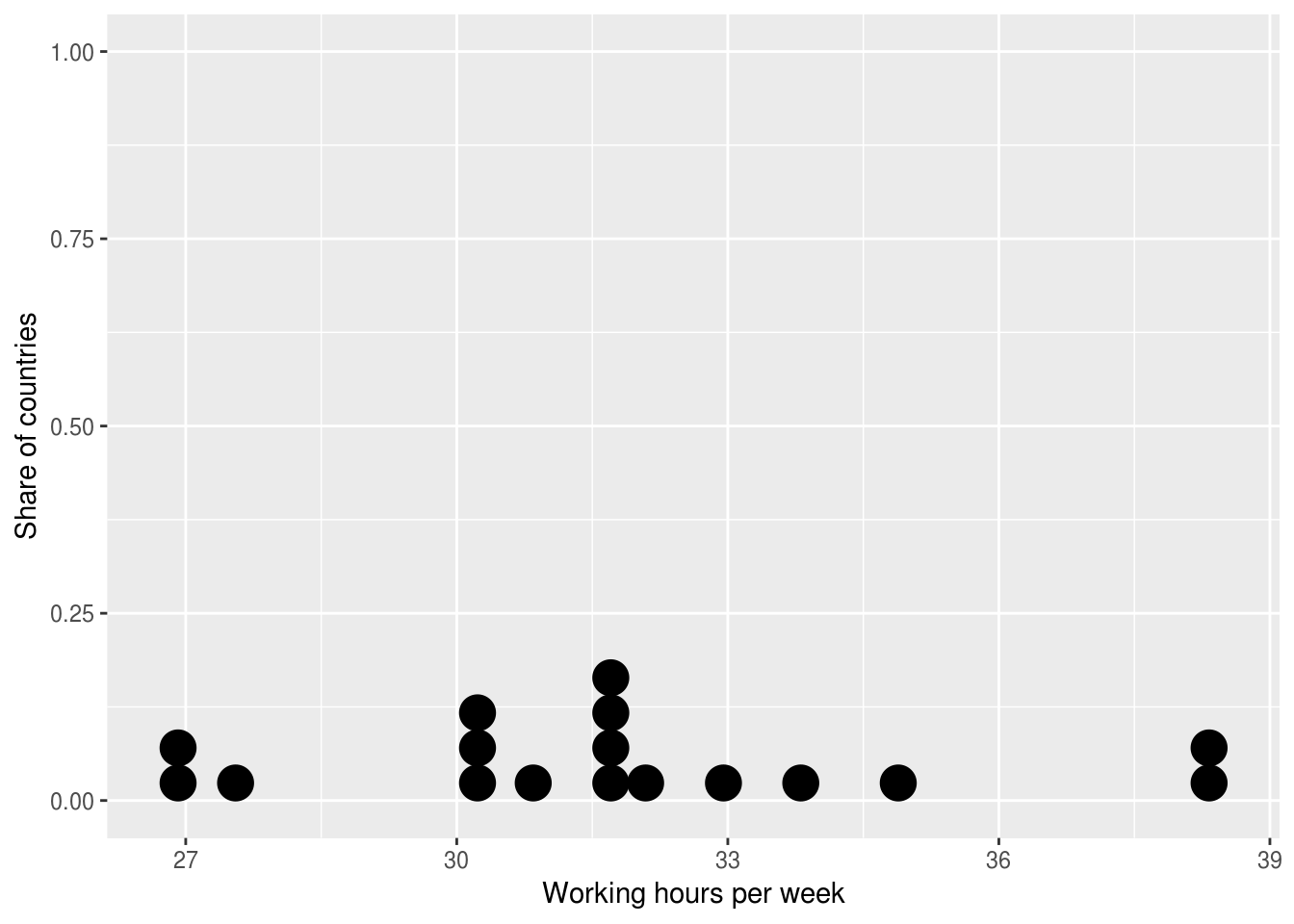
ggplot((ilo_data %>% filter(year == 2006))) +
geom_dotplot(aes(x = working_hours)) +
labs(x = "每周工作时长",
y = "国家占比")
?geom_path
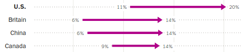
geom_path() 按数据出现的顺序连接观测值。
ilo_data %>%
arrange(country)
# A tibble: 34 x 4
country year hourly_compensation working_hours
<fct> <fct> <dbl> <dbl>
1 Austria 1996 24.75 31.99808
2 Austria 2006 30.46 31.81731
3 Belgium 1996 25.25 31.65385
4 Belgium 2006 31.85 30.21154
5 Czech Rep. 1996 2.94 39.72692
# ... with 29 more rows
ggplot() +
geom_path(aes(x = numeric_variable, y = numeric_variable))
ggplot() +
geom_path(aes(x = numeric_variable, y = factor_variable))
ggplot() +
geom_path(aes(x = numeric_variable, y = factor_variable),
arrow = arrow(___))
在 Tidyverse 中用数据进行沟通