在 R 中使用 tidymodels 建模
David Svancer
Data Scientist
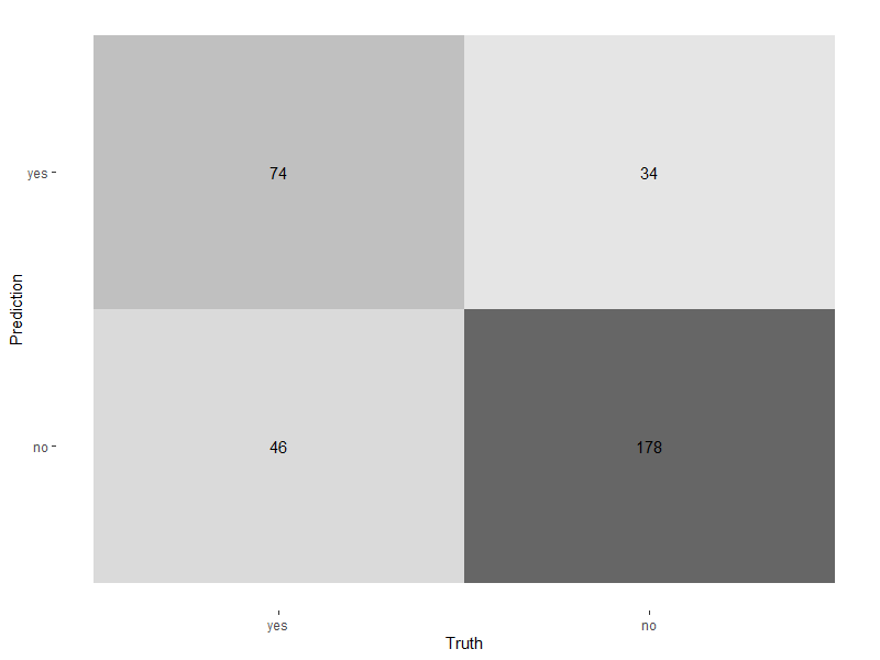
使用 autoplot() 绘制热图
autoplot()type设为'heatmap'
conf_mat(leads_results, truth = purchased, estimate = .pred_class) %>%autoplot(type = 'heatmap')

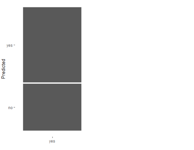
使用 autoplot() 绘制马赛克图
type设为'mosaic'
conf_mat(leads_results,
truth = purchased,
estimate = .pred_class) %>%
autoplot(type = 'mosaic')

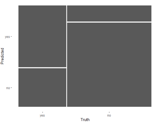
使用 autoplot() 绘制马赛克图
type设为'mosaic'conf_mat(leads_results,
truth = purchased,
estimate = .pred_class) %>%
autoplot(type = 'mosaic')

二分类的默认概率阈值为 0.5
leads_results
.pred_yes≥0.5,则tidymodels中predict()将.pred_class设为'yes'leads_results
# A tibble: 332 x 4
purchased .pred_class .pred_yes .pred_no
<fct> <fct> <dbl> <dbl>
1 no no 0.134 0.866
2 yes yes 0.729 0.271
3 no no 0.133 0.867
4 no no 0.0916 0.908
5 yes yes 0.598 0.402
6 no no 0.128 0.872
7 yes no 0.112 0.888
8 no no 0.169 0.831
9 no no 0.158 0.842
10 yes yes 0.520 0.480
# ... with 322 more rows
分类模型在一系列阈值上的表现如何?
.pred_yes列的唯一概率阈值
| threshold | specificity | sensitivity |
|---|---|---|
| 0 | 0 | 1 |
| 0.11 | 0.01 | 0.98 |
| 0.15 | 0.05 | 0.97 |
| ... | ... | ... |
| 0.84 | 0.89 | 0.08 |
| 0.87 | 0.94 | 0.02 |
| 0.91 | 0.99 | 0 |
| 1 | 1 | 0 |
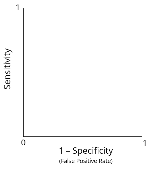
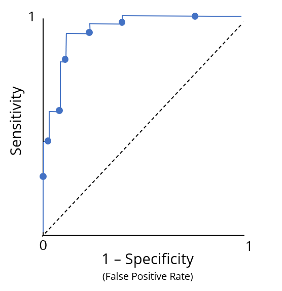
受试者工作特征(ROC)曲线
受试者工作特征(ROC)曲线

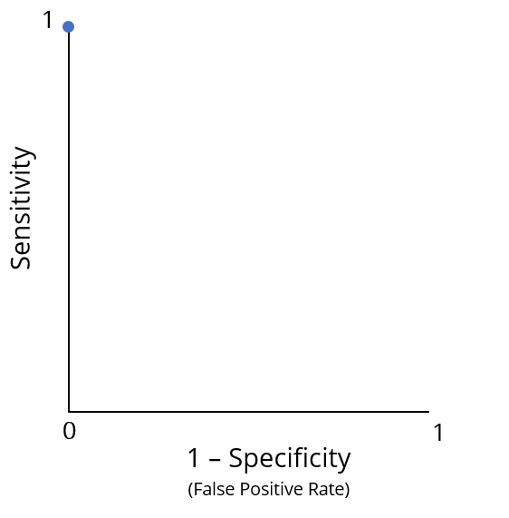
"最佳性能"位于点 (0, 1)
"最佳性能"位于点 (0, 1)
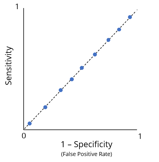
"较差性能"

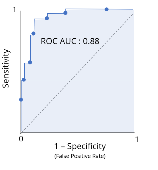
ROC 曲线下面积(ROC AUC)将分类模型的 ROC 信息汇总为单一数值
可将其直观地解读为"绩点"

roc_curve() 函数
truth 列包含真实类别leads_results 中为 .pred_yes
.pred_yes所有唯一阈值的特异度与敏感度的 tibbleleads_results %>%
roc_curve(truth = purchased, .pred_yes)
# A tibble: 331 x 3
.threshold specificity sensitivity
<dbl> <dbl> <dbl>
1 -Inf 0 1
2 0.0871 0 1
3 0.0888 0.00472 1
4 0.0893 0.00943 1
5 0.0896 0.0142 1
6 0.0902 0.0142 0.992
7 0.0916 0.0142 0.983
8 0.0944 0.0189 0.983
# ... with 323 more rows
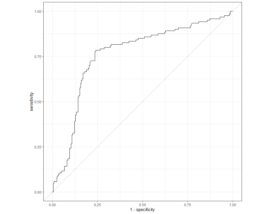
将 roc_curve() 的结果传入 autoplot() 可绘制 ROC 曲线图
leads_results %>%
roc_curve(truth = purchased, .pred_yes) %>%
autoplot()

yardstick 中的 roc_auc() 计算 ROC AUC
truth 列roc_auc(leads_results,
truth = purchased,
.pred_yes)
# A tibble: 1 x 3
.metric .estimator .estimate
<chr> <chr> <dbl>
1 roc_auc binary 0.763
在 R 中使用 tidymodels 建模