多边形映射

在 R 中使用 leaflet 构建交互式地图

Rich Majerus

Vice President of Strategy & Planning, Queens University of Charlotte

绘制多边形

shp %>% 
  leaflet() %>% 
  addTiles() %>% 
  addPolygons()
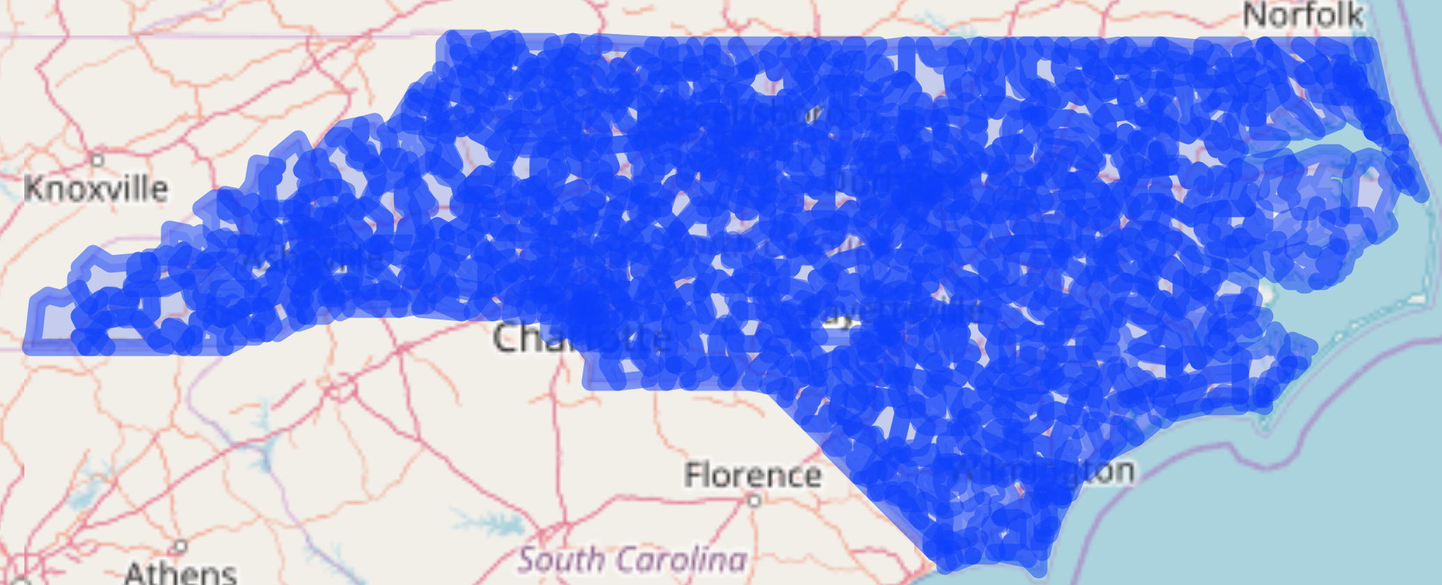
所有北卡邮编 1

在 R 中使用 leaflet 构建交互式地图

addPolygons()

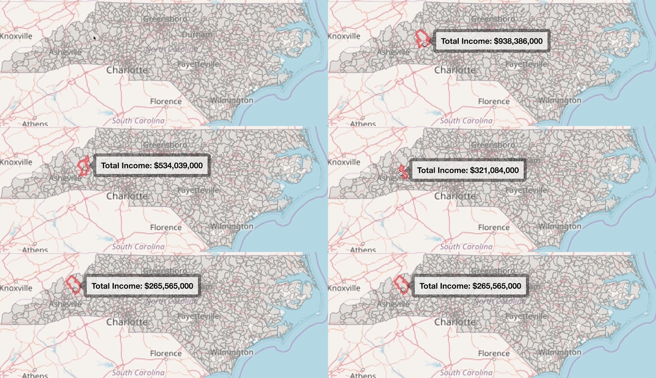
  • weight:边界线像素厚度
  • color:多边形颜色
  • label:悬停时显示的信息
  • highlight:悬停高亮选项
shp %>% 
leaflet() %>% 
addTiles() %>% 
addPolygons(weight = 1,
            color = "grey",
            label = ~paste0("Total Income: " dollar(income)),
            highlight = highlightOptions(weight = 3, color = "red",
                                         bringToFront = TRUE))
在 R 中使用 leaflet 构建交互式地图

addPolygons()

所有北卡邮编 2

在 R 中使用 leaflet 构建交互式地图

数值数据着色

  • colorNumeric

    nc_pal <- colorNumeric(palette = "Blues", 
                           domain = high_inc@data$mean_income)
    
  • colorBin

    nc_pal <- colorBin(palette = "YlGn", bins = 5,
                       domain = high_inc@data$mean_income)
    
  • colorQuantile

    nc_pal <- colorQuantile(palette = "YlGn", n = 4, 
                            domain = high_inc@data$mean_income)
    
在 R 中使用 leaflet 构建交互式地图

colorNumeric()

nc_pal <- colorNumeric("Blues", domain = high_inc@data$mean_income)

previewColors(pal = nc_pal, values = c(seq(100000, 600000, by = 100000)))
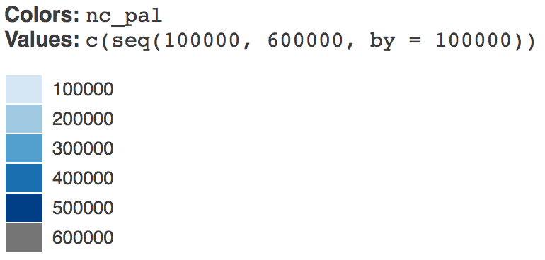
previewColors() 预览

在 R 中使用 leaflet 构建交互式地图

分级着色图

nc_pal <- colorNumeric(palette = "Blues", 
                       domain = shp@data$mean_income)

shp %>% leaflet() %>% addTiles() %>% addPolygons(weight = 1, fillOpacity = 1, color = ~nc_pal(mean_income), label = ~paste0("Mean Income: ", dollar(mean_income)), highlight = highlightOptions(weight = 3, color = "red", bringToFront = TRUE))
在 R 中使用 leaflet 构建交互式地图

分级着色图

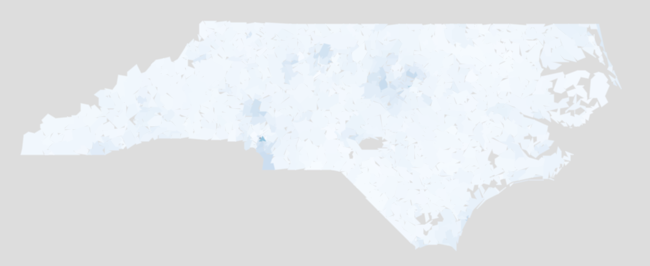
北卡收入分级着色图

在 R 中使用 leaflet 构建交互式地图

分级着色示例

ggplot(shp@data,
       aes(mean_income)) +
  geom_histogram()
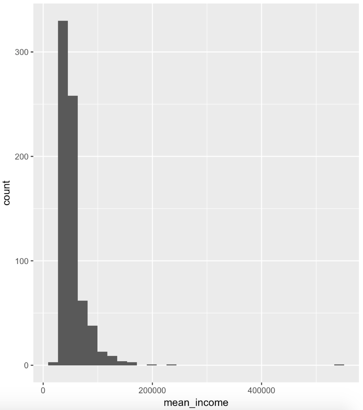
收入直方图

ggplot(shp@data, 
        aes(log(mean_income))) +
  geom_histogram()
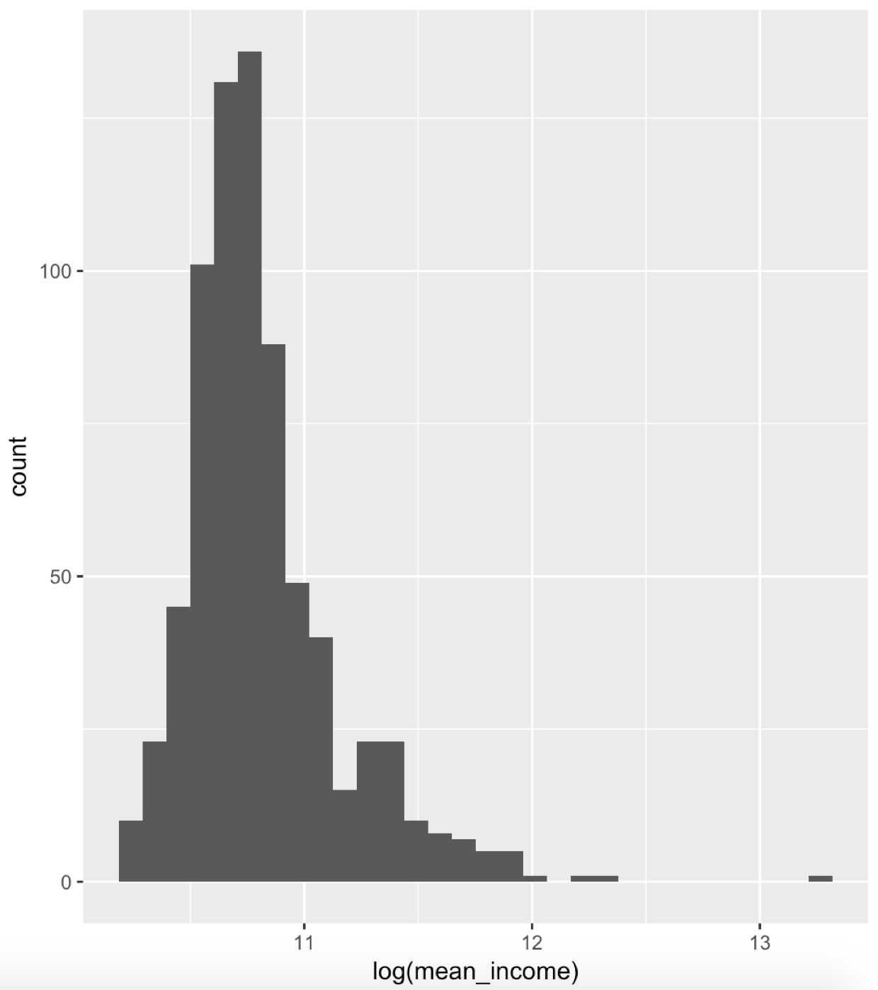
取对数的收入直方图

在 R 中使用 leaflet 构建交互式地图

取对数

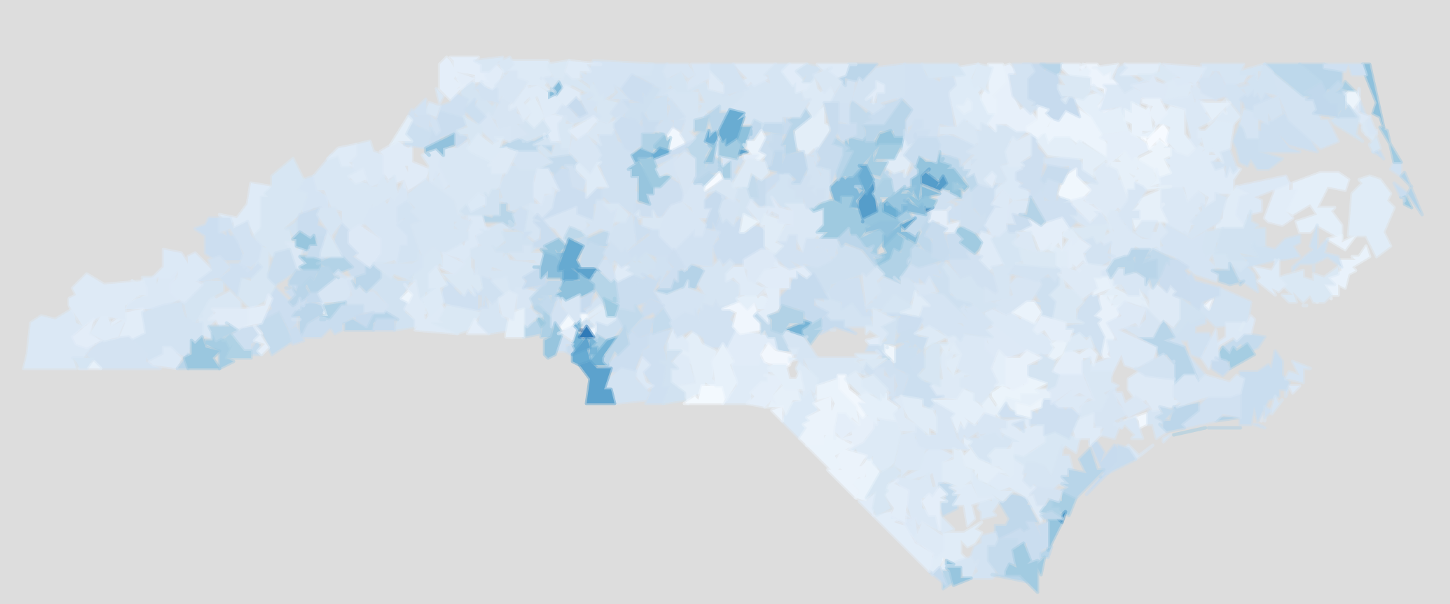
北卡收入取对数分级着色图 1

在 R 中使用 leaflet 构建交互式地图

Passons à la pratique !

在 R 中使用 leaflet 构建交互式地图

Preparing Video For Download...