使用 ggplot2 在 R 中进行可视化

面向 SAS 用户的 R

Melinda Higgins, PhD

Research Professor/Senior Biostatistician Emory University

ggplot2 包

ggplot2 六边形贴纸标志

  • ggplot2 是 R 的强大绘图包
  • ggplot 中的"GG"指"图形语法"
  • ggplot2 通过分层构建图形
  • 在基础图层上添加一个或多个几何对象
面向 SAS 用户的 R

图层 - 基础图层

# 创建 x=sex, y=diameter 的图
ggplot(data = abalone, aes(sex, diameter))
  • ggplot() 定义基础图层
  • 设定 data = abalone
  • aes 设为 sexdiameter

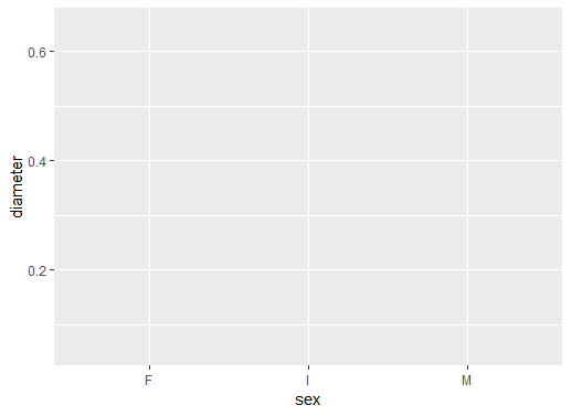
  • 还没有添加几何对象

  • x 轴已就绪:sex
  • y 轴已就绪:diameter
  • 网格已铺好

ggplot2 图形环境,尚无箱线图

面向 SAS 用户的 R

图层 - 添加箱线图 geom

# 添加箱线图几何对象(geom)
ggplot(data = abalone,
       aes(sex, diameter)) +
  geom_boxplot()
  • 用加号 + 添加图层
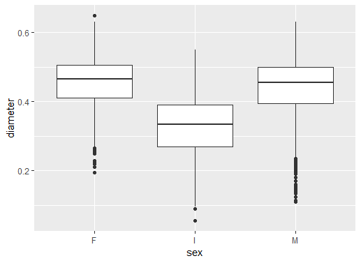
  • 添加箱线图 geom_boxplot()

  • 得到一组箱线图

  • 按性别展示鲍鱼直径
  • F 雌性,I 幼体,M 雄性

ggplot2 已添加箱线图

面向 SAS 用户的 R

图层 - 添加主题

# 添加黑白主题
ggplot(data = abalone,
       aes(sex, diameter)) +
  geom_boxplot() +
  theme_bw()
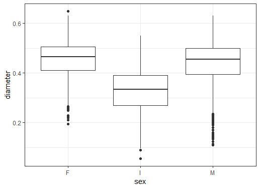
  • theme_bw() 添加"主题"层
  • 去除灰色背景
  • 在图周围加黑色边框

ggplot2 箱线图添加黑白主题

面向 SAS 用户的 R

将箱线图 geom 改为小提琴图 geom

# 改为 geom_violin()
ggplot(data = abalone,
       aes(sex, diameter)) +
  geom_violin() +
  theme_bw()
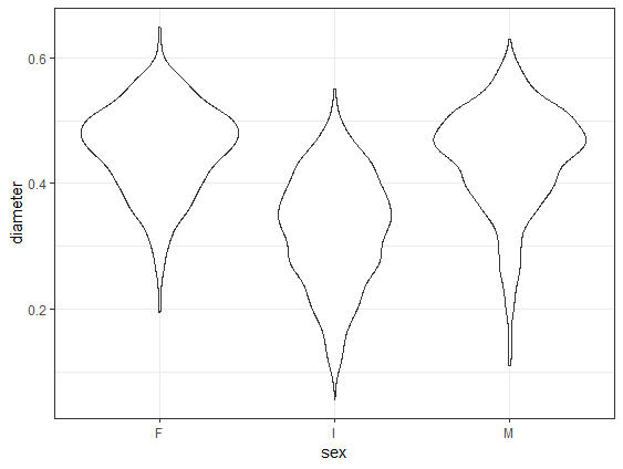
  • geom_violin 替换 geom_boxplot
  • 形状类似小提琴
  • 反映数据密度分布
  • 小改动即可生成新图

ggplot2 小提琴图

面向 SAS 用户的 R

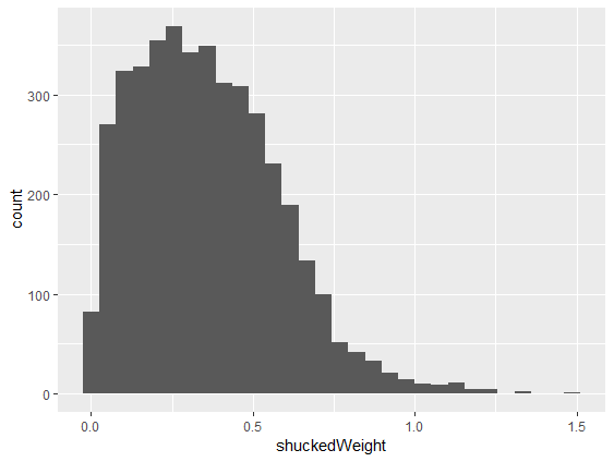
单变量直方图

# 绘制 shuckedWeight 的直方图
ggplot(abalone, aes(shuckedWeight)) +
  geom_histogram()
  • 为单个变量绘制直方图
  • 一个变量 = 一个美学映射
  • 添加 geom_histogram()
  • aes() 设为 shuckedWeight
  • 默认配色需调整

ggplot2 直方图全黑

面向 SAS 用户的 R

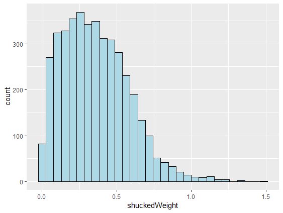
直方图添加配色

# 线条设为黑色,填充浅蓝
ggplot(abalone, aes(shuckedWeight)) +
  geom_histogram(color = "black",
                 fill = "lightblue")
  • 修改图形参数
  • 设置箱线的 color
  • 设置箱体的 fill 颜色
  • 选项都在 () 内设置
  • 图形更美观

ggplot2 直方图蓝色柱黑色边

面向 SAS 用户的 R

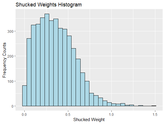
直方图添加标题与轴标签

# 添加坐标轴标签和标题
ggplot(abalone, aes(shuckedWeight)) +
  geom_histogram(color = "black",
                 fill = "lightblue") +
  xlab("Shucked Weight") +
  ylab("Frequency Counts") +
  ggtitle("Shucked Weights Histogram")
  • 为坐标轴和标题添加更佳标签
  • 轴用 xlab()ylab()
  • 标题用 ggtitle()
  • 图形可发布

ggplot2 直方图添加坐标轴标签与标题

面向 SAS 用户的 R

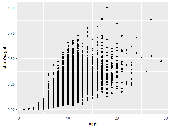
绘制散点图

# 用 geom_point() 绘制散点图
ggplot(abalone,
       aes(rings, shellWeight)) +
  geom_point()
  • 散点图的 aes 需两个变量
  • geom_point() 添加点
  • 按 rings 显示 shellWeight 的散点图

ggplot2 按 rings 的 shellweight 散点图

面向 SAS 用户的 R

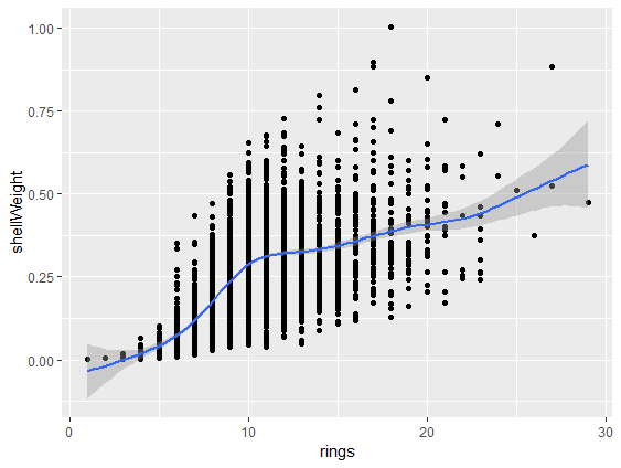
散点图添加平滑拟合线

# 添加平滑拟合线
ggplot(abalone,
       aes(rings, shellWeight)) +
  geom_point() +
  geom_smooth()
  • 在散点图上添加 geom_smooth() 线
  • 含阴影置信区间

ggplot2 散点图添加平滑拟合线

面向 SAS 用户的 R

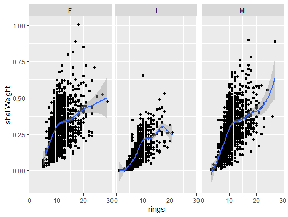
按另一变量创建分面

# 用 facet_wrap() 添加分面
ggplot(abalone,
       aes(rings, shellWeight)) +
  geom_point() +
  geom_smooth() +
  facet_wrap(vars(sex))
  • 在散点图上再加一层
  • 为每个性别创建面板
  • 添加 facet_wrap()
  • vars(sex) 指定分面变量

ggplot2 按性别的三面板散点图

面向 SAS 用户的 R

课程其余内容

  • 第1章:图形入门
    • 夯实 ggplot2 绘图基础
    • 按性别可视化鲍鱼测量值
  • 第2章:数据整理
    • 清洗鲍鱼数据集
  • 第3章:数据探索
    • 描述统计、相关与比较检验
  • 第4章:建模与结果呈现
    • 用测量值预测鲍鱼年龄
    • 按性别比较模型
面向 SAS 用户的 R

为鲍鱼做些图吧

面向 SAS 用户的 R

Preparing Video For Download...