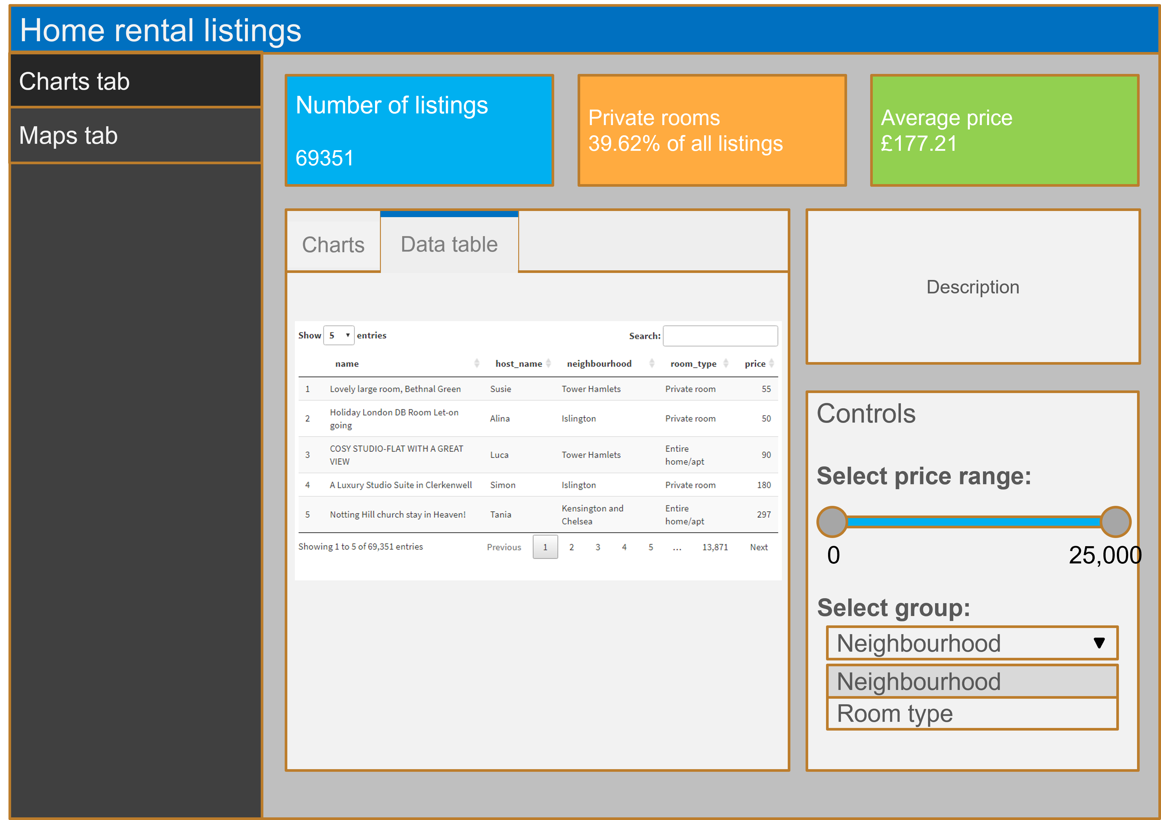
使用 shinydashboard 构建仪表板
Png Kee Seng
Researcher
我们在伦敦的一家旅行社工作。
游客需要住宿。
我们能如何帮助他们?


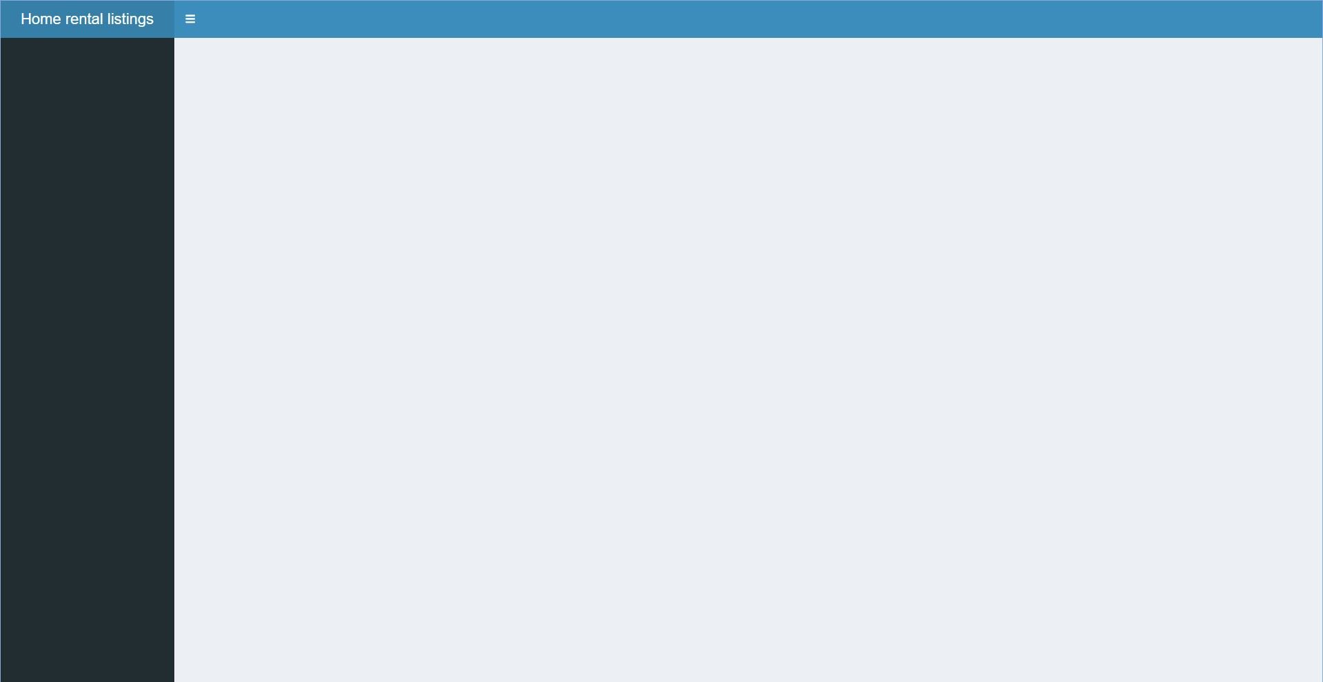
header <- dashboardHeader(
title = "Home rental listings")
sidebar <- dashboardSidebar()
body <- dashboardBody()
ui <- dashboardPage(header,
sidebar,
body)
server <- function(input, output) {}
shinyApp(ui, server)
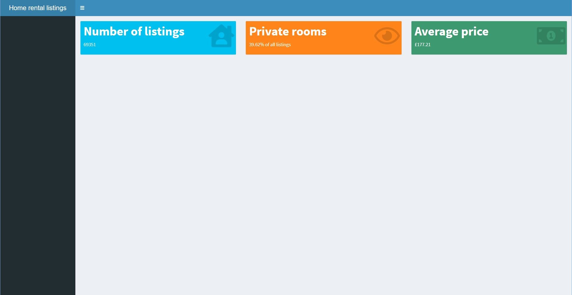
在 body 中:
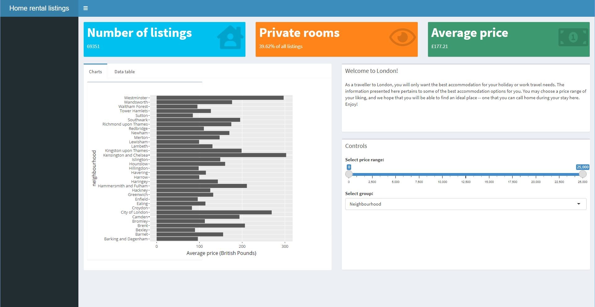
fluidRow(
valueBoxOutput(outputId = "count"),
valueBoxOutput(outputId = "prop"),
valueBoxOutput(outputId = "avg"))
在 server 中:
output$count <- renderValueBox({
valueBox(..., icon = ...)})
output$prop <- renderValueBox(...)
...
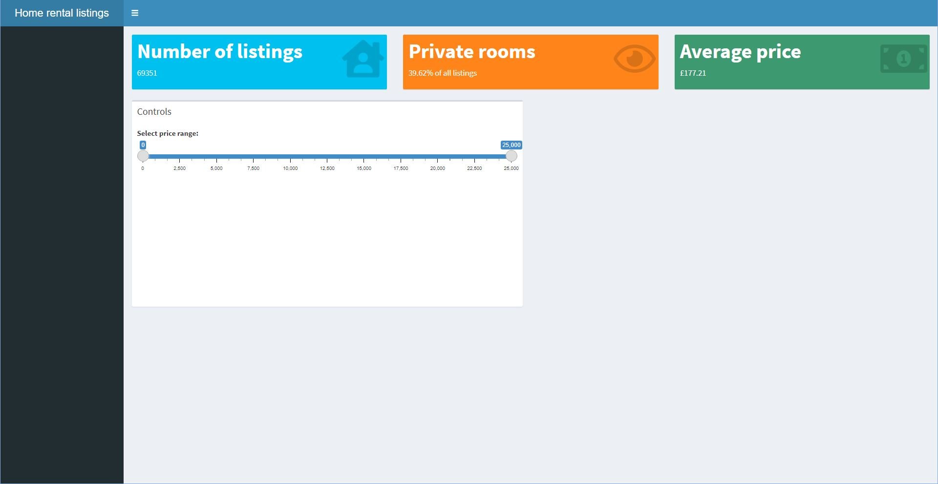
在 body 中:
box(
side = "right", ...,
sliderInput(inputId = "range",
label = "选择价格范围:",
min = 0,
max = 25000,
value = c(0,25000))
))
在 server 中更新,使用 input$range[1] 和 input$range[2]

在 body 中:
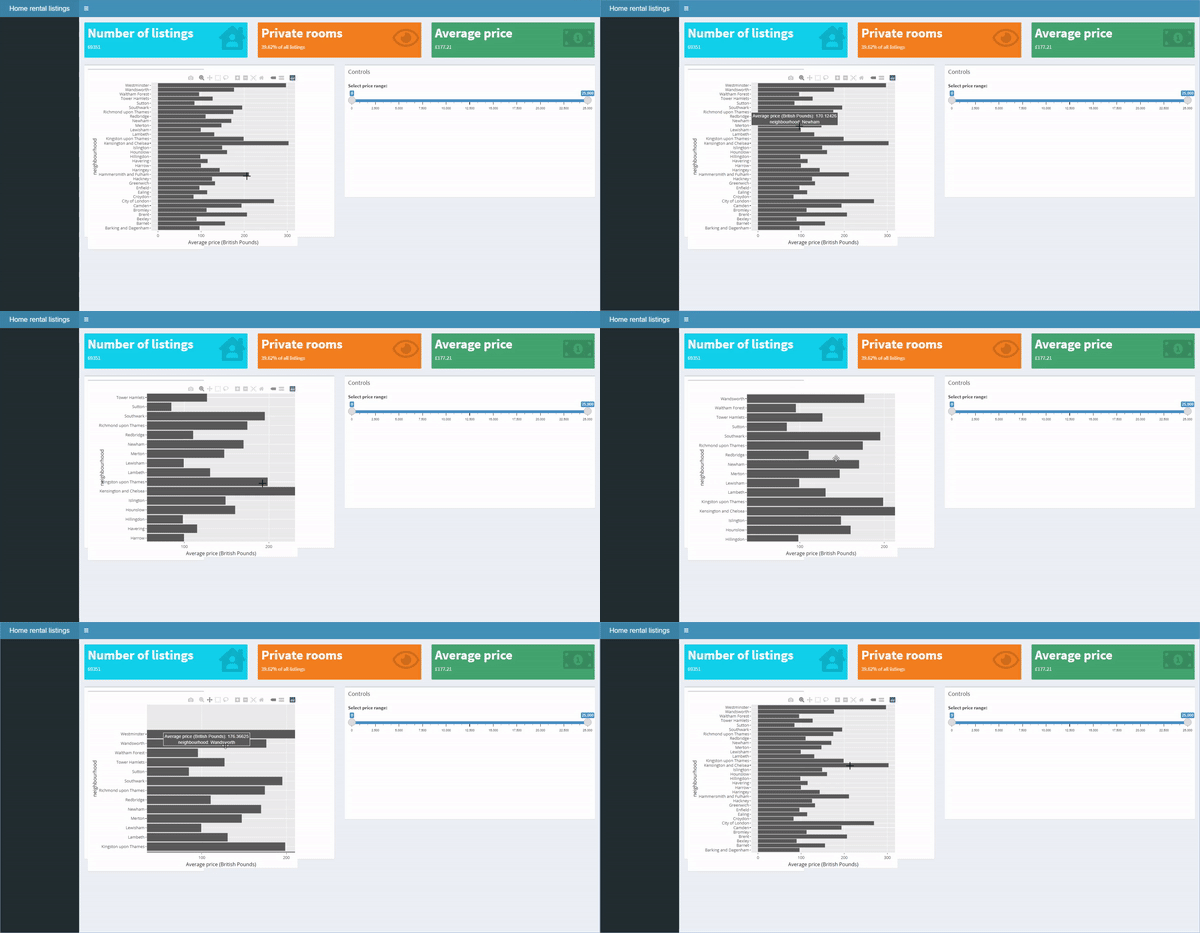
plotlyOutput("plots",
height = 500,
width = 600)
在 server 中:
output$plots <- renderPlotly({
...
})

在 body 中:
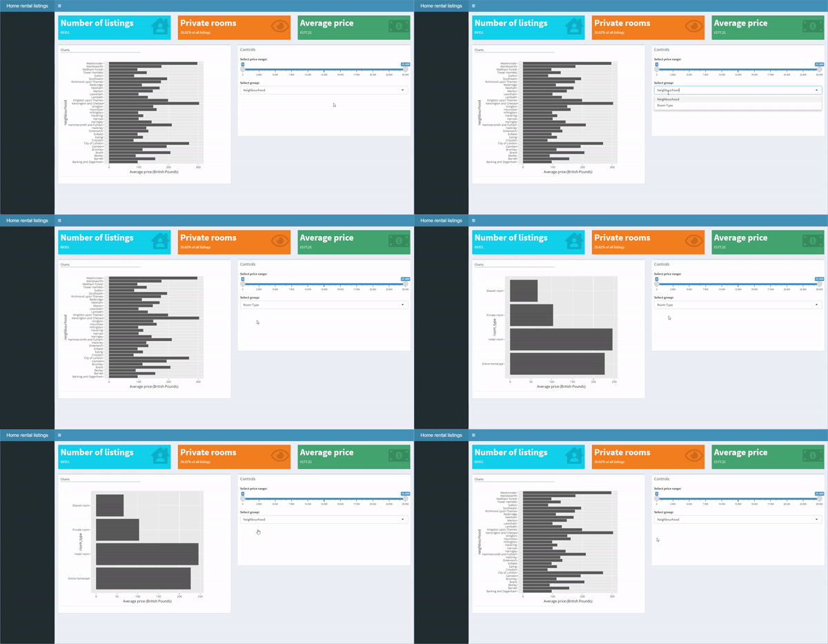
selectInput(inputId = "select",
label = "选择分组:",
choices = c("Neighbourhood",
"Room Type"))
在 server 中:
output$plots <- renderPlotly({
if (input$select == ...){plot1}
else if(input$select == ...){plot2}
})
在 body 中:
box(side = "right", ...,
title = "欢迎来到伦敦!",
"...")
在 body 中更新:
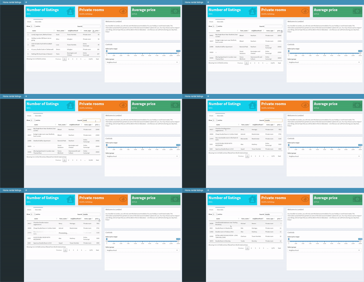
tabBox(id = "tabset", ...,
tabPanel("Charts", ...),
tabPanel("Data table", ...)

可使用 shiny 函数。
在 body 中:
dataTableOutput("table")
在 server 中:
output$table <-
renderDataTable(listings)

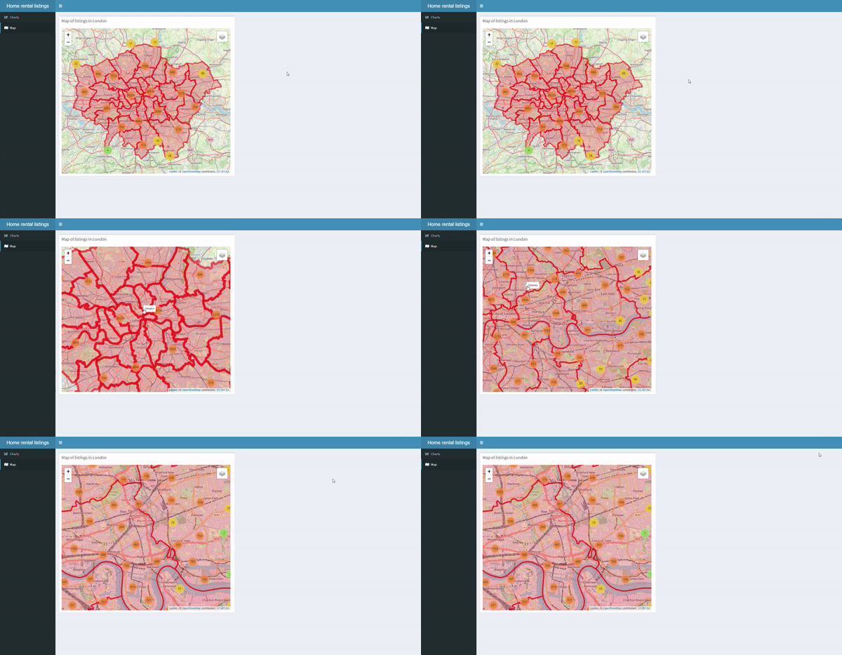
在 sidebar 中:
sidebarMenu(
menuItem("Charts", ...),
menuItem("Map", ...))
在 body 中:
leafletOutput("map",...)
在 server 中:
output$map <- renderLeaflet(map)
使用 shinydashboard 构建仪表板