介绍

R 中级交互式数据可视化(plotly)

Adam Loy

Statistician, Carleton College

动机
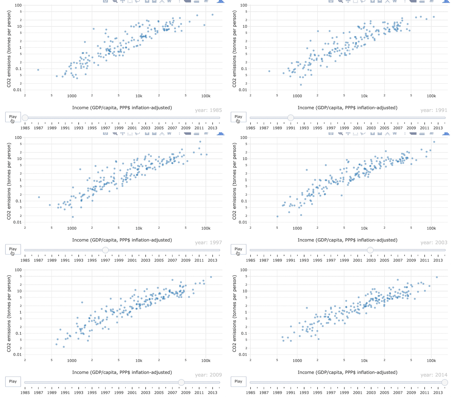
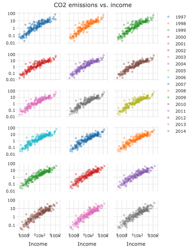
1985–2014 年人均 GDP 与二氧化碳排放的动画散点图

基于动画更容易看出随时间的变化,还是基于分面视图?

ch1_1_motivation.png

R 中级交互式数据可视化(plotly)

plotly

  • 用于交互式与动态网页图形的可视化库

  • 仍在积极开发中

R 中级交互式数据可视化(plotly)

图形类型

  • 静态

  • 交互式

  • 动态

R 中级交互式数据可视化(plotly)

静态图形

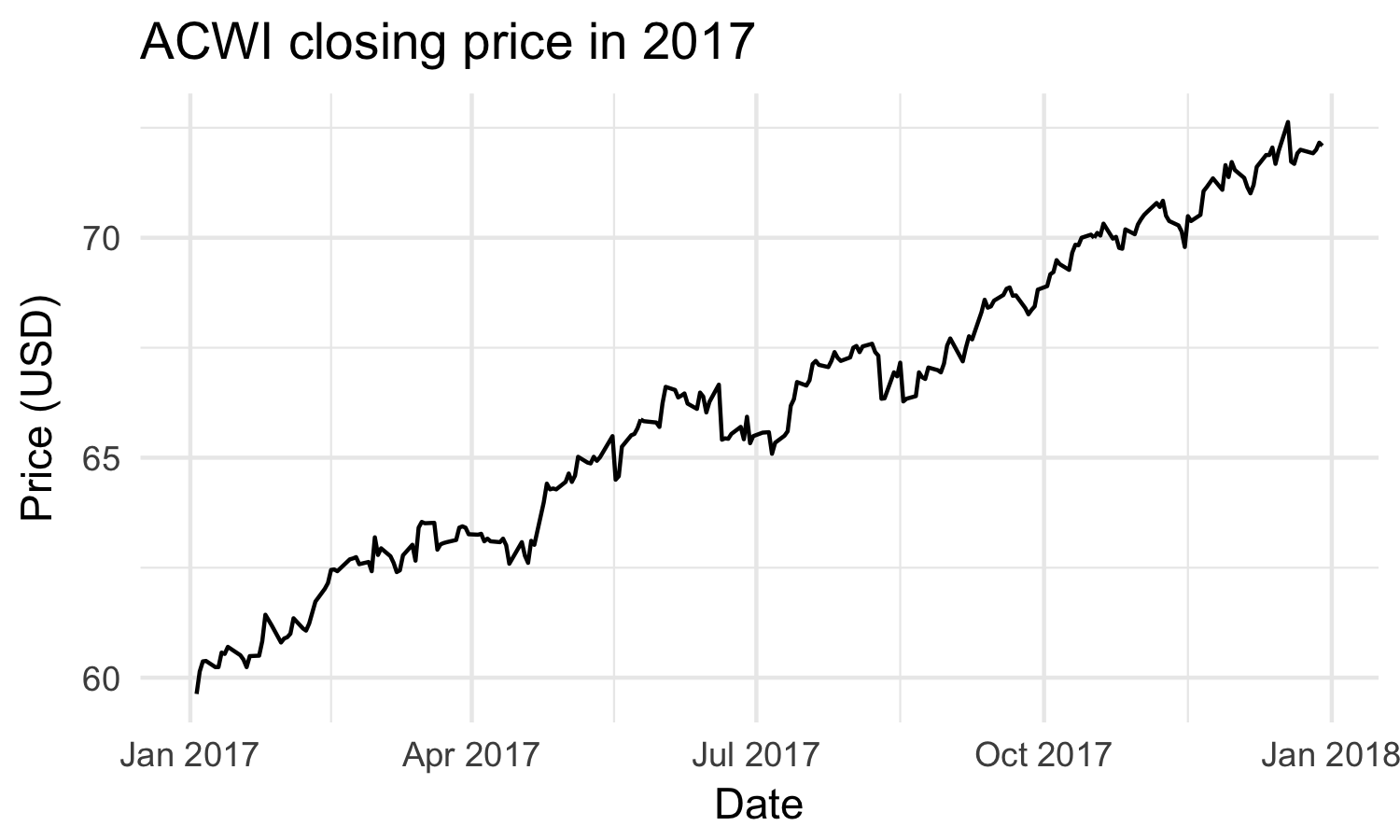
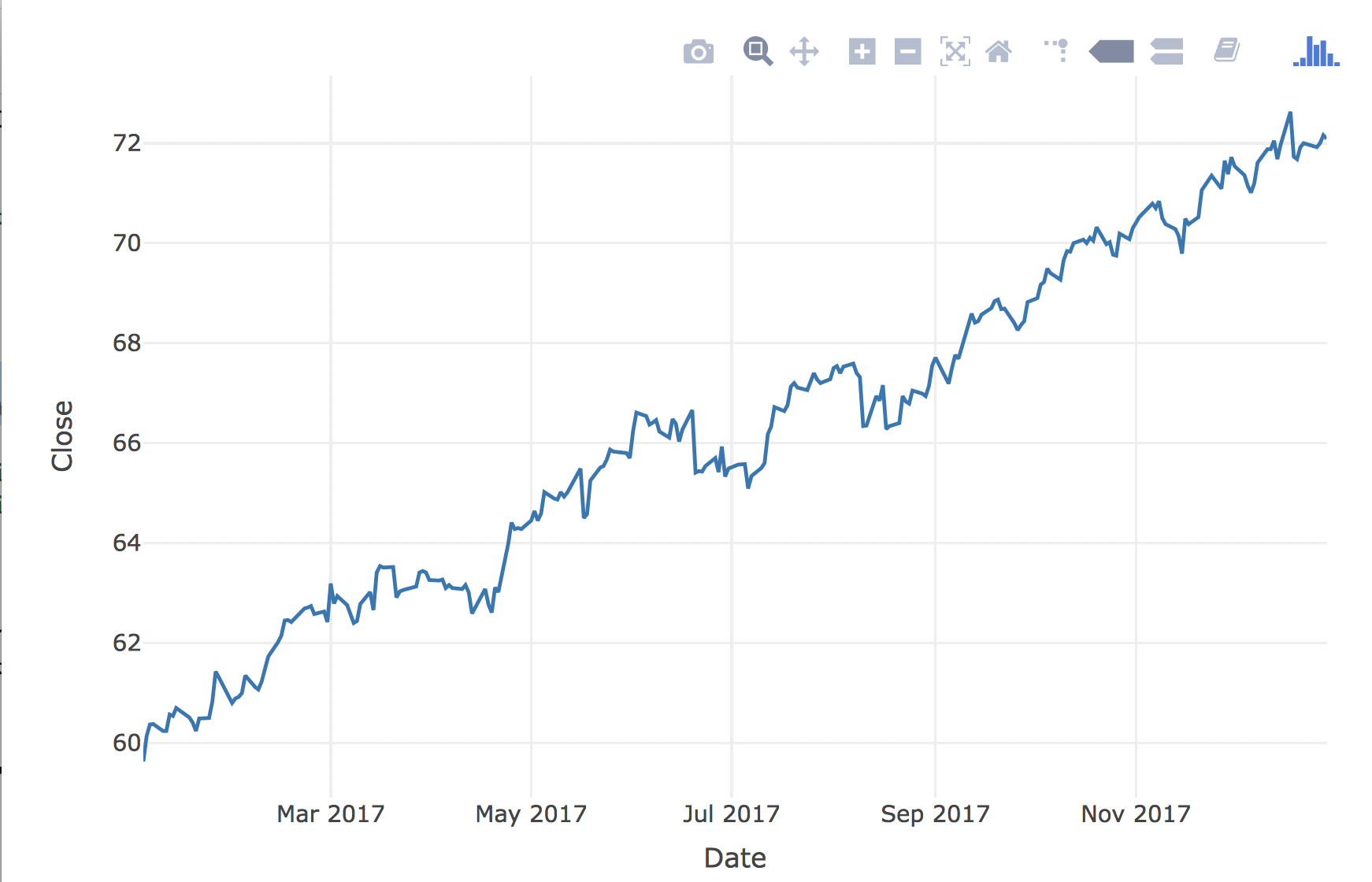
静态图形在创建后保持不变

2017 年 ACWI 的时间序列图

R 中级交互式数据可视化(plotly)

交互式图形

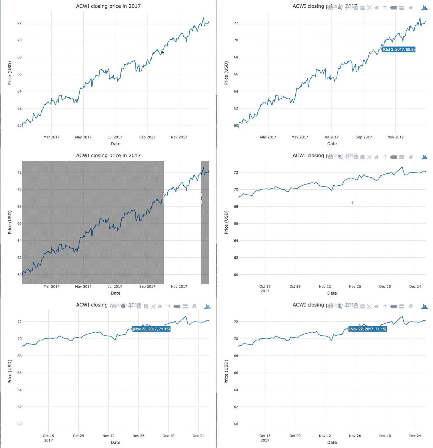
交互式图形会根据用户的操作而变化

悬停与缩放交互示例

R 中级交互式数据可视化(plotly)

动态图形

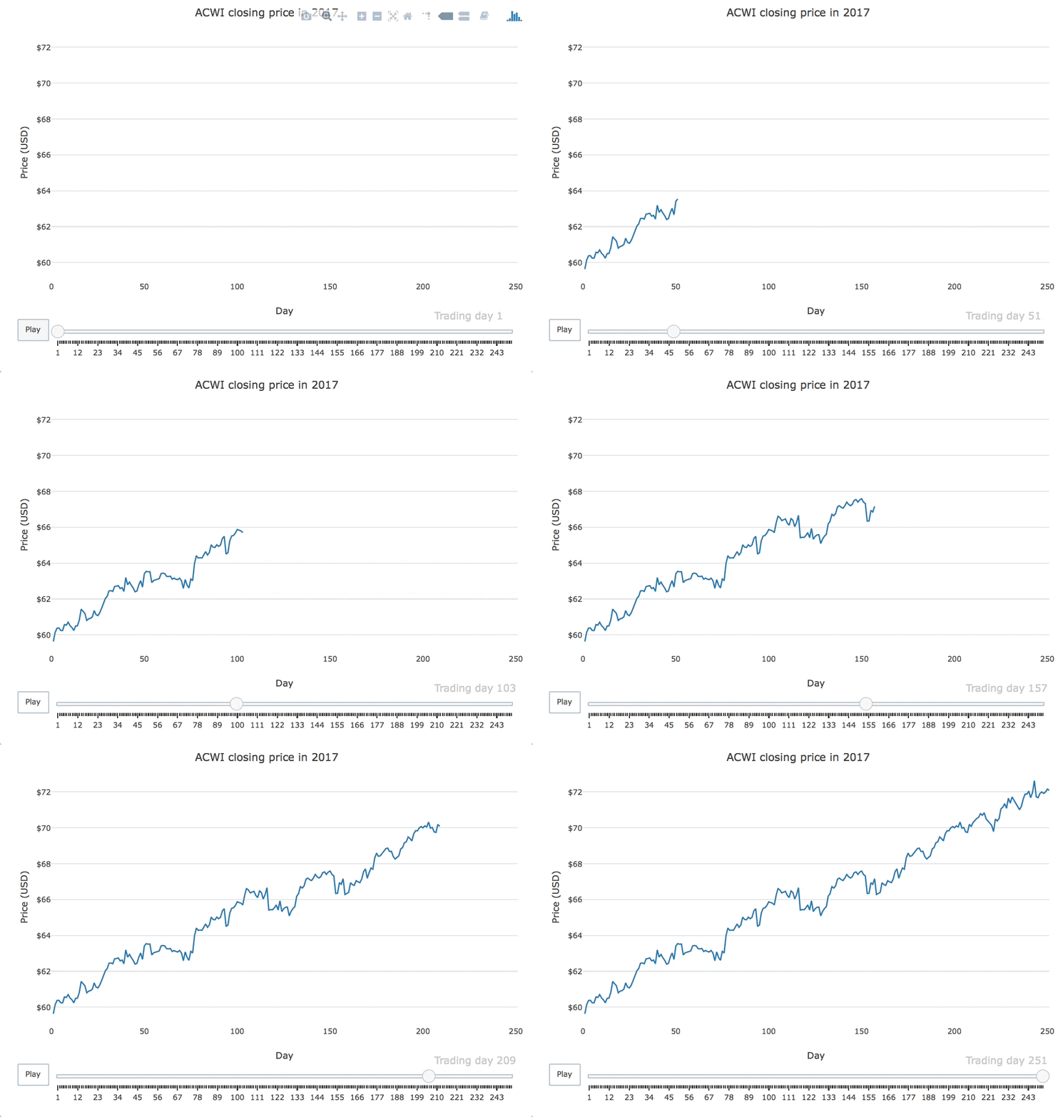
动态图形会在无用户输入的情况下周期性变化

2017 年 ACWI 收盘价的动画时间序列图

R 中级交互式数据可视化(plotly)

plotly 回顾

msci
# A tibble: 251 x 7
   Date        Open  High   Low Close Volume Adjusted
   <date>     <dbl> <dbl> <dbl> <dbl>  <int>    <dbl>
 1 2017-01-03  79.8  79.8  78.4  78.7 646000     77.4
 2 2017-01-04  79.1  81.1  79.1  80.7 849200     79.3
 3 2017-01-05  80.4  81.8  80.4  81.6 557500     80.2
 4 2017-01-06  81.8  83.9  81.8  83.4 597800     82.0
 5 2017-01-09  83.1  83.5  82.6  82.7 668100     81.3
 6 2017-01-10  82.3  82.6  81.1  81.5 558900     80.1
 7 2017-01-11  81.2  81.6  80.8  81.5 365500     80.1
# ... with 244 more rows
R 中级交互式数据可视化(plotly)

plotly 回顾

library(plotly)

msci %>% plot_ly(x = ~Date, y = ~Close) %>% add_lines()
R 中级交互式数据可视化(plotly)

交互式时间序列图

R 中级交互式数据可视化(plotly)

让我们来练习!

R 中级交互式数据可视化(plotly)

Preparing Video For Download...