添加图层
R 中级交互式数据可视化(plotly)

Adam Loy
Statistician, Carleton College
文本图层
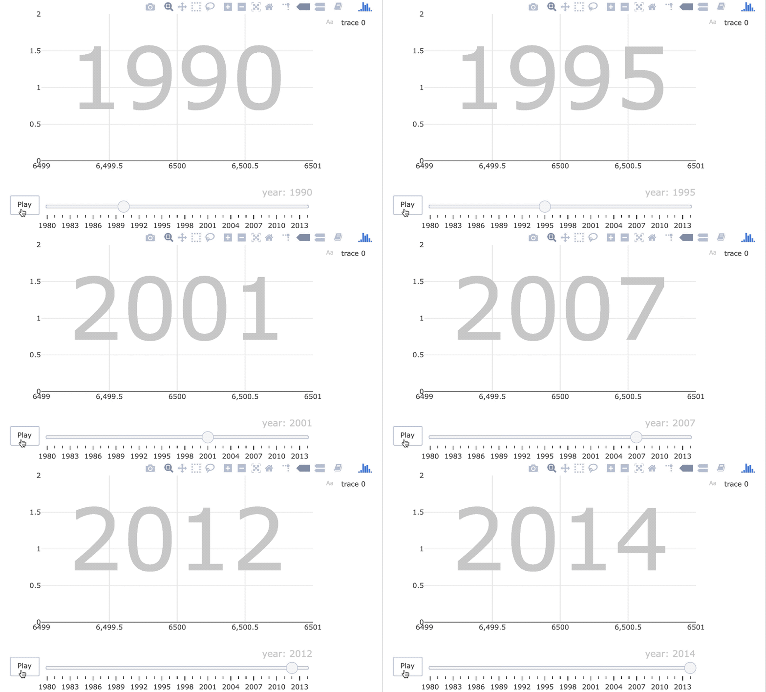
world_indicators %>%
  plot_ly(x = ~income, y = ~co2) %>%
  add_text(
    x = 6500, y = 1, text = ~year, frame = ~year,
    textfont = list(size = 150, color = toRGB("gray80"))
  )
润色
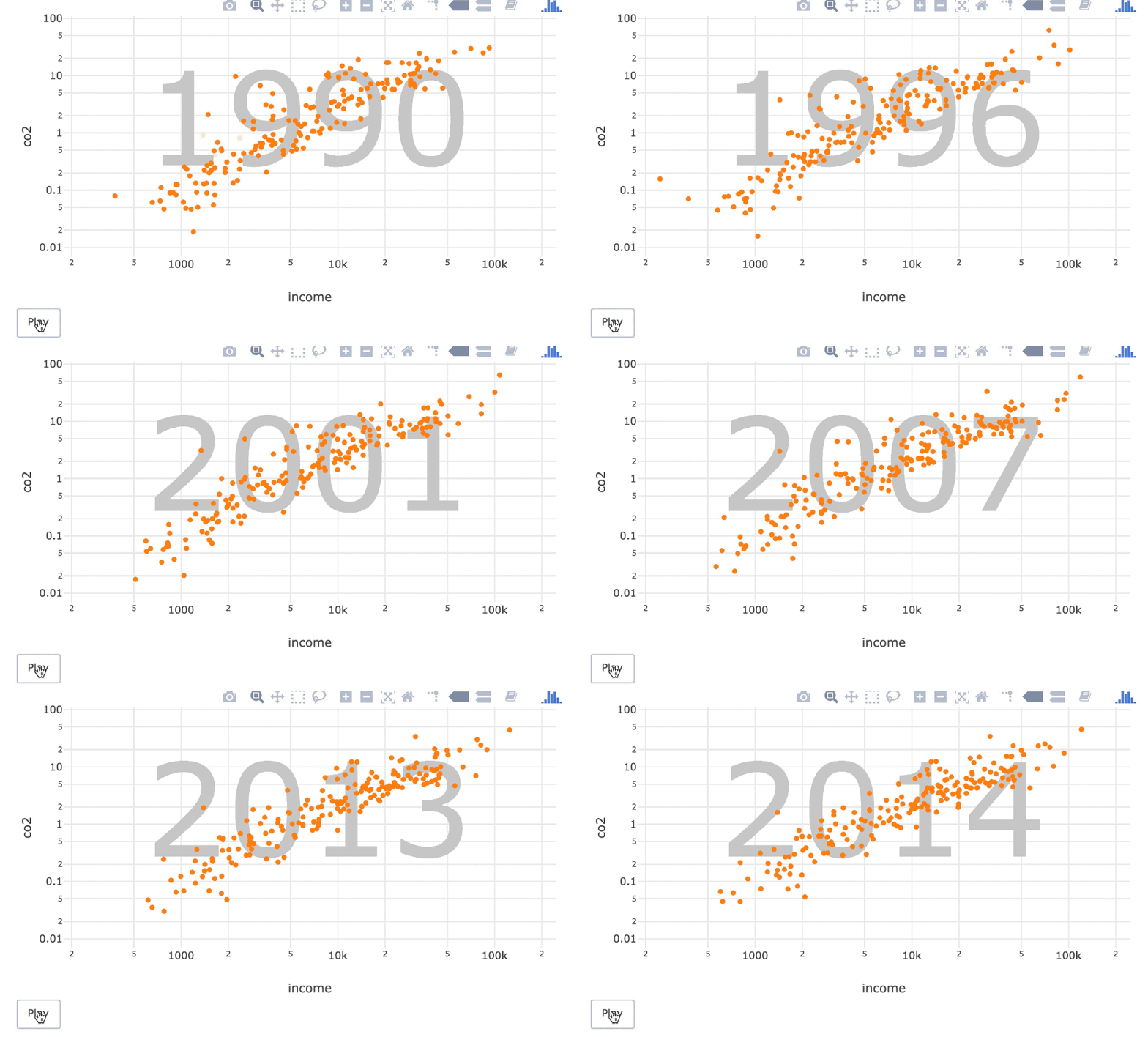
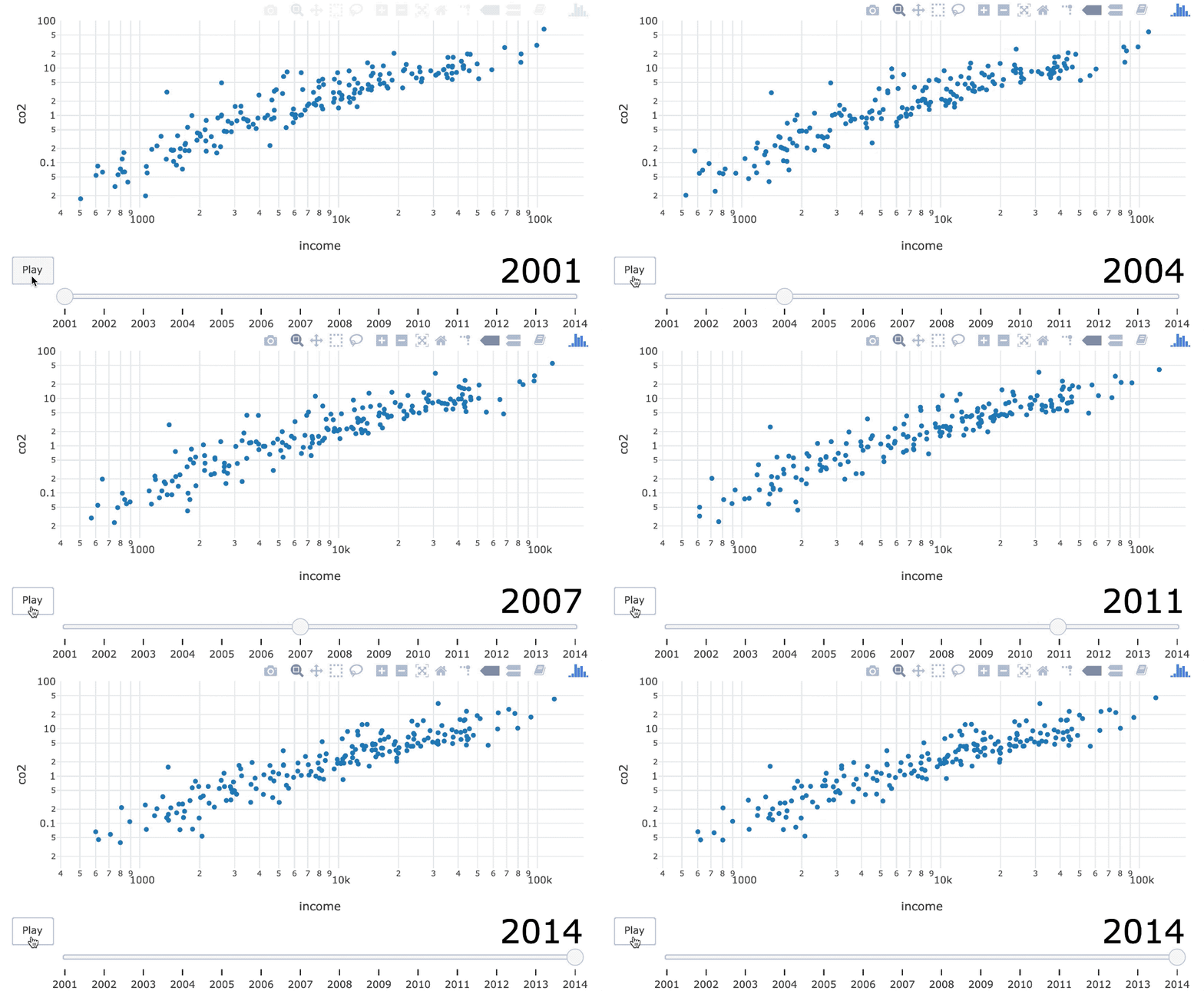
world_indicators %>%
  plot_ly(x = ~income, y = ~co2) %>%
  add_text(
    x = 6500, y = 1, text = ~year, frame = ~year,
    textfont = list(size = 150, color = toRGB("gray80"))
  ) %>%
  add_markers(frame = ~year, ids = ~country) %>%
  layout(
    xaxis = list(type = "log"), yaxis = list(type = "log"),
    showlegend = FALSE
  ) %>%
  animation_slider(hide = TRUE)