R 中级交互式数据可视化(plotly)
Adam Loy
Statistician, Carleton College
library(plotly)
library(crosstalk)
shared_data <- world2014 %>% SharedData$new()

p1 <- shared_data %>%
  plot_ly(x=~income, y = ~co2, color = ~four_regions) %>%
  add_markers() %>%
  layout(xaxis = list(type = "log"), yaxis = list(type = "log"))
p2 <- shared_data %>%
  plot_ly(x=~income, y = ~life_expectancy, color = ~four_regions) %>%
  add_markers() %>%
  layout(xaxis = list(type = "log")))

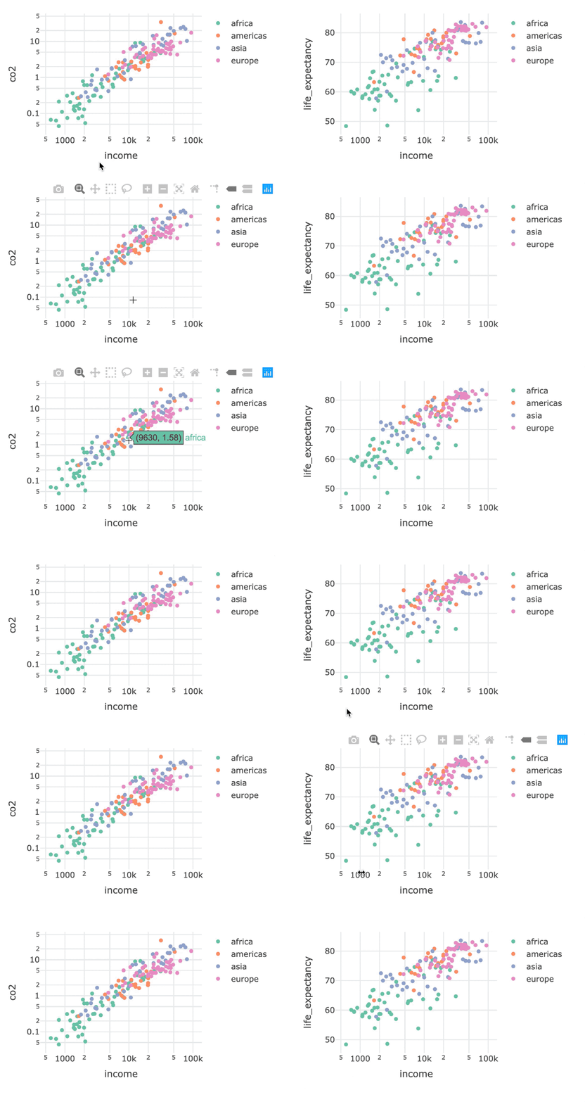
bscols(p1, p2)
library(plotly) library(crosstalk) shared_data <- world2014 %>% SharedData$new()
p1 <- shared_data %>% plot_ly(x=~income, y = ~co2, color = ~four_regions) %>% add_markers() %>% layout(xaxis = list(type = "log"), yaxis = list(type = "log")) p2 <- shared_data %>% plot_ly(x=~income, y = ~life_expectancy, color = ~four_regions) %>% add_markers() %>% layout(xaxis = list(type = "log")))
bscols(p1, p2)
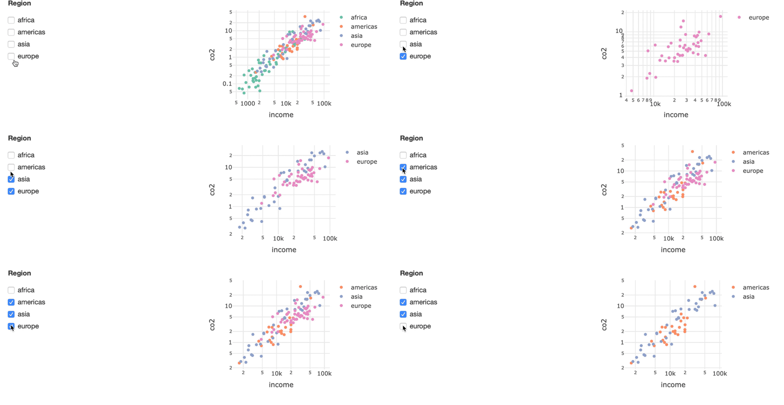
bscols(filter_checkbox(id = "four_regions", label = "Region",
                       sharedData = shared_data, group = ~four_regions),
       p1)
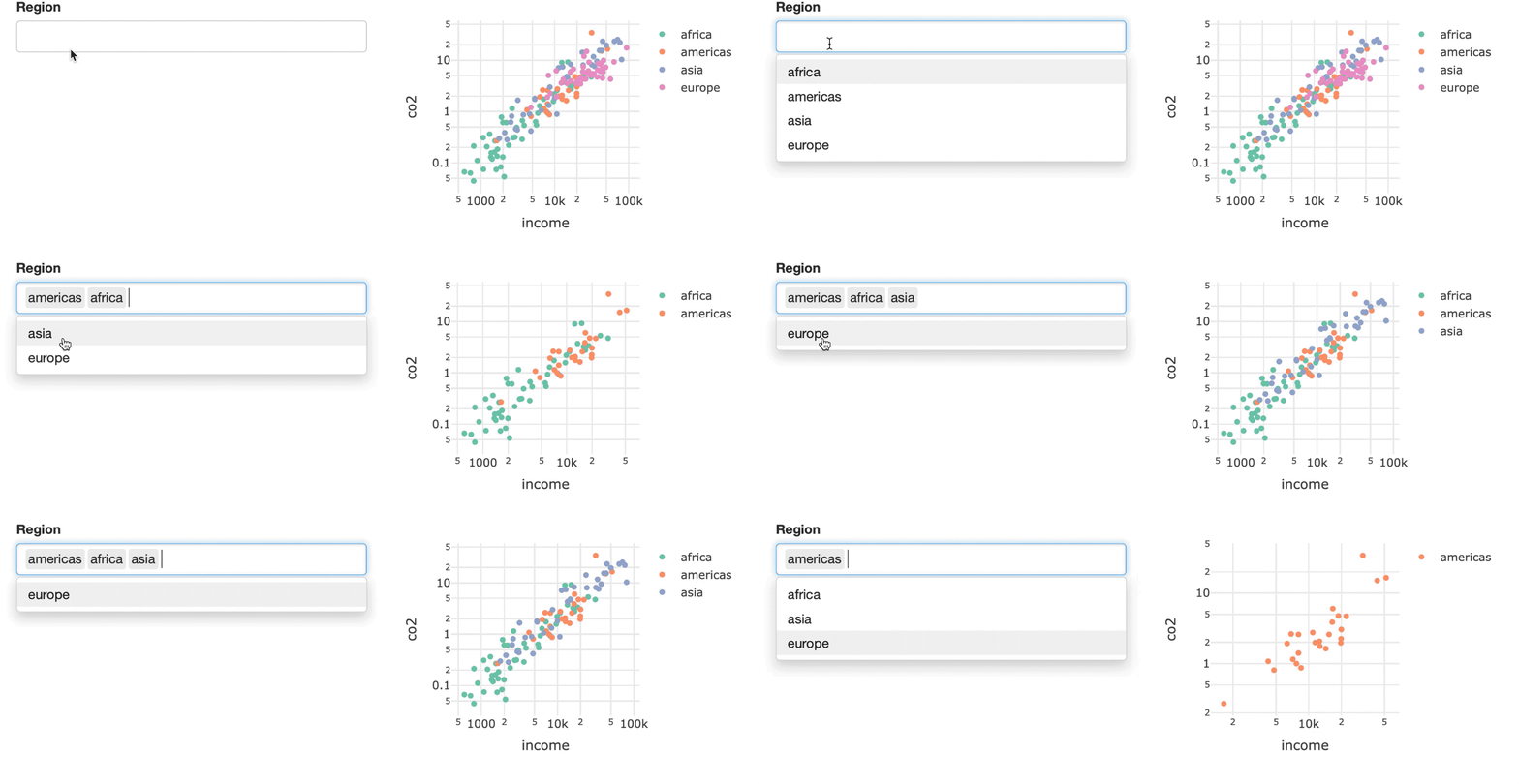
bscols(filter_select(id = "four_regions", label = "Region",
                sharedData = shared_data, group = ~four_regions),
       p1)
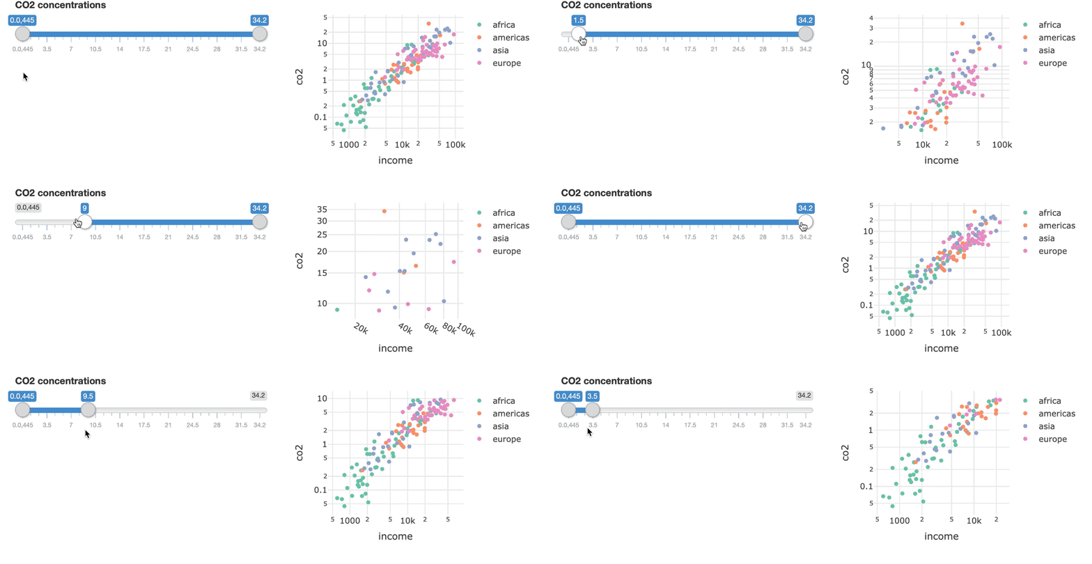
bscols(filter_slider(id = "co2", label = "CO2 concentrations",
                     sharedData = shared_data, column = ~co2),
       p1)
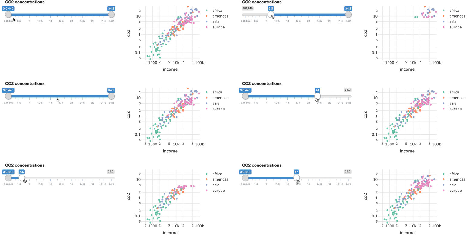
bscols(filter_slider(id = "co2", label = "CO2 concentrations",
                     sharedData = shared_data, column = ~co2),
        p1 %>% layout(xaxis = list(range = c(2.5, 5)),
                      yaxis = list(range = c(-1.4, 1.55)))
)
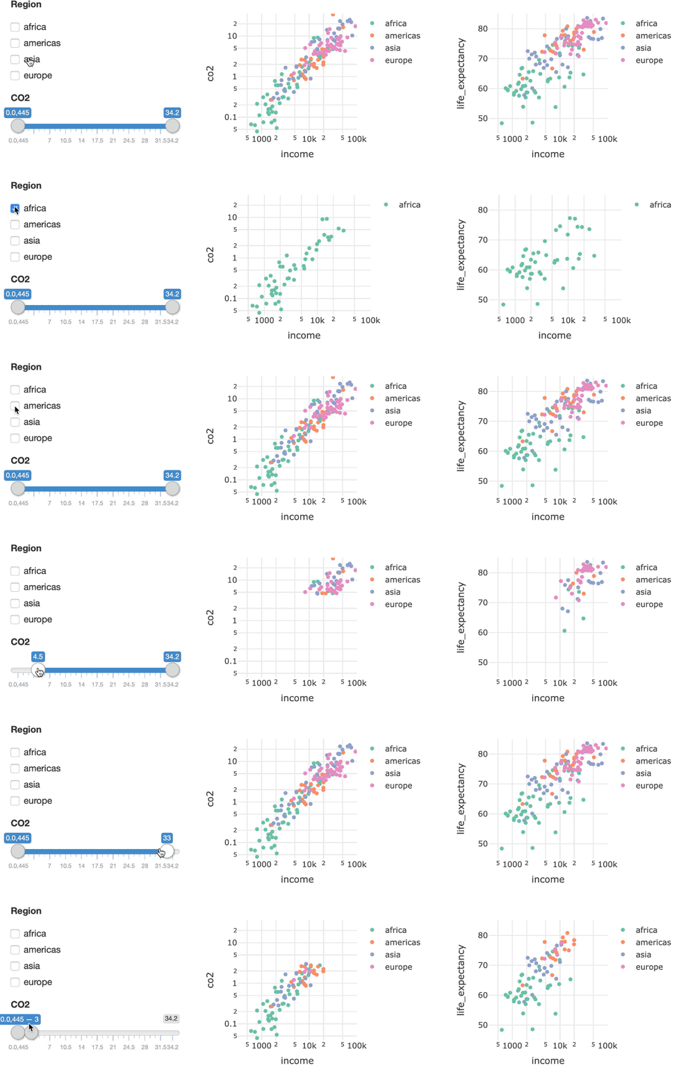
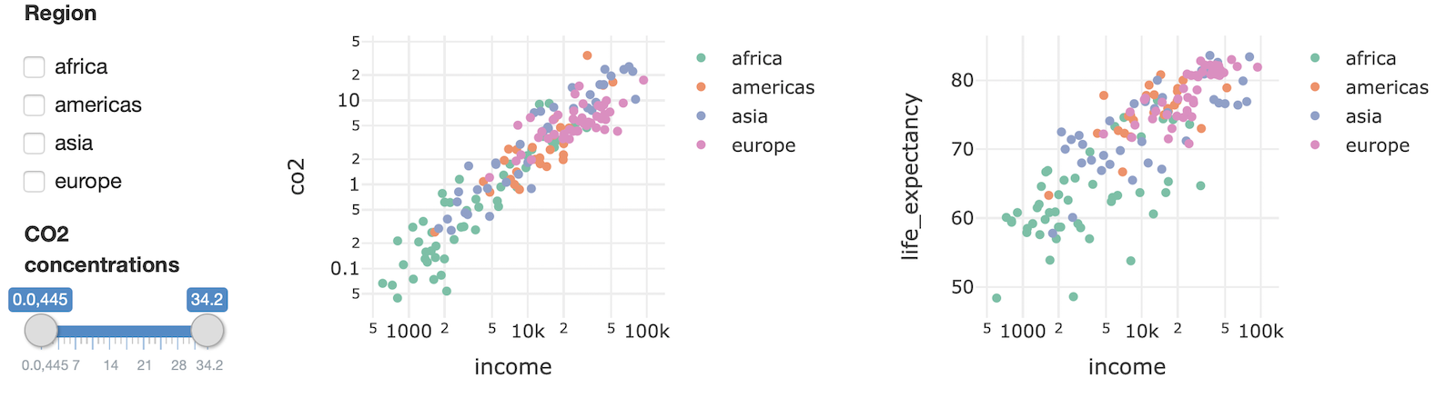
bscols(widths = c(2, 5, 5),
  list(
    filter_checkbox(
      id = "four_regions", label = "Region",
      sharedData = shared_data, group = ~four_regions
    ),
    filter_slider(
      id = "co2", label = "CO2 concentrations",
      sharedData = shared_data, column = ~co2
    )
  ),
  p1,
  p2
)