Peste 95%

Îmbunătățirea vizualizărilor de date în Python

Nick Strayer

Instructor

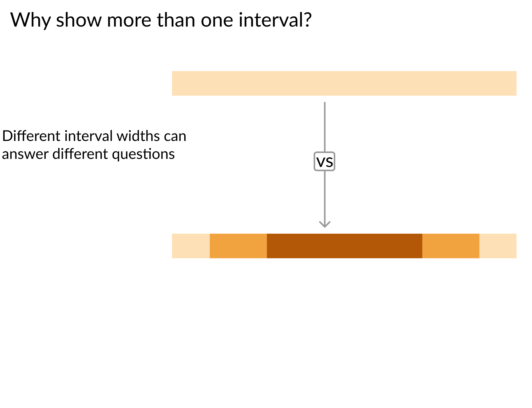
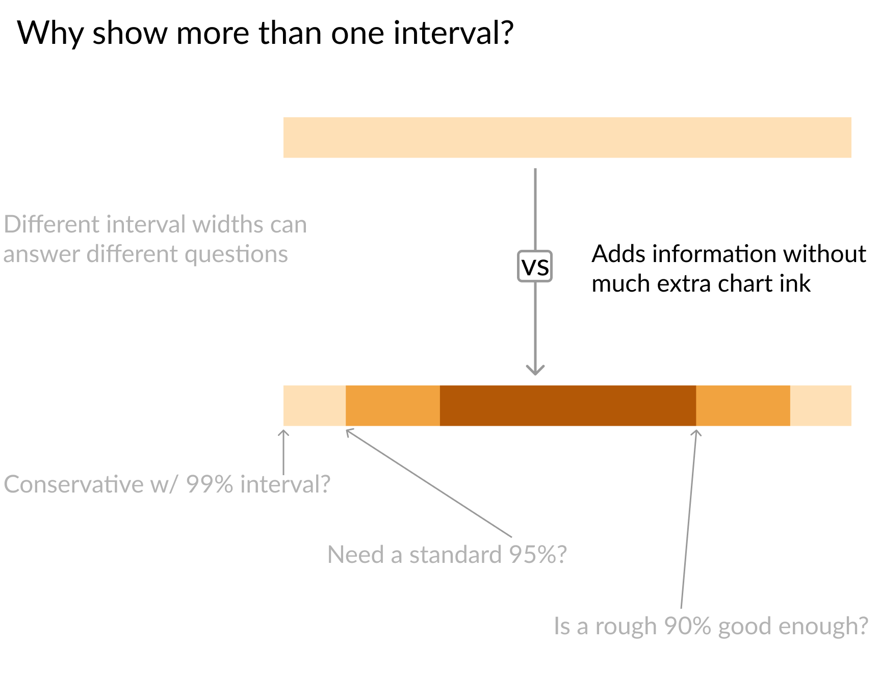
Bandă de încredere pe un singur nivel în partea de sus cu săgeată îndreptată spre o bandă pe trei niveluri dedesubt

Îmbunătățirea vizualizărilor de date în Python

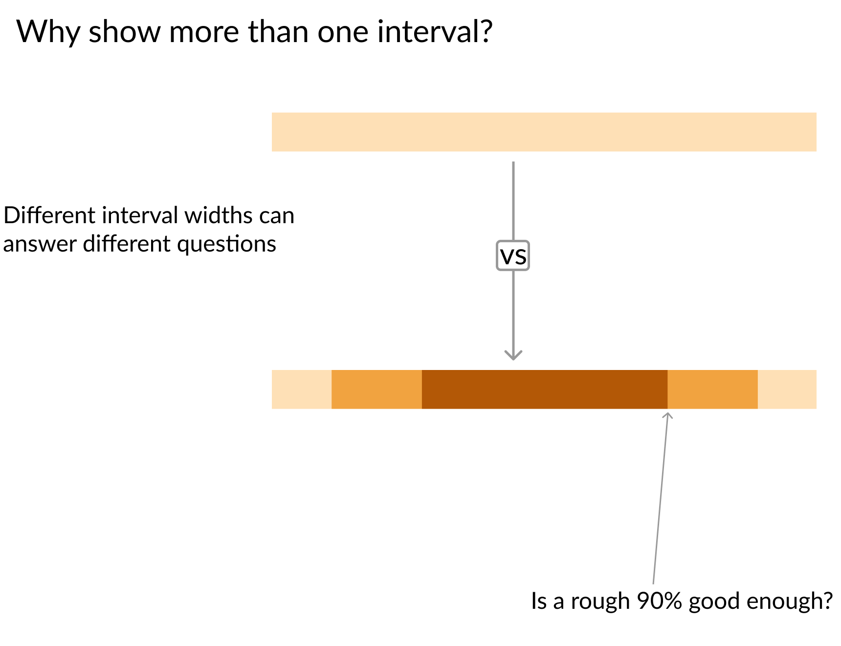
Bandă de încredere pe un singur nivel în partea de sus cu săgeată îndreptată spre o bandă pe trei niveluri dedesubt și săgeată indicând nivelul de 90% al benzii inferioare

Îmbunătățirea vizualizărilor de date în Python

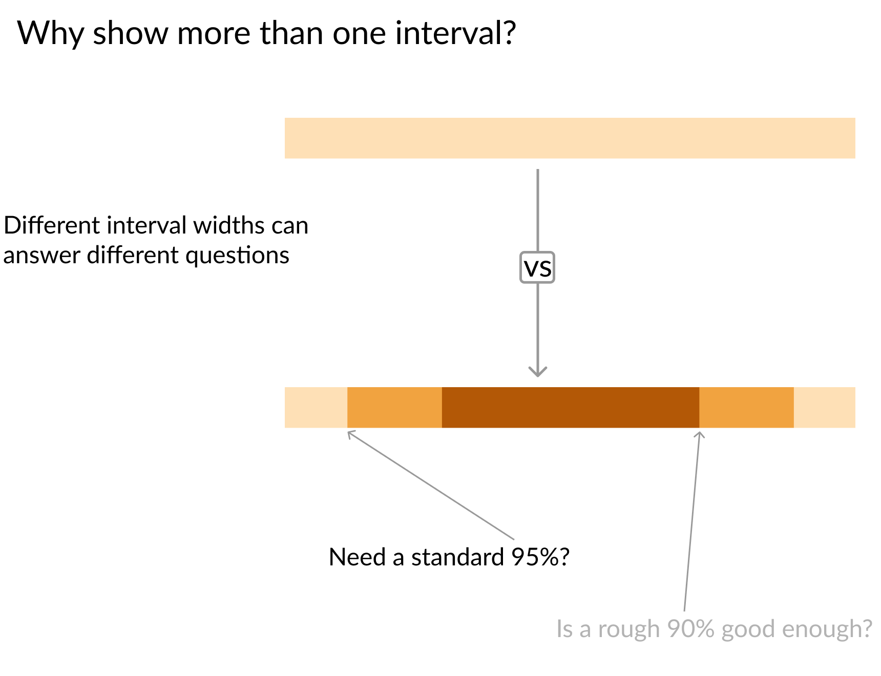
Bandă de încredere pe un singur nivel în partea de sus cu săgeată îndreptată spre o bandă pe trei niveluri dedesubt și săgeată indicând nivelul de 95% al benzii inferioare

Îmbunătățirea vizualizărilor de date în Python

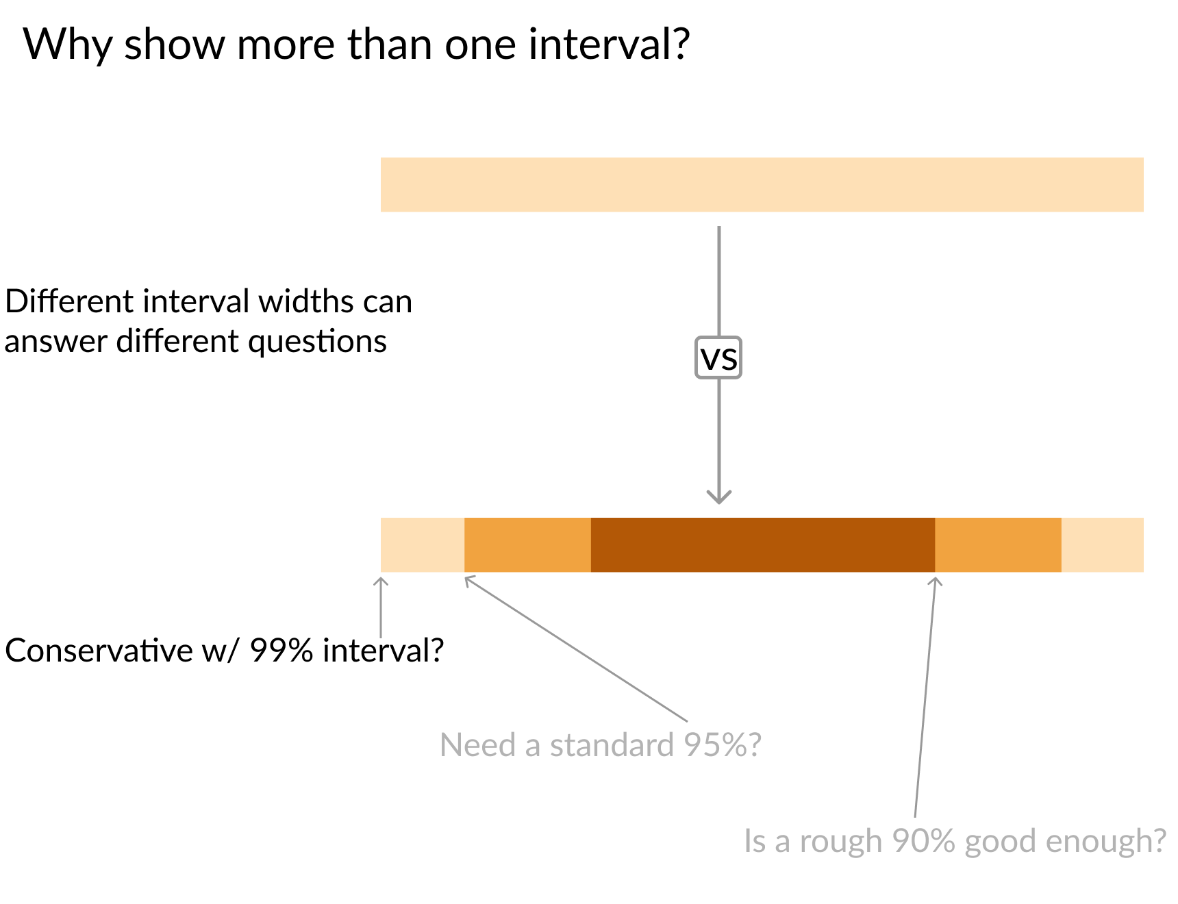
Bandă de încredere pe un singur nivel în partea de sus cu săgeată îndreptată spre o bandă pe trei niveluri dedesubt și săgeată indicând nivelul de 99% al benzii inferioare

Îmbunătățirea vizualizărilor de date în Python

Bandă de încredere pe un singur nivel în partea de sus cu săgeată îndreptată spre o bandă pe trei niveluri dedesubt

Îmbunătățirea vizualizărilor de date în Python
# Interval size setup
sizes    = ['99%', '95%', '90%']
Z_scores = [2.58,   1.96,  1.67]
colors   = ['#fee0b6','#f1a340', '#b35806']


for size, z, color in zip(sizes, Z_scores, colors): plt.hlines(y = data.y, # Calculate lower and upper boundaries xmin = data['est'] - z*data['std_err'], xmax = data['est'] + z*data['std_err'], # Color by interval size color = color,
# Make line thicker for visibility linewidth = 7,
# Label line so legend text is clear label = size)
plt.plot('est', 'y', 'ko', data = data, label = 'Point Estimate') plt.legend()
Îmbunătățirea vizualizărilor de date în Python

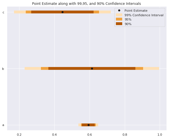
Trei benzi de încredere orizontale cu culori indicând intervalele de încredere de 90, 95 și 99%

Îmbunătățirea vizualizărilor de date în Python

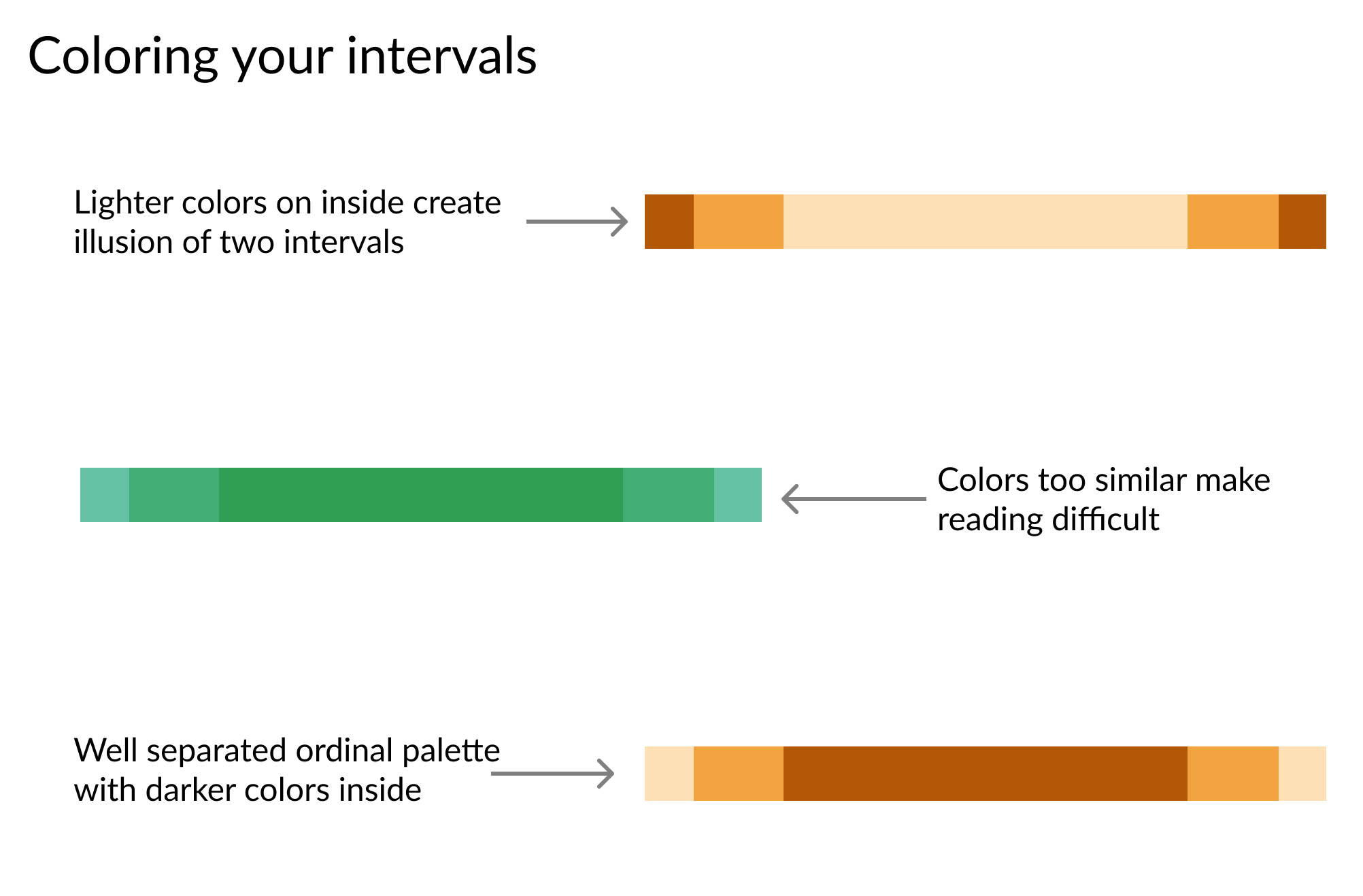
Trei intervale de încredere: primul cu culori mai închise la exterior, al doilea cu nuanțe similare, al treilea cu culori mai închise la interior

Îmbunătățirea vizualizărilor de date în Python
widths   = [    '99%',     '90%']
z_scores = [     2.58,      1.67]
colors   = ['#99d8c9', '#41ae76']

for percent, Z, color in zip(widths, z_scores, colors):
    # Set color to distinquish bands
    plt.fill_between(
        x=data.day, 
        y1=data['mean'] - Z*data['std_err'],
        y2=data['mean'] + Z*data['std_err']
        color=color,

# Lower opacity so grid can show through alpha=0.5,
# Give each band id for the legend label=percent)
Îmbunătățirea vizualizărilor de date în Python

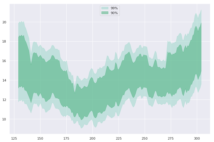
Două benzi de încredere suprapuse, banda mai mică și mai închisă la culoare înscrisă în interiorul benzii mai largi și mai deschise

Îmbunătățirea vizualizărilor de date în Python
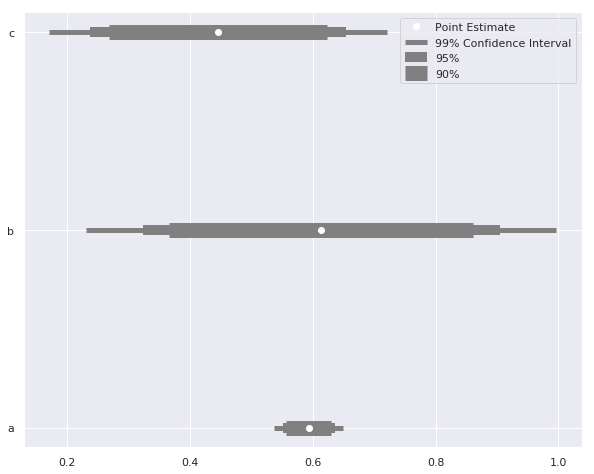
sizes = ['99% Confidence Interval', '95%', '90%']

# Set up different line widths for intervals
widths   = [   5,     10,    15]
Z_scores = [2.58,   1.96,  1.67]

for size, z, width in zip(sizes, Z_scores, widths):
    plt.hlines(
        y = data.y, label = size,
        xmin = data['est'] - z*data['std_err'], 
        xmax = data['est'] + z*data['std_err'], 
        color = 'grey'

# Adjust line thickness by interval linewidth = width)
plt.plot('est', 'y', 'wo', data = data, label = 'Point Estimate') plt.legend()
Îmbunătățirea vizualizărilor de date în Python

Trei intervale de încredere pe trei niveluri, intervalele interioare ocupând banda cea mai groasă, grosimea scăzând spre exterior

Îmbunătățirea vizualizărilor de date în Python

Să ne extindem limitele!

Îmbunătățirea vizualizărilor de date în Python

Preparing Video For Download...