Vizualizarea datelor de tip serie temporală în Python
Thomas Vincent
Head of Data Science, Getty Images
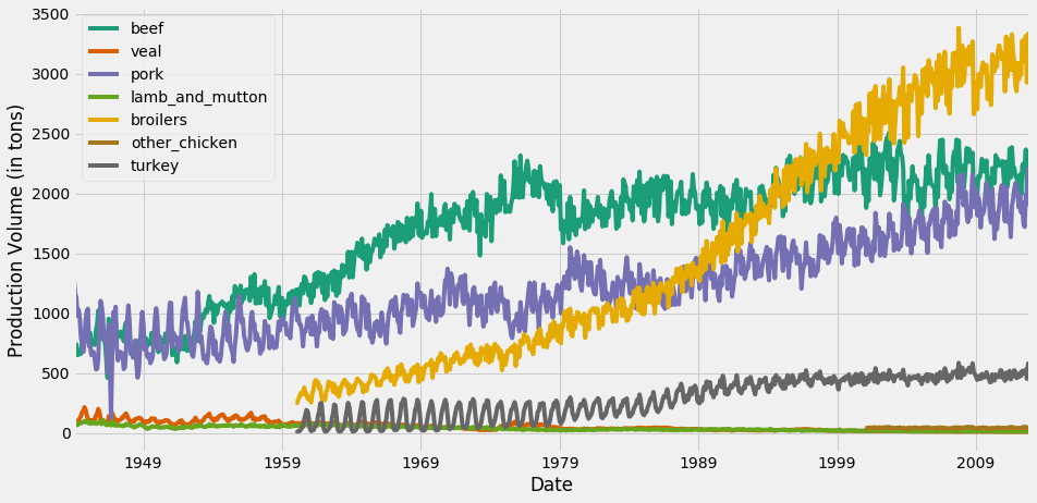
În acest grafic, schema de culori implicită din matplotlib atribuie aceeași culoare seriilor temporale beef și turkey.
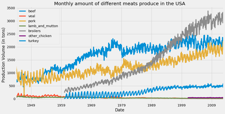
ax = df.plot(colormap='Dark2', figsize=(14, 7))
ax.set_xlabel('Date')
ax.set_ylabel('Production Volume (in tons)')
plt.show()
Pentru lista completă a hărților de culori disponibile, accesați aici.

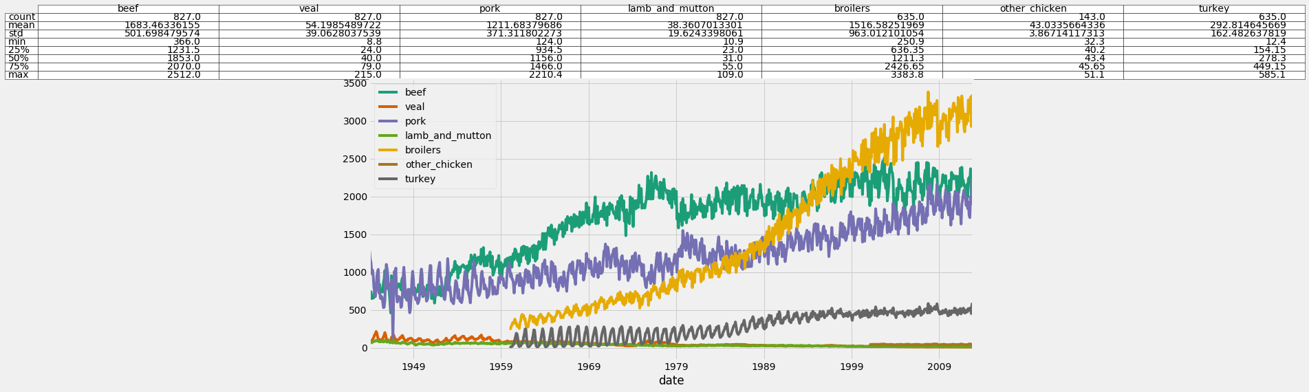
ax = df.plot(colormap='Dark2', figsize=(14, 7))df_summary = df.describe() # Specify values of cells in the table ax.table(cellText=df_summary.values, # Specify width of the table colWidths=[0.3]*len(df.columns), # Specify row labels rowLabels=df_summary.index, # Specify column labels colLabels=df_summary.columns, # Specify location of the table loc='top') plt.show()


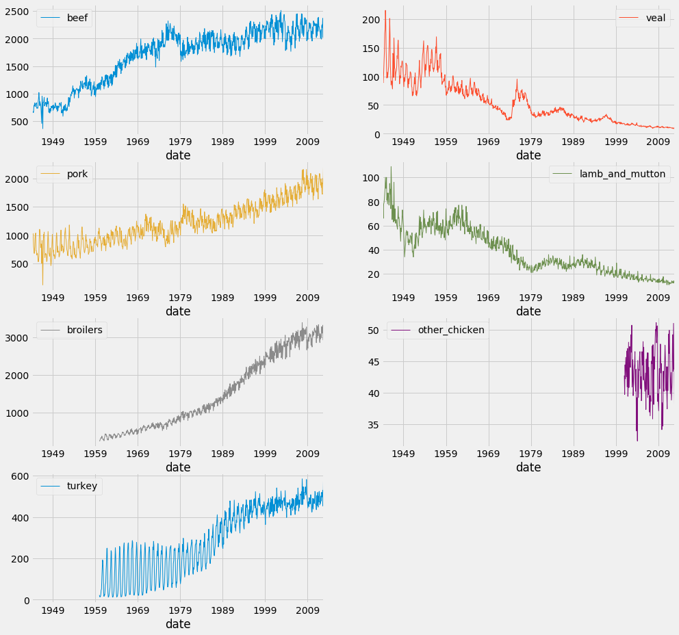
df.plot(subplots=True,
linewidth=0.5,
layout=(2, 4),
figsize=(16, 10),
sharex=False,
sharey=False)
plt.show()

Vizualizarea datelor de tip serie temporală în Python