From polygons to maps
Interactive Data Visualization with plotly in R

Adam Loy
Statistician, Carleton College
Boundaries
head(us_states)
       long      lat group order  region
1 -87.46201 30.38968     1     1 alabama
2 -87.48493 30.37249     1     2 alabama
3 -87.52503 30.37249     1     3 alabama
4 -87.53076 30.33239     1     4 alabama
5 -87.57087 30.32665     1     5 alabama
6 -87.58806 30.32665     1     6 alabama
Joining data frames
glimpse(us_states)
Rows: 15,537
Columns: 5
$ long   <dbl> -87.46201, -87.48493, -87.52503, ...
$ lat    <dbl> 30.38968, 30.37249, 30.37249, ...
$ group  <dbl> 1, 1, 1, ...
$ order  <int> 1, 2, 3, ...
$ region <chr> "alabama", "alabama", "alabama", ...
glimpse(turnout)
Rows: 51
Columns: 7
$ state       <fct> Alabama, Alaska, Arizona, Ar...
$ state.abbr  <fct> AL, AK, AZ, AR, ...
$ turnout2018 <dbl> 0.474, 0.537, 0.486, 0.412, ...
$ turnout2014 <dbl> 0.332, 0.548, 0.341, 0.403, ...
$ ballots     <int> 1725000, 280000, 2385000, 89...
$ vep         <int> 3641209, 521777, 4910625, 21...
$ vap         <int> 3802714, 554426, 5519036, 23...
Joining data frames
turnout <- turnout %>% mutate(state = tolower(state)) # make state names lowercasestates_map <- left_join(us_states, turnout, by = c("region" = "state"))
Rows: 15,537
Columns: 11
$ long        <dbl> -87.46201, -87.48493, -87.52503, -87.53076...
$ lat         <dbl> 30.38968, 30.37249, 30.37249, 30.33239, 30...
$ group       <dbl> 1, 1, 1, 1, 1, 1, 1, 1, 1, 1, 1, 1, 1, 1, ...
$ order       <int> 1, 2, 3, 4, 5, 6, 7, 8, 9, 10, 11, 12, 13,...
$ region      <chr> "alabama", "alabama", "alabama", "alabama"...
$ state.abbr  <fct> AL, AL, AL, AL, AL, AL, AL, AL, AL, AL, AL...
$ turnout2018 <dbl> 0.474, 0.474, 0.474, 0.474, 0.474, 0.474, ...
$ turnout2014 <dbl> 0.332, 0.332, 0.332, 0.332, 0.332, 0.332, ...
...
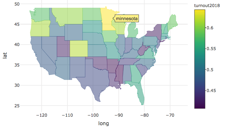
Creating the map
states_map %>% group_by(group) %>%plot_ly( x = ~long, y = ~lat, color = ~turnout2018, # variable mapped to fill color split = ~region # no more than one fill color per polygon ) %>%add_polygons( line = list(width = 0.4), showlegend = FALSE )
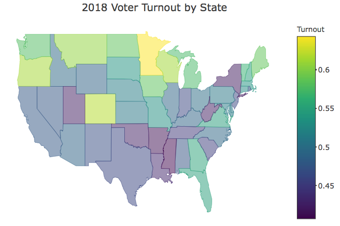
Polishing your map
state_turnout_map %>%
  layout(
    title = "2018 Voter Turnout by State",
    xaxis = list(title = "", showgrid = FALSE,
                 zeroline = FALSE, showticklabels = FALSE),
    yaxis = list(title = "", showgrid = FALSE,
                 zeroline = FALSE, showticklabels = FALSE)
  ) %>%
  colorbar(title = "Turnout")
Let's practice!
Interactive Data Visualization with plotly in R

