An Introduction to plotly
Interactive Data Visualization with plotly in R

Adam Loy
Statistician, Carleton College
Static vs. Interactive graphics
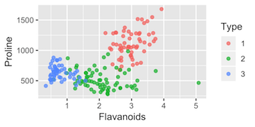
ggplot2 scatterplot
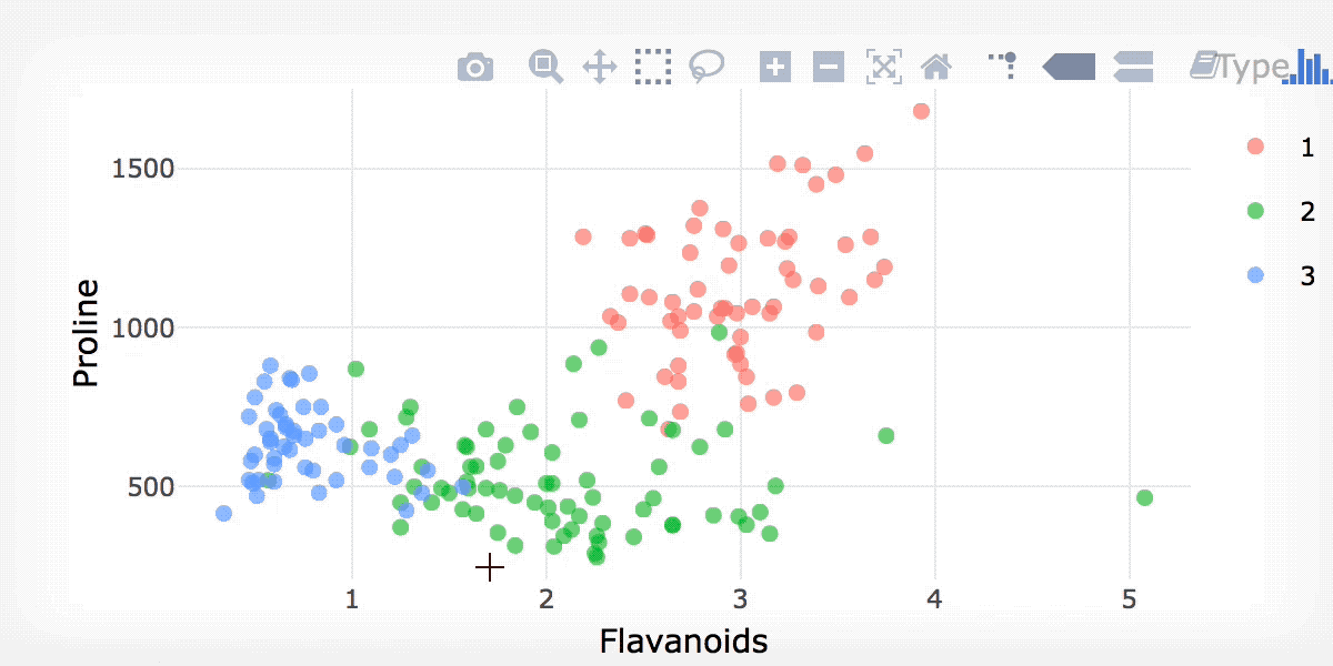
ggplotly()
library(plotly)
ggplotly(static)
Interactive Data Visualization with plotly in R
Adam Loy
Statistician, Carleton College
library(plotly)
ggplotly(static)

