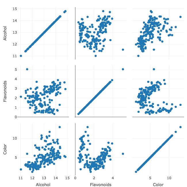
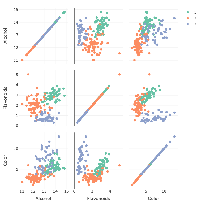
Interactive scatterplot matrices

Interactive Data Visualization with plotly in R

Adam Loy

Statistician, Carleton College

Wine data

glimpse(wine)
Rows: 178
Columns: 14
$ Type            <fct> 1, 1, 1, 1, 1, 1, 1, 1, 1, 1, 1, 1, 1, 1, 1, 1...
$ Alcohol         <dbl> 14.23, 13.20, 13.16, 14.37, 13.24, 14.20, 14.3...
$ Malic           <dbl> 1.71, 1.78, 2.36, 1.95, 2.59, 1.76, 1.87, 2.15...
$ Ash             <dbl> 2.43, 2.14, 2.67, 2.50, 2.87, 2.45, 2.45, 2.61...
$ Alcalinity      <dbl> 15.6, 11.2, 18.6, 16.8, 21.0, 15.2, 14.6, 17.6...
$ Magnesium       <int> 127, 100, 101, 113, 118, 112, 96, 121, 97, 98,...
...
$ Color           <dbl> 5.64, 4.38, 5.68, 7.80, 4.32, 6.75, 5.25, 5.05...
$ Hue             <dbl> 1.04, 1.05, 1.03, 0.86, 1.04, 1.05, 1.02, 1.06...
$ Dilution        <dbl> 3.92, 3.40, 3.17, 3.45, 2.93, 2.85, 3.58, 3.58...
$ Proline         <int> 1065, 1050, 1185, 1480, 735, 1450, 1290, 1295,...
Interactive Data Visualization with plotly in R

33_motive_splom.png

Interactive Data Visualization with plotly in R

The template

data %>%
  plot_ly() %>%
  add_trace(
    type = 'splom',
    dimensions = list(
      list(label='string-1', values=~X1),
      list(label='string-2', values=~X2),
      .
      .
      .
      list(label='string-n', values=~Xn))
  )
  • add_trace()to specify variables
  • For each variable, two arguments:
    • String for axis label
    • Mapping specifying variable
  • 'splom' trace type = scatterplot matrix
Interactive Data Visualization with plotly in R

Wine SPLOM

wine %>%
  plot_ly() %>%
  add_trace(
    type = 'splom',
    dimensions = list(
      list(label='Alcohol', values=~Alcohol),
      list(label='Flavonoids', values=~Flavanoids),
      list(label='Color', values=~Color)
    )
  )
Interactive Data Visualization with plotly in R

Linked brushing

33_linking.gif

Interactive Data Visualization with plotly in R

Adding color

wine %>%
  plot_ly(color = ~Type) %>%
  add_trace(
    type = 'splom',
    dimensions = list(
      list(label='Alcohol', values=~Alcohol),
      list(label='Flavonoids', values=~Flavanoids),
      list(label='Color', values=~Color)
    )
  )
Interactive Data Visualization with plotly in R

33_color_splom.png

Interactive Data Visualization with plotly in R

Let's practice!

Interactive Data Visualization with plotly in R

Preparing Video For Download...