Interactive Data Visualization with plotly in R
Adam Loy
Statistician, Carleton College
glimpse(wine)
Rows: 178
Columns: 14
$ Type <fct> 1, 1, 1, 1, 1, 1, 1, 1, 1, 1, 1, 1, 1, 1, 1, 1...
$ Alcohol <dbl> 14.23, 13.20, 13.16, 14.37, 13.24, 14.20, 14.3...
$ Malic <dbl> 1.71, 1.78, 2.36, 1.95, 2.59, 1.76, 1.87, 2.15...
$ Ash <dbl> 2.43, 2.14, 2.67, 2.50, 2.87, 2.45, 2.45, 2.61...
$ Alcalinity <dbl> 15.6, 11.2, 18.6, 16.8, 21.0, 15.2, 14.6, 17.6...
...
$ Color <dbl> 5.64, 4.38, 5.68, 7.80, 4.32, 6.75, 5.25, 5.05...
$ Hue <dbl> 1.04, 1.05, 1.03, 0.86, 1.04, 1.05, 1.02, 1.06...
$ Dilution <dbl> 3.92, 3.40, 3.17, 3.45, 2.93, 2.85, 3.58, 3.58...
$ Proline <int> 1065, 1050, 1185, 1480, 735, 1450, 1290, 1295,...
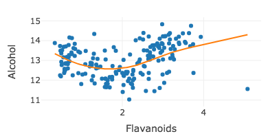
m <- loess(Alcohol ~ Flavanoids, data = wine, span = 1.5)
wine %>% plot_ly(x = ~Flavanoids, y = ~Alcohol) %>% add_markers() %>%
add_lines(y = ~fitted(m)) %>%
layout(showlegend = FALSE)
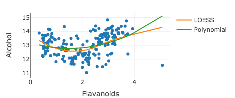
m2 <- lm(Alcohol ~ poly(Flavanoids, 2), data = wine)
wine %>% plot_ly(x = ~Flavanoids, y = ~Alcohol) %>% add_markers(showlegend = FALSE) %>% add_lines(y = ~fitted(m), name = "LOESS") %>% add_lines(y = ~fitted(m2), name = "Polynomial")
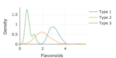
d1 <- filter(wine, Type == 1) d2 <- filter(wine, Type == 2) d3 <- filter(wine, Type == 3)
density1 <- density(d1$Flavanoids) density2 <- density(d2$Flavanoids) density3 <- density(d3$Flavanoids)
plot_ly(opacity = 0.5) %>% add_lines(x = ~density1$x, y = ~density1$y, name = "Type 1") %>% add_lines(x = ~density2$x, y = ~density2$y, name = "Type 2") %>% add_lines(x = ~density3$x, y = ~density3$y, name = "Type 3") %>% layout(xaxis = list(title = 'Flavonoids'), yaxis = list(title = 'Density'))
Interactive Data Visualization with plotly in R