Bivariate graphics
Interactive Data Visualization with plotly in R

Adam Loy
Statistician, Carleton College
Scatterplots with plotly
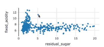
winequality %>%
  plot_ly(x = ~residual_sugar, y = ~fixed_acidity) %>%
  add_markers()
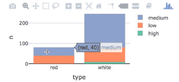
Stacked bar charts with plotly
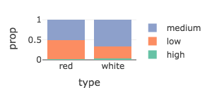
From counts to proportions
Boxplots with plotly
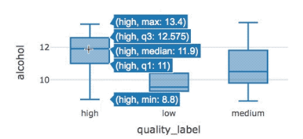
winequality %>%
  plot_ly(x = ~quality_label, y = ~alcohol) %>%
  add_boxplot()

