Customize your traces
Interactive Data Visualization with plotly in R

Adam Loy
Statistician, Carleton College
Color
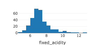
winequality %>%
   plot_ly(x = ~fixed_acidity) %>%
   add_histogram()
Color
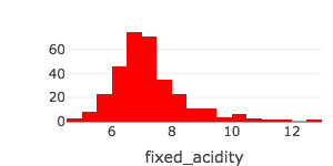
winequality %>%
   plot_ly(x = ~fixed_acidity) %>%
   add_histogram(color = I("red")) # Setting color
Opacity
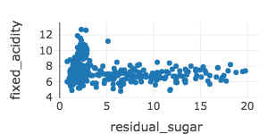
winequality %>%
  plot_ly(x = ~residual_sugar, y = ~fixed_acidity) %>%
  add_markers()
Opacity
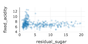
winequality %>%
  plot_ly(x = ~residual_sugar, y = ~fixed_acidity) %>%
  add_markers(marker = list(opacity = 0.2))           # Adjust opacity
Symbols
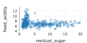
winequality %>%
  plot_ly(x = ~residual_sugar, y = ~fixed_acidity) %>%
  add_markers(marker = list(symbol = "circle-open"))   # Change symbol

