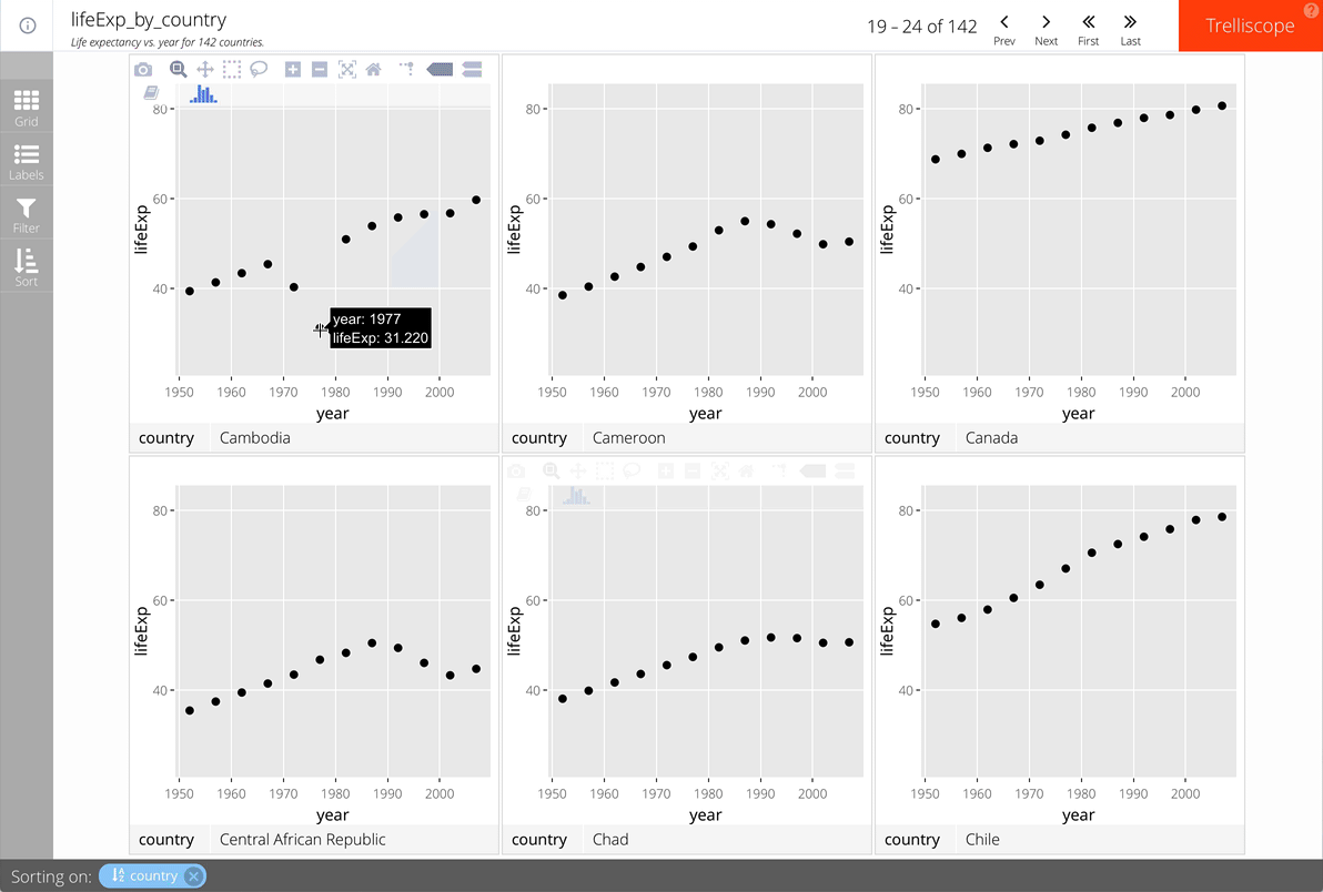
Additional TrelliscopeJS features
Visualizing Big Data with Trelliscope in R

Ryan Hafen
Author, TrelliscopeJS
ggplot panel interactivity using Plotly
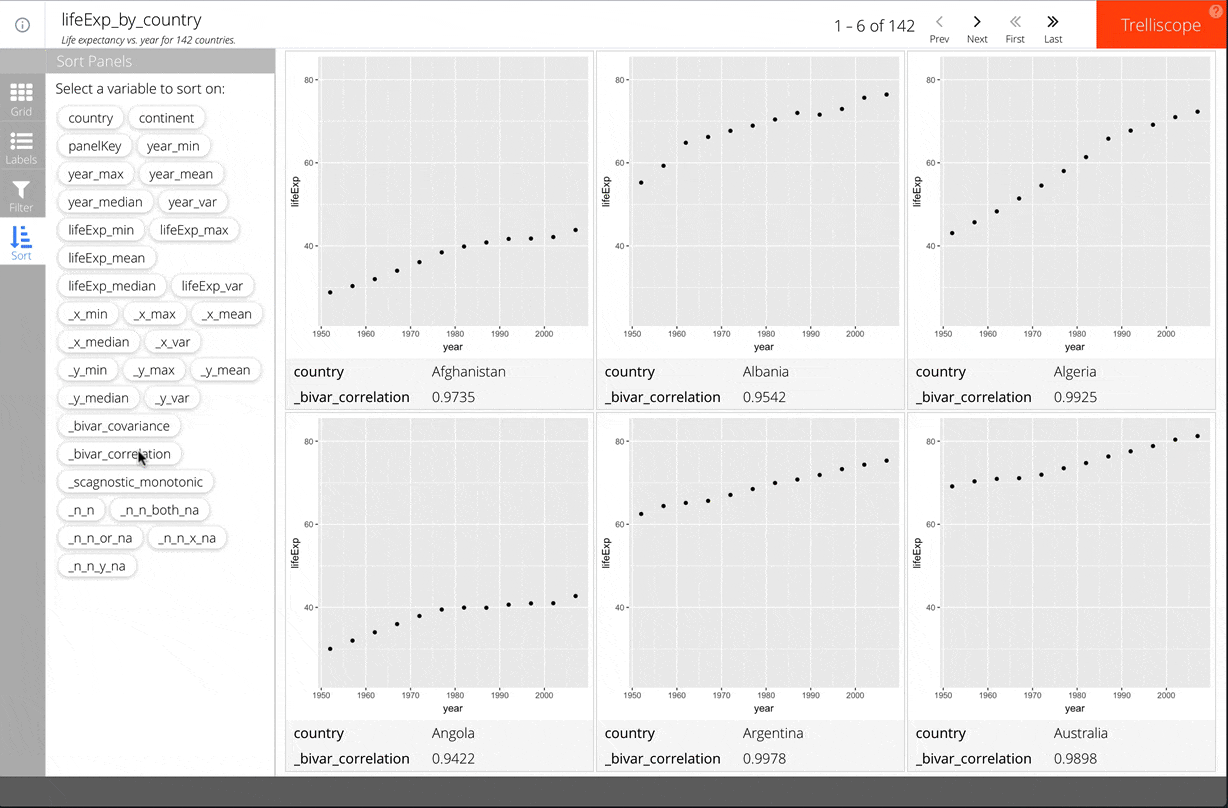
Context-based automatic cognostics
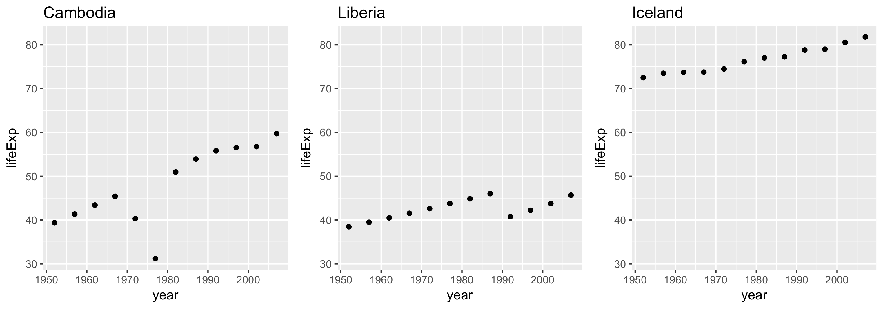
scales = "same"
Each panel's limits are the same.
Enables "apples to apples" comparisons across panels.
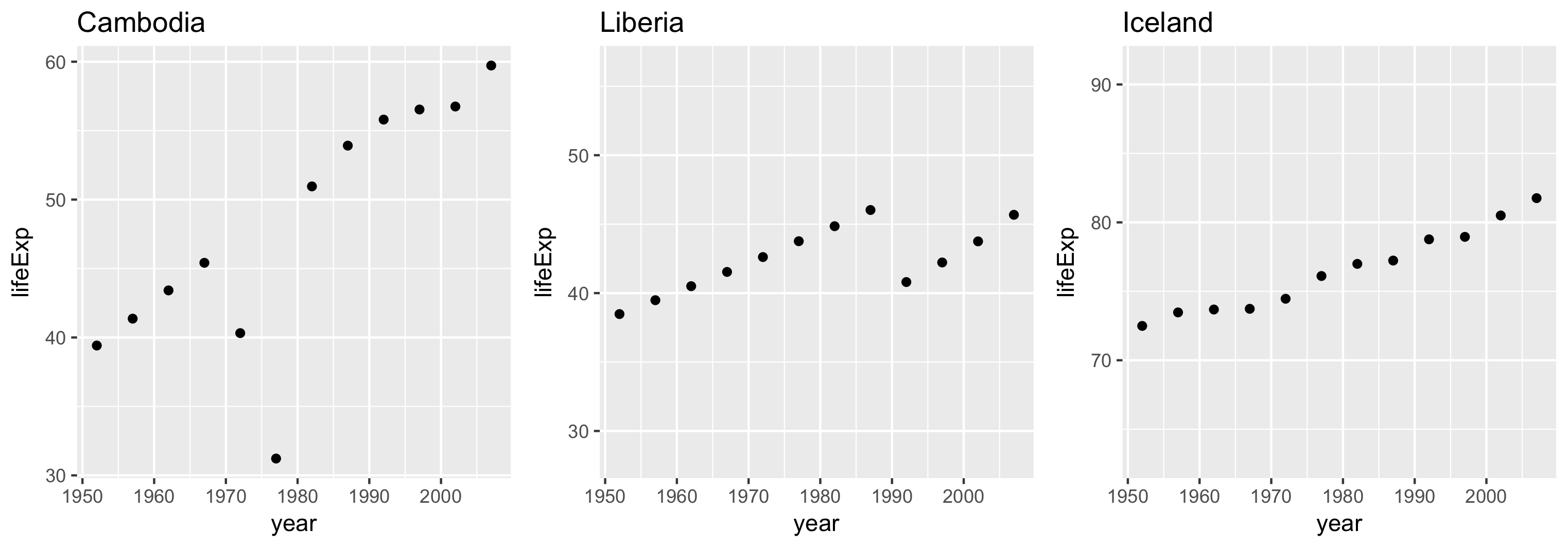
scales = "sliced"
Each panel's limits span the same range but don't necessarily start in the same place.
Useful for making comparisons of differences of scale.
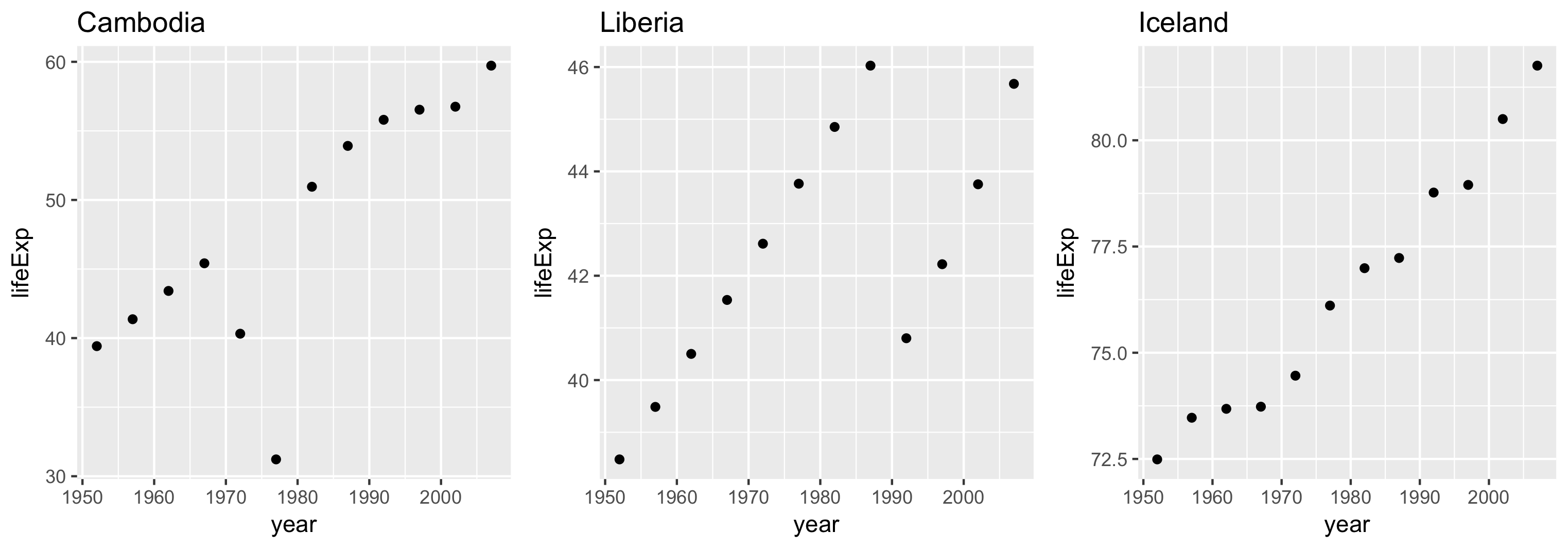
scales = "free"
Each panel's limits are based on the bounds of its own data.