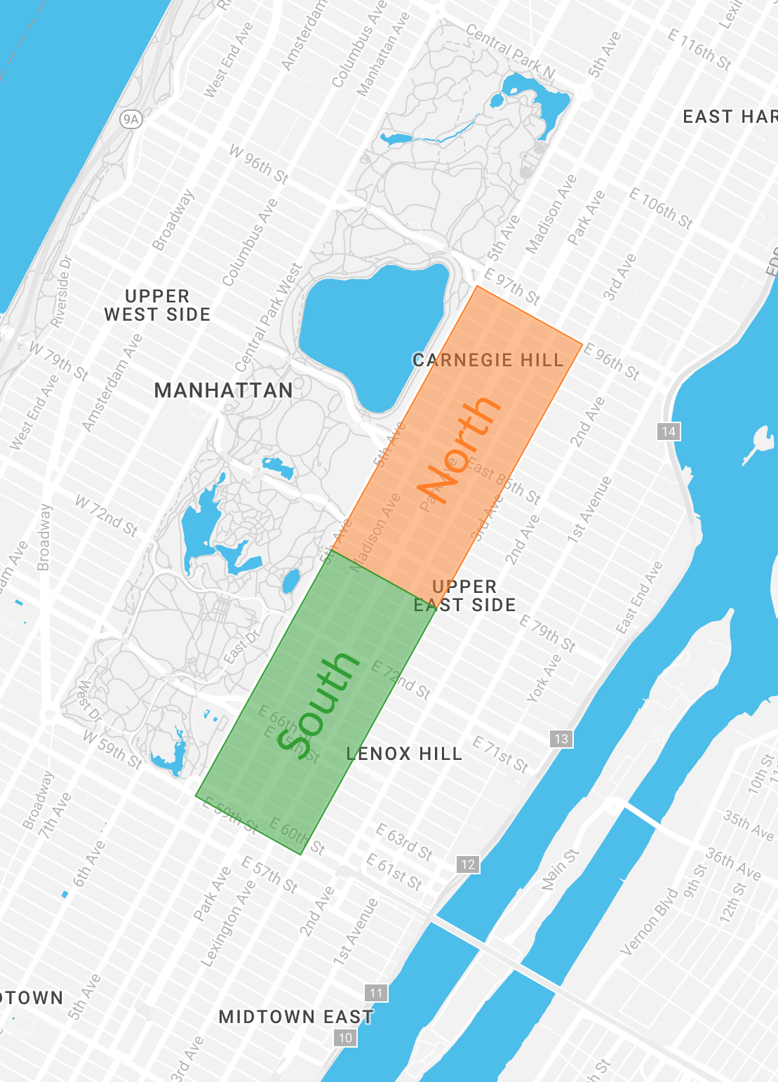
Visualizing subsets

Visualizing Big Data with Trelliscope in R

Ryan Hafen

Author, TrelliscopeJS

Visualizing subsets in detail

Visualizing Big Data with Trelliscope in R

Investigating the tip amount distribution

Question: Do cash payments have tips?

Visualizing Big Data with Trelliscope in R

A subset of the taxi data

Rides of the same nature should have similar fare and tip amounts.

  • Most popular route: Upper East Side South to the Upper East Side North of Manhattan
  • Only include cash and credit transactions
  • 5,187 observations

Visualizing Big Data with Trelliscope in R

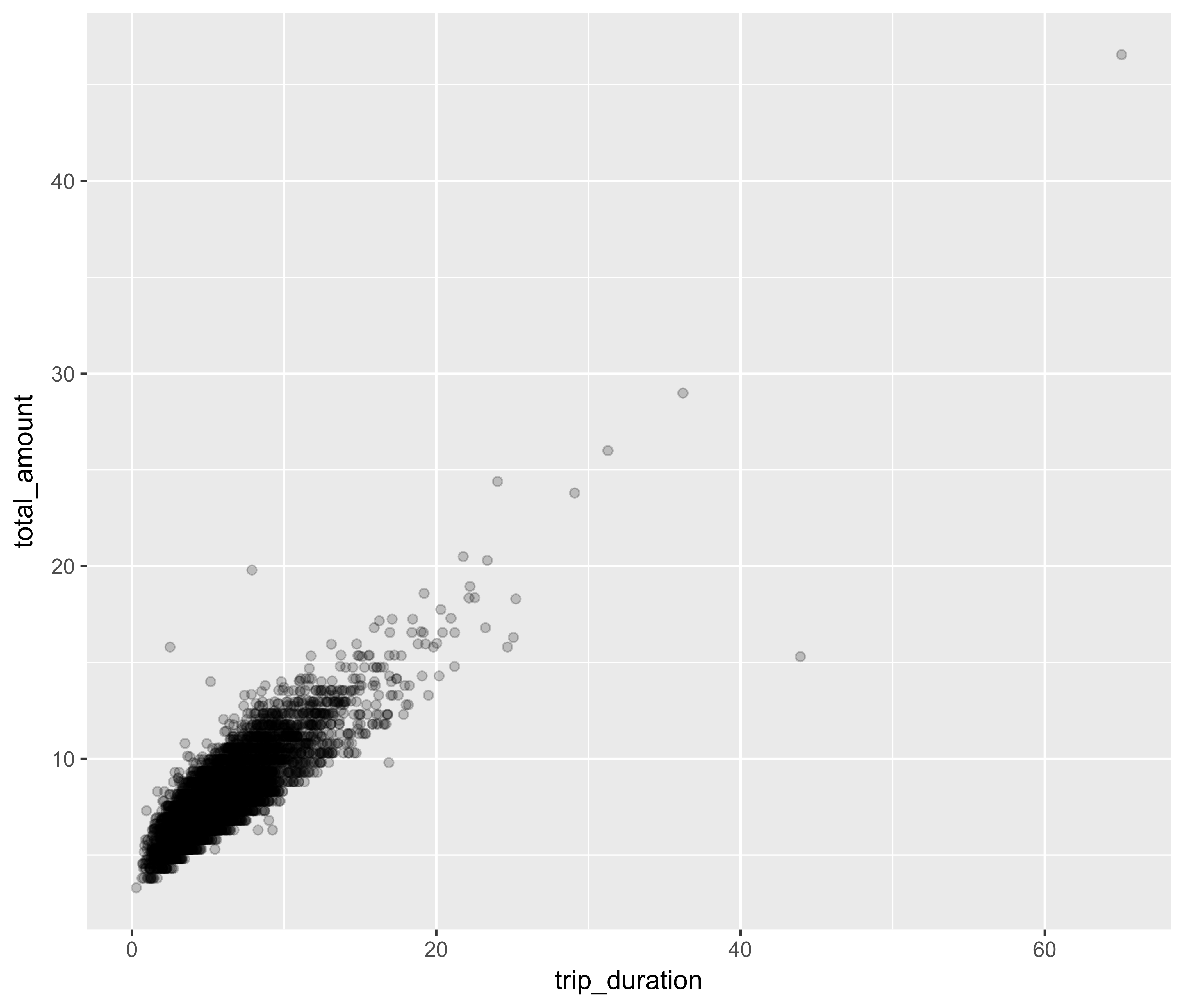
Total fare vs. trip duration

ggplot(tx_pop, aes(trip_duration, total_amount)) +
  geom_point(alpha = 0.2)

Visualizing Big Data with Trelliscope in R

Cash / card distribution comparison using a quantile plot

ggplot(tx_pop, aes(sample = total_amount, color = payment_type)) +
  geom_qq(distribution = stats::qunif) +
  ylim(c(3, 20))

Visualizing Big Data with Trelliscope in R

Let's practice!

Visualizing Big Data with Trelliscope in R

Preparing Video For Download...